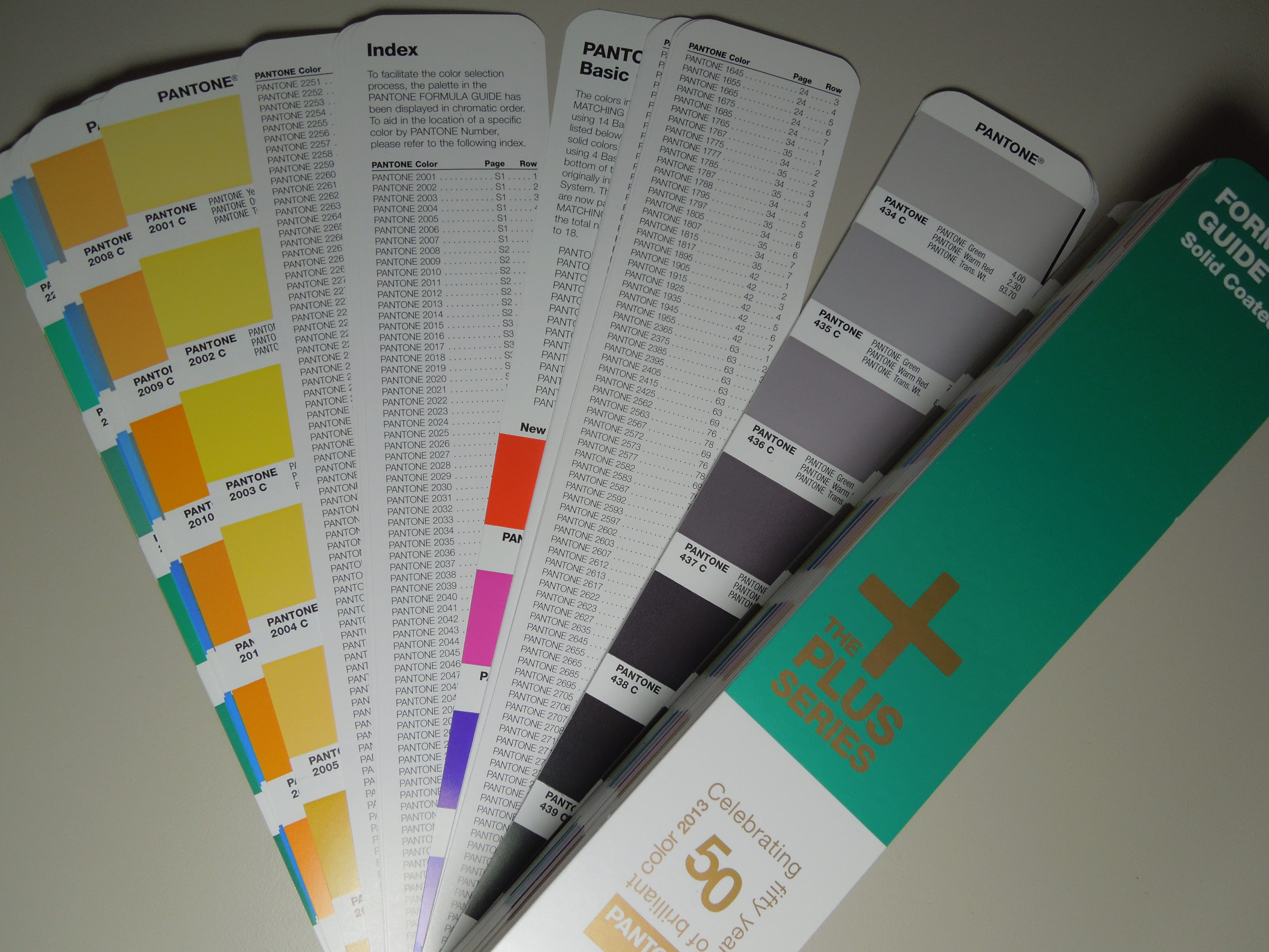
In 2010, one of the central innovations at Pantone was the new system for graphic designers, service providers and printers: The Pantone palette was extended by numerous colours and was given a new name: Pantone Plus
The extension by 560 colours was done in two steps:
2010: 224 added to a total of 1341 Pantone Solid colours
In 2010, the Pantone palette was extended by 224 colours, which are named from 7548 to 7771 in the Pantone classification. All new colours could continue to be mixed with the previous 14 Pantone basic colours in the print shop.
- PANTONE Yellow
- PANTONE Yellow 012
- PANTONE Orange 021
- PANTONE Warm Red
- PANTONE Red 032
- PANTONE Rubine Red
- PANTONE Rhodamine Red
- PANTONE Purple
- PANTONE Violet
- PANTONE Blue 072
- PANTONE Reflex Blue
- PANTONE Process Blue
- PANTONE Green
- PANTONE Black
2012: Another 336 more to a total of 1677 Pantone Solid colours
In 2012, the Pantone Plus palette was expanded by additional 336 colours, which in the Pantone classification are named from 2001 to 2336. In order to achieve these colours, the previous 14 Pantone base colours were extended by 4 new colours to a total of 18 base colours. The new colours borrowed from the Pantone GOE palette are:
- PANTONE Bright Red
- PANTONE Pink
- PANTONE Medium Purple
- PANTONE Dark Blue
Unfortunately, Pantone did not communicate these changes very well. A typical example can be seen in a screenshot from November 8, 2013: On the German and English Pantone pages, there are two completely different numbers for new colours; only the total number of colours on the two Pantone country pages is the same.