Video by Peter Jäger Pro2Media: 3 minutes for simple cross-media color management

Cross-media colour management really works

Peter Jäger is an expert in colour management that reliably works across the boundaries of printers and monitors, web and print – essentially: cross-media.

Gamut map: The colour tool for cross-media design

Due to our involvement with freeColour e.V., at the last meeting in Switzerland the desire for a cross-media tool for designers was expressed with which one can create intersections of colourspaces from the freieFarbe CIELAB HLC Colour Atlas XL. With Gamutmap, Proof GmbH has now created such a tool, which is available to all designers free of charge. With Gamutmap nearly 100 individual colour spaces can be indicated from 34.250 colours of the entire CIELAB colour space, or intersections from many combined colour spaces can be indicated. An example: As …

Read more

HLC Colour Atlas XL - freieFarbe proof.de - title white 2018 v1

free colour: CIELAB HLC Colour Atlas XL published and can be ordered at proof.de

After almost a year of work the time has finally come. The CIELAB HLC Colour Atlas XL saw the light of day. The new HLC Colour Atlas XL is the basis for all stages of professional colour communication – from design to the finished product. The standard version contains 2040, the new XL version even 13283 mathematically-systematically graded CIELAB colour tones on 74 pages. You can order the CIELAB HLC colour atlas here in our shop The free file package contains the layer PDF version with several gamuts for the analysis …

Read more

Comparison between eciRGB_V2 (white) and sRGB

Why is the embedding of RGB profiles so important?

A few days ago we received a call from a customer in the field of design, who sent open Adobe InDesign data in ISOCoatedV2 300% with contained RGB images to the production company for a complex CD production on the advice of the producing company (“The printing company still has a prepress stage, which can then prepare your data optimally…”). The result of the finished printed CD booklets and inlays did not correspond at all to the calibrated monitor image of our customer, the client was also unhappy and requested …

Read more

How CMYK and RGB profiles are handled in proofing

When we receive a file from you, the first thing we check is whether there are colours other than CMYK in the file. If the file is built exclusively in CMYK, it will be sent directly for proofing.

Handling wrong profiles with CMYK data / “Profile Mismatch
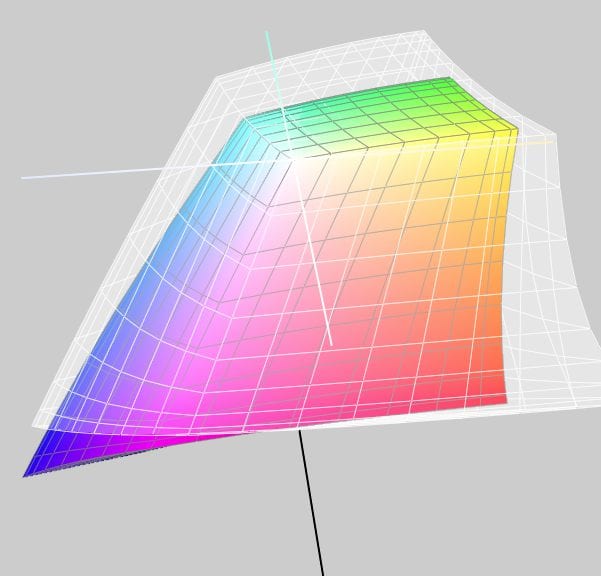
If we have only received CMYK data from you, we will ignore all input and output profiles and only use the CMYK values that we bring to the ordered output colour space.

Example 1: Data in ISOCoated, proof in ISOCoatedV2 ordered, thus wrong or no CMYK profile embedded.

You send a file with the profile ISOCoated and a colour area in CMYK 100/70/0/0 and order a proof according to ISOCoatedV2.
We ignore the ISOCoated profile and proof the pure colour value 100/70/0/0 according to ISOCoatedV2.

Read more

Adobe Color Picker 2019: Decimal places possible in InDesign and Illustrator

Adobe has updated its colour picker in the 2019 version. Especially in Adobe InDesign 2019, decimal places are now possible for LAB and CMYK during colour input, which is a long-desired feature especially in the high-end colour area. Up to now it was already possible in Adobe InDesign to enter colour values e.g. in CMYK with decimal places and to write them into the PDF during PDF export, but only integer values were displayed.

In Adobe InDesign 2019, three decimal places can now be entered for LAB and CMYK and can also be read out again. However, these values are not adopted in the automatic labelling of the colour fields, although this can always be adjusted manually.

Read more

The 10 best colour websites to inspire designers

Designers constantly need to be inspired to create new colour creations. Often pictures are chosen as the starting point for a new colour composition. Or there is a leading colour for which further colours must be found in order to create a harmonious colour palette.

There are several websites on the net that are perfect for such colour breakdowns and colour inspirations for graphic artists and designers. We have summarized the best of them here in an overview.

1. Adobe Color CC, formerly Adobe Kuler:

Adobe Color CC is the Adobe social colour network. Designers can test and evaluate colours and develop different colour schemes and colour combinations. These can then be downloaded directly for use in Adobe products such as Adobe Creative Suite. https://color.adobe.com

Read more

Is it possible to proof on special paper such as production paper?

“We print 135gr/sqm on a Berberich Allegro. Can you make us a proof on this paper? Can you proof on our final production paper?”

Our telephone support often asks for a proof on production paper. Unfortunately, we always have to answer the question negatively. I would like to briefly explain the reasons for this in the following article.

Proofing on production paper is still technically impossible.

All proofing systems currently certified by Fogra are based on an inkjet printer as a test printer, mostly from Epson, Canon or HP. These printers are characterised by a large colour space, good resolution and excellent homogeneity and colour stability – all characteristics that are absolutely necessary for a proof printing system. The Epson systems used by the majority of proof printers are based on 11-colour pigment inks, which can reproduce a significantly larger colour space than e.g. ISOCoatedV2. However, the prerequisite for this is the use of special papers optimized for inkjet printing, in which the pigments and inks are optimally emphasized. This requires special coatings that are optimized for optimum reproduction, fast drying, good abrasion resistance and high UV stability of the print. On an image printing paper without these coatings, the ink would run, hardly dry and would not be smudge-proof. The color space would also be impossible to achieve. A proof would therefore not be possible from this point of view.

Read more

Anaglyph glasses - transmitted spectrum of the two foils

Reproduction of anaglyph images and line drawings

Already a few weeks ago we received an unusual request: The musician and aspiring art student Tobias Weh from Osnabrück experimented with line drawings based on anaglyphs and achieved very good results on the monitor. He created superimposed line drawings, which then delivered a different image when viewed through the left eye than when viewed through the right eye. The question was whether this could be reproduced better with the high color range of a proofing system than with a simple domestic inkjet printer.

Since such questions are of course very interesting at first sight, we were quickly prepared to support Mr Weh in his work. To get closer to the matter, we use an i1 Pro 2 and BabelColor Color Translator & Analyzer to measure the spectra for the two films, which are transmitted through standard anaglyph glasses.

Anaglyphenbrille - Durchgelassenes Spektrum der beiden FolienActually a very satisfactory result. By choosing two colours as printing in the spectral ranges of 450 to 500 nanometres for blue and 650 to 700 nanometres for red, it should actually be possible to achieve quite a good result.

Read more

Ten points that you should always keep in mind when proofing.

It is actually quite simple to have proofs made. But experience shows that many customers often stumble over the same mistakes. We have put together the ten most important steps towards a successful proofing job:

  1. Proof as late as possible in the production process
  2. Select the right proof profile for your purposes
  3. Convert RGB or LAB images to CMYK
  4. Name Pantone and HKS colours correctly
  5. Proof your data in a 1:1 ratio and not scaled down
  6. Always proof with UGRA/Fogra Media Wedge 3.0
  7. Make sure that the job ticket is correct
  8. Make sure your service provider has the latest proof software and hardware
  9. Only accept authentic “contract proofs” according to ISO 12647-7
  10. Make sure that your proof provider has valid certifications

In the following we would like to present these individual points in more detail.

Read more

Moiré effect through overlapping grid

What is Moiré? And can I see Moiré in a proof?

The Moiré effect, or in other words a halftone screen overlay, is a common phenomenon when viewing prints. It occurs when two even patterns overlap unevenly.
Moiré Effekt

When does Moiré appear?

Moire is always created when screens overlap. Typical examples:

  • You have scanned in a newspaper ad and print it in another newspaper.
  • You print the portrait of a managing director wearing a jacket with a fine houndstooth pattern, a checkered shirt and a finely patterned tie. Regardless of the printing process, complete moiré chaos is guaranteed to break out here.
  • A brick building is reproduced in offset printing.
  • The photograph of a ventilation grille is viewed on a monitor

    Read more

Color Selector - Adobe Photoshop

Easy conversion of Pantone – HKS – CMYK – RGB with Adobe Photoshop

Farbbücher Auswahl in Adobe Photoshop CC: HKS, Pantone, CMYK und vieles mehr

More often the question arises as to what kind of Pantone colour corresponds to the HKS 43 K. Or what CMYK value? And what kind of web color in RGB?

If you own Adobe Photoshop, you can do these conversions directly there. In Photoshop CC all well-known color books are stored with values.

Let’s assume we are looking for the Pantone equivalent and the matching CMYK color of HKS 43 K.

1: Open the color palette in Adobe Photoshop and select HKS K as the book and then the color HKS 43 K. All well-known colour books are directly stored in Photoshop.

Read more

Layout in RGB, print in CMYK. Problems?

Especially in larger companies today the layout in RGB is the rule rather than the exception. The advantages are obvious:

  • The layout takes place in a large, almost media-neutral color space
  • All Photoshop filters are available without restrictions
  • The process of color space conversion to CMYK is shifted to the production process as late as possible

In practice, however, there are two potential problems in particular.

Problem 1: CMYK conversion in the last step.
The catalogue is designed in InDesign, all data is perfectly matched, the last step before printing and proofing is the export to a printable PDF in CMYK. Usually this is done via a preset in InDesign, which defines the exact specifications for the color space conversion. In practice, however, this color space transfer can hardly be monitored. The problem: Even if you check the color values in Acrobat in the exported PDF file, for example, Acrobat does not really display the colors it contains. Acrobat brav would show you CMYK values even if the RGB images are still wrongly contained. However, other CMYK values can occur during printing when the data is processed again. Lately it looked like this:

Read more

The proof is much darker than the image on my monitor. Why?

Customers are often unsettled when they hold a proof in their hands. “The proof of the picture is much darker than the picture on my monitor. Why is that so? And what do I do now?” There are many possible reasons for a deviation between the proof and, for example, the monitor display: The monitor is not calibrated Only calibrated monitors can accurately display color. When I buy a cheap monitor and connect it to my computer, I definitely can’t see any real color. As a rule of thumb, only …

Read more

White lines appearing in print PDFs in Adobe Acrobat

The question often arises why when creating a PDF-X/3:2002 file in Adobe Acrobat, white lines often appear in the preview when there are no lines at all in the file. The answer is simple: In contrast to current PDF printing standards such as PDF/X-4:2010, which is exported as PDF 1.6 standard, the PDF-X/3:2002 standard often required by printers uses PDF format 1.3, in which transparency is prohibited. As a result, when you create drop shadows in Adobe InDesign, for example, they are converted into rectangular images. If such drop shadows …

Read more

Why monitor and paper don’t get along when it comes to colour.

Colour is colour, you’d think. That’s right. But have you ever tried to explain the colour of your new car or your new red wallet to a friend on the phone? You will notice that human colour recognition and the reproduction of the same in another medium is very difficult. The same applies to computers – better: monitors, and printers – i.e.: laser printers, inkjet printers or newspaper printing or offset brochure printing. Why is the red on a monitor different from exactly the same red printed on paper? It’s …

Read more

proof.de Packaging of a Proof/ Digital proof

What’s a proof for? The most important reasons for proofing!

A proof is reassuring: The proof shows the colour result of the subsequent printing. The customer knows exactly the later result from the proof and is reassured. The printer knows that the customer knows the proof and is also reassured. A proof is fast: Ordered today, delivered tomorrow: Modern proofing service providers work quickly and produce hardly any loss of time in the design and printing process A proof is precise: All professional service providers nowadays work with proof printers that are recalibrated at short intervals. A media wedge with …

Read more

Comparison between eciRGB_V2 (white) and AdobeRGB 1998

Which RGB working colour space is suitable for colour-consistent work?

In the early days of color spaces Apple and e.g. Photoshop up to version 5.5 set the monitor color space as working color space by default. But it soon became clear that a design office would be working with 10 Macs in 10 different color spaces. A neutral concept was needed. There are many RGB Colour Spaces around. In the area of print media there are currently primarily three different variants: sRGB, AdobeRGB(1998) and eciRGB_V2. The sRGB color space is widely used in digital cameras and is the industry leader …

Read more

Embed profiles for proofing? Yes or No?

The question often arises whether color profiles should be embedded in the PDF files for proofing. To answer the question, you have to get some answers: The proof should simulate the subsequent offset printing. For offset printing, with few exceptions, the imagesetters have been configured so that a 70% black in the file is displayed as 70% black on the printing plate, no matter what profile was specified in the file. It didn’t matter whether it was coated paper or uncoated paper: 70% in the file corresponded to 70% on …

Read more

Depending on the selected setting, the EAN lines in proofs are displayed smoother or less smooth. It is clearly recognizable that the modules are built up by many colours and especially within the narrow black lines a considerable increase in width takes place. Normally, a narrow black EAN bar should correspond to the width of the white space in between.

Verifiability of GTIN codes in proofing

Proofing service providers are increasingly required to be able to display “verifiable” GTIN codes, i.e. barcodes in the proof. The background to this is that especially the big german discounters like Aldi, Lidl, Hofer & Co. want to see a packaging proof from their suppliers in advance for approval. This packaging proof is not only visually assessed according to colour, but also the legibility of the printed EAN codes is evaluated using a measuring device and must meet certain criteria: Symbol contrast, modulation, decodability, defects, blemish: all this is measured …

Read more

WordPress Cookie Plugin by Real Cookie Banner