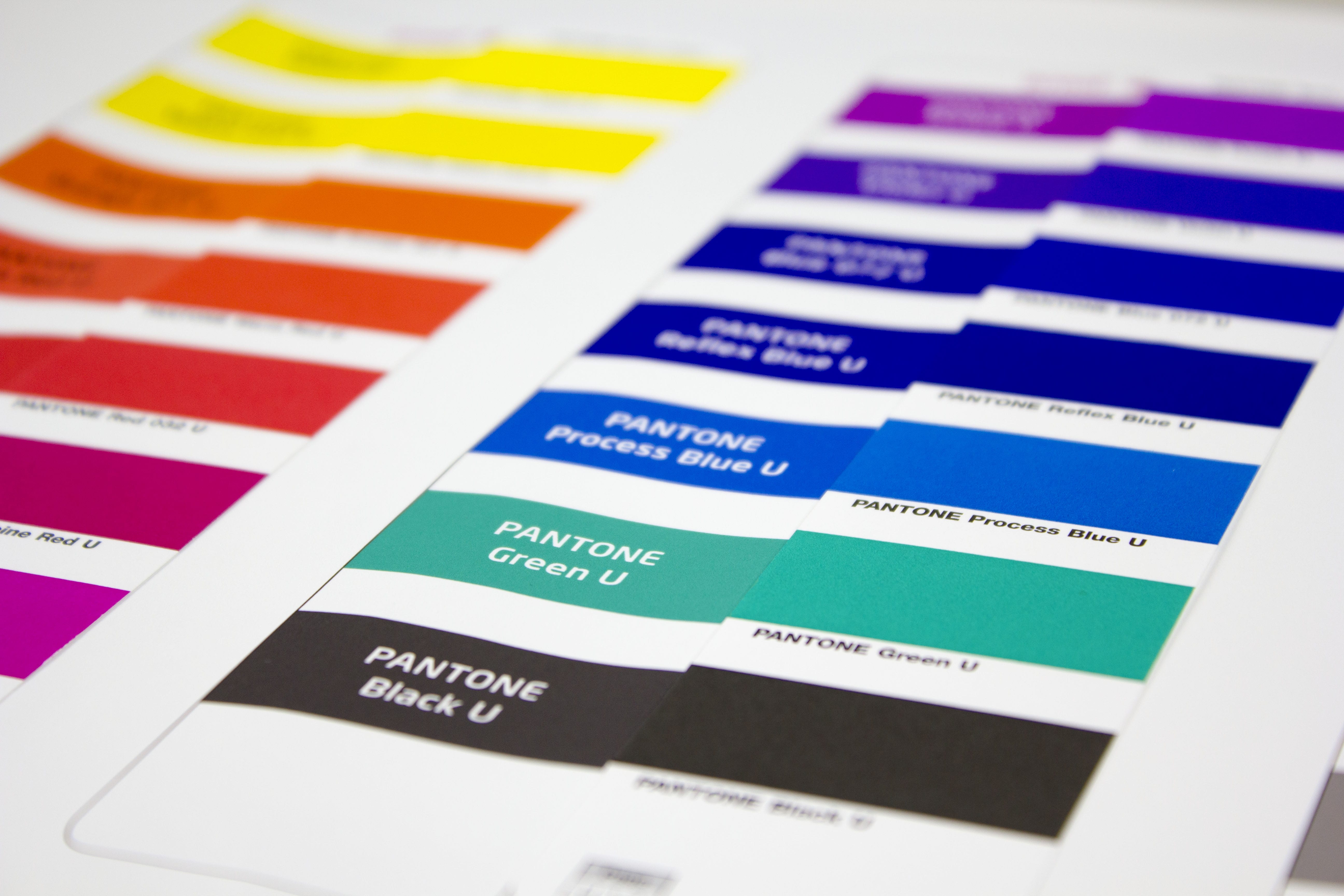
Current proofing systems can print spot colours like Pantone or HKS very accurate. With Fiery XF 5.2 Proof software and the Epson 7900/9900 proof printers we evaluated, with which colour deviation PANTONE Metallics Coated and PANTONE Premium Metallics Coated colours can be reproduced in proofing.
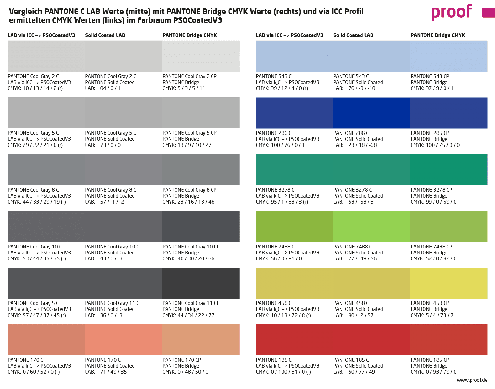
The colour deviations were calculated based on the measured colour space of the proof system of Proof GmbH by the proofing software. Deviations should therefore be quite similar in practice. Almost all PANTONE colours can be simulated quite well in the wide colour gamut of the proofer.
The smaller the Delta-E value, the lower is the colour distance of the PANTONE reference to the proofed PANTONE colour. Higher Delta-E values show, which PANTONE colours can’t be simulated accurately in the proof.
Please note: Since the proof devices does not have colours with metallic pigments, the metallic shine in the proof can not be reproduced. Only through the satin finish of our proofing paper a somewhat shiny effect is produced, which replaces partly the metallic luster of true PANTONE colours. Although the colour is well rendered, the metallic effect in the proof does not exist. The proof can therefore always be used only as a guide, but not as binding simulation of the final result.
Read more