New edition of ISOCoatedV2 in M1 in sight?

Even almost 9 years after the introduction of the successor colour space PSOCoatedV3, ISOCoatedV2 / FOGRA39 is still the most widespread colour space in Europe. We at Proof GmbH count around 200 jobs from time to time for the German Printing and Media Industries Federation, among others. In the last count, proofs in ISOCoatedV2 accounted for around 68% of all proof jobs at our company. This is a clear sign of the continued widespread use of the colour space.

ISOCoatedV2: From the classic colour space to the beacon of the industry

In addition to the print proofs for offset printing on image printing paper, numerous other applications also come to mind: ISOCoatedV2 is also used for many other, non-standardised or less standardised printing processes and is used as an exchange colour space: From digital printing in exhibition stand construction to packaging printing in flexo and gravure printing: almost all major players in the market rely on the power of ISOCoatedV2.

At the Fogra 2024 colour management symposium in Munich, we heard a lot about how companies and large print service providers from printing processes other than offset printing also rely on ISOCoatedV2 as a colour space reference for their applications. They are virtually following ISOCoatedV2 from the “master standard” and simply orienting themselves to the “largest ship in the colour space sea: ISOCoatedV2”, which is well established among all players in the market such as agencies and designers. Over the last few years, this has turned a successful colour space into a de facto standard.

Updated and future-proof? ISOCoatedV2 is “growing up”

It is therefore not surprising that there has been a call to provide the less popular PSOCoatedV3 with a modernised older brother: An updated FOGRA39/ISOCoatedV2, which, at the age of almost 18 years, can leave the most important legacy issues behind in order to perform its lighthouse function even better as a renewed replacement colour space.

The advantages of a new ISOCoatedV2 in M1:

  • Adaptation to the new measurement condition M1 in force since 2015 and the new standardised light D50 in accordance with ISO 3664:2009
  • Conversion of the old GDMI Gretag-Macbeth measuring base to the new XRGA for better comparability of measured values and higher precision
  • This improves process control thanks to updated H values for full tones for cyan and magenta
  • Retention of the white point of LAB 95/0/-2 and the proof on papers with few optical brighteners (OBA)
  • Classic ISOCoatedV2 proofs would still be valid, but with the new ISOCoatedV2 M1 printing condition, “new” proofs could produce more consistent and better results
ISOCoatedV2 / FOGRA39 Relaunch in M1?

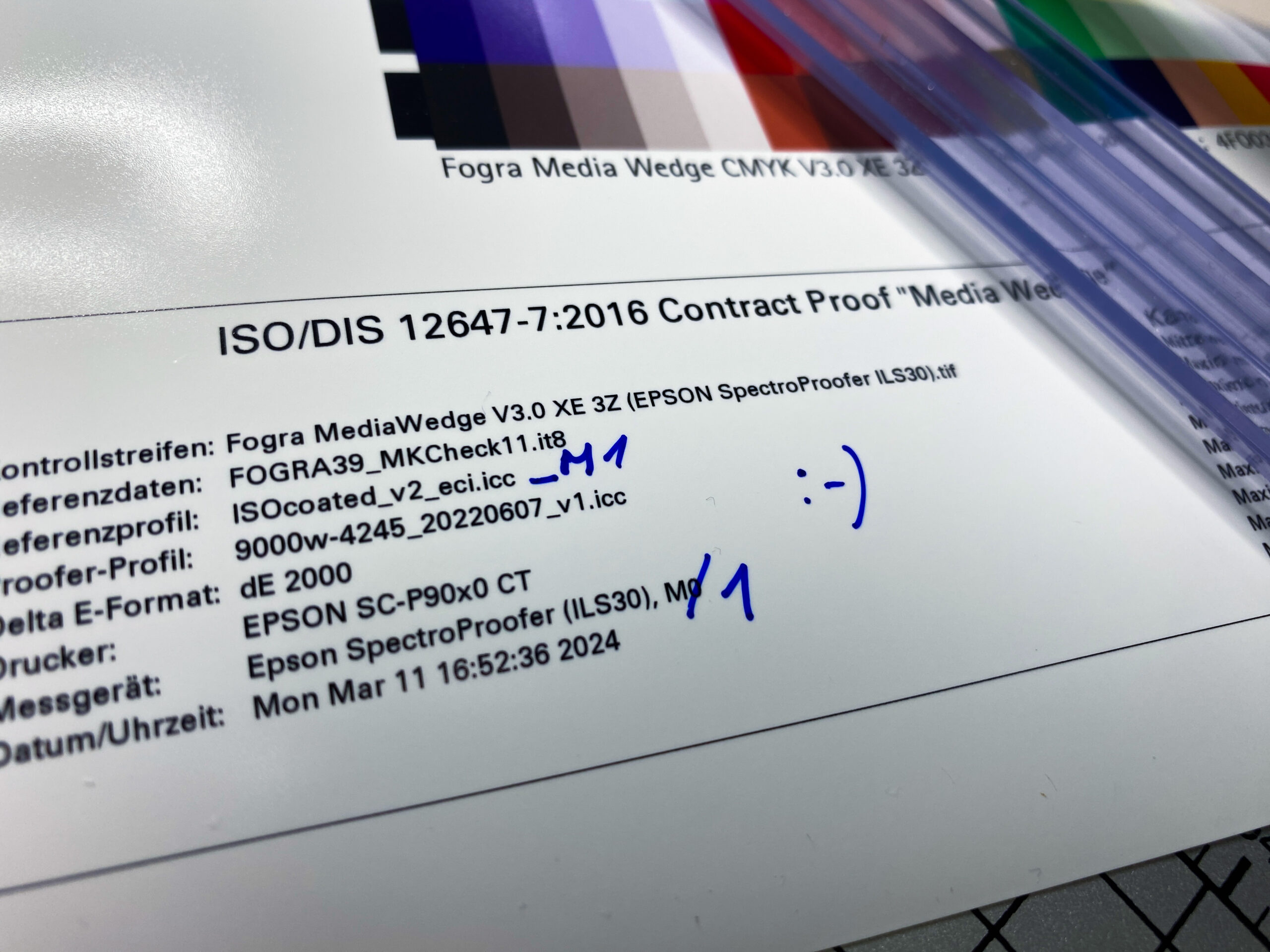
Jürgen Seitz from GMG already presented this outlook at the last DPWG meeting of Fogra in Aschheim and already presented a new FOGRA39 data set in XRGA M1 for discussion. We in the proofing sector could then print a classic FOGRA39 proof on low-lightener proofing paper and measure it with M1 (like all new standards) – with the best results. However, the overriding aim is not so much to update an existing printing condition, but rather to make an exchange colour space fit for the future. The proposal for the profile name of the ICC profile for the ECI: ISOCoated_v2_M1.icc.

What speaks against an updated ISOCoatedV2?

Colour management expert Jan-Peter Homann from Berlin points out: “Users use characterisation data for separation, proofing and controlling the printing process. However, a new characterisation data set would not be suitable for print process control due to the white point with M1. The small but still existing differences to the classic ISOCoatedV2 FOGRA39 data set could unsettle users and make communication between prepress, proof and print more complicated and cause misunderstandings. Jan-Peter Homann therefore fears that an updated ISOCoatedV2 would be ignored by the market.

Paper white simulation of PSOUncoated

Since 2009 PSOUncoated has been the standard profile for uncoated paper. Nevertheless, proof service providers often have the problem that at first glance proofs on PSOUncoated often differ significantly from the print result. Immediately visible: the white point of the paper.

The PSOUncoated paper white looks very grayish. If, for example, PSOUncoated is proofed on an EFI 9120 XF paper, which actually has a neutral white coloration as paper, then the paper must be recolored by the printer in terms of paper white. This paper-white simulation makes the proof look “grayish” and often not “bright white” like the real production paper. “I can’t put this down to my client” proof service providers often hear from the agencies and designers who commission proofs. And frankly, printing on bright white uncoated paper will also differ significantly from the PSOUncoated Proof result depending on the paper selected.

Some proofing services still proof uncoated paper according to ISOUncoated, because the paper tone is much whiter and not so grayish. In the medium term, however, this will not overcome the misery: PSOUncoated is the current standard according to which the process standard for offset printing certified print shops are also based. But in the pressroom the differences between norm and reality often become apparent. If the new D50 standard light according to ISO 3664:2009 with higher UV components is used for inspection at the printing table, then proof and printing result can often only be matched very poorly. And due to the long standardization periods, this problem will continue to accompany printers and proofing service providers for quite some time to come.

D50 is not the same as D50: Standardized light and ISO3664:2009

Since 2009, printers and proofing service providers have increasingly encountered a new D50 lighting standard: ISO 3664:2009, which defines how the new D50 standardized light, under which proofs and print products are to be evaluated, looks like. The new standard light contains UV components that address the optical brighteners that are frequently used in offset papers nowadays.

The result: next to a bluish-white glowing sheet in the pressroom, there is a yellowish-pale proof.

What is the reason for this? The standard came sort of as a surprise and was poorly communicated within the industry. All proofing substrates available from proofing service providers contain no or almost no optical brighteners – this was previously a requirement. And under the old D50 standardized light – which did not contain any UV components – the proof and production run looked identical, since the optical brighteners were not addressed in the production run. Proofing and production printing can no longer be compared on all new presses that are already equipped with light tubes of the new standard: This looks completely different, the differences in paper white are absolutely obvious.

Printers and proofing service providers have mostly replaced the old tubes with new ones. However, this is often a complex topic: The old diffusing screens, which are mounted in front of the neon tubes, had so far predominantly once again installed UV filtering in order to ensure that completely no UV components get through. If new ISO 3664:2009 tubes with a defined amount of UV components are mounted behind the diffusors, unfortunately exactly this component is missing in front of the diffusor again… So there are some extra costs for the printers.

In the meantime with M1 and the new proofing Standards Fogra51 upwards, many proofing papers with brighteners havel been launched on the market so that proof and run can be compared cleanly again in the pressroom.

Standardized light and metamerism effect

A proof is only as good as the light under which it is viewed. Just going to the window or switching on the light at dusk is useless: between December and July, between 8 am and 8 pm, between cloudy and sunny days there is a huge difference in the lighting, which makes any colour evaluation impossible. And if you switch on the light, you normally switch on a bulb with 2700 Kelvin – or even worse: an energy-saving neon bulb that somehow shines in any spectra… a disaster!

The reasons for metamerism effects (in short: that two colors look identical under one light, but completely different under another) lie in the different printing technologies. Colors that look the same under a light bulb can suddenly look very different under a neon tube.

In recent years, ink-based digital proofs have established themselves in the proofing sector. Because it is printed in ink, specially coated paper must be used, which is not in any way similar to the subsequent production run. Anyone who has ever tried to print on glossy coated paper with an inkjet printer knows: the ink never lasts! Metamerism is therefore always involved when a proof is to be compared with offset printing.

The light under which proof and production run are viewed is particularly important.

ISO 3664 regulates standardized light, which is important for viewing proofs and prints. D50 is no longer D50: The International Lighting Commission CIE has revised ISO 3664 in recent years and adapted it to today’s circumstances. If UV components used to be strictly prohibited, they are now part of the standard. In the past, the focus was on consistency between slide and print, while today monitor, digital proof and offset printing are important. Therefore, proofs must always be viewed under D50 Standardized Light, so that they are really “colour-binding” in their perception.

If you want to check metamerism effects, we recommend the UGRA colour temperature indicator. With these strips, metamerism effects can be checked very quickly and clearly.


WordPress Cookie Plugin by Real Cookie Banner