Proof GmbH 2021 Certified Again by Fogra with Fogra “Spot cert”

Title Test Report Fogra Certificate Proof GmbH 2021 Fogra Contract Proof Creation 34558

Fogra Certificate Proof GmbH 2021 Fogra Contract Proof Creation 34558

This year we have again submitted proofs for Fogra certification. We thus prove that we not only deliver excellent proof quality through internal quality controls and checks, but that the quality of our proofs is also confirmed by an external body. We have therefore had proof prints certified for the seventh year in a row.
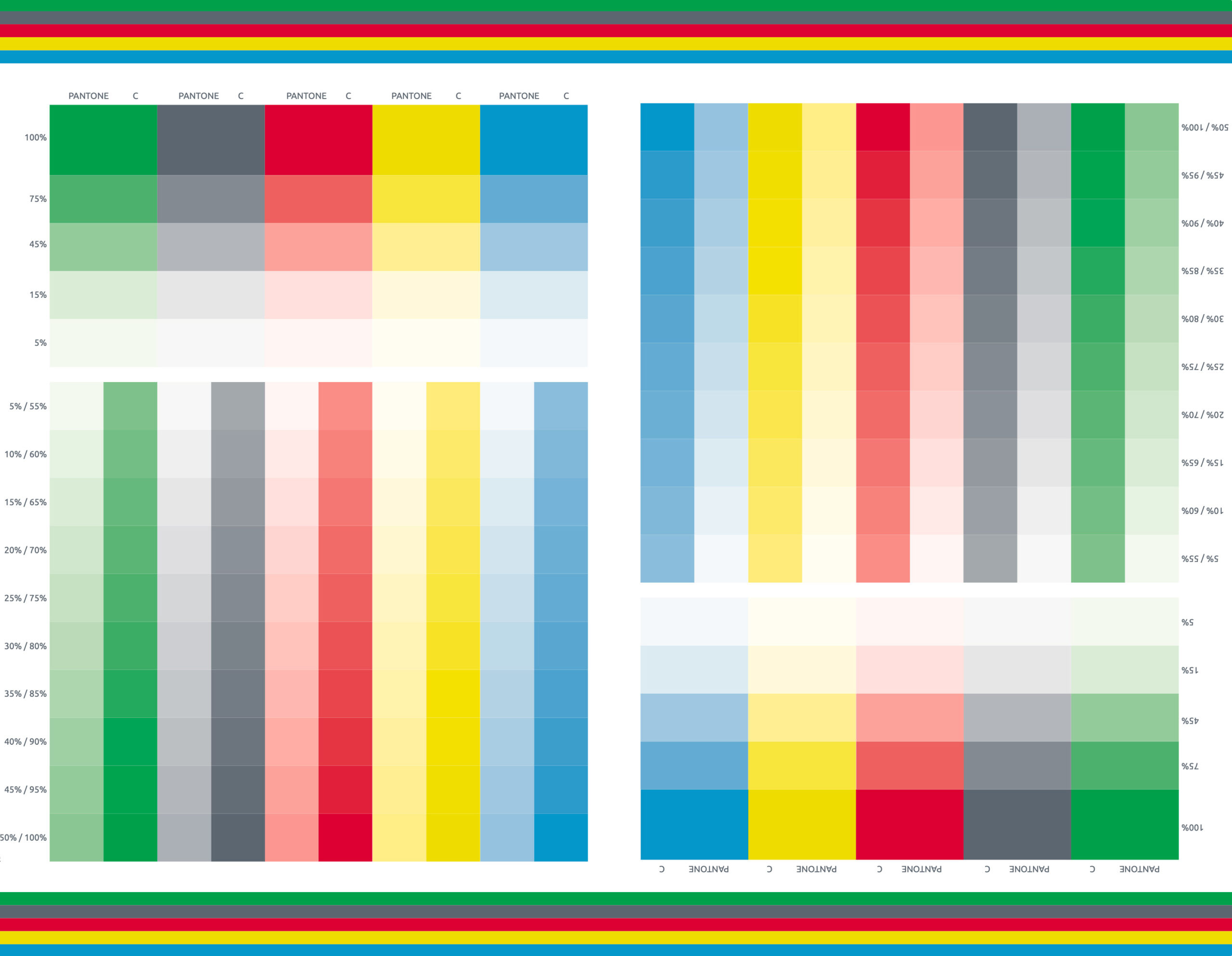
Already in 2019, we were among the first to also be certified for the representation of spot colours (“Spot-cert”), and in 2020 we also went through Spot-cert in addition. And all in all, we have been successfully certified by Fogra for the ninth time in a row. Sometimes customers ask:

“You get Fogra certified every year. Won’t that become unnecessary at some point? You know you can do it …”

Yes, that is sometimes true. Every certification means effort and costs, the prints have to be made, sheets have to be filled in, everything has to be sent to Munich and invoices have to be transferred. And that’s just so that we can have the same high quality confirmed as in previous years. On the other hand, this isn’t true either.

Proofing is only superficially “service by the book as always”. In real life, no two years are the same. Proofing software, for example, is not sold on the mass market, so every update brings difficulties: Important functions fail, protocols are output incorrectly, optimisations do not optimise but worsen the results…: What we haven’t had to experience! Especially here it is important to have the security of certification by Fogra that even with the latest software revision all relevant processes still run cleanly.

The same applies to the hardware, which can be just as troublesome as the software: sometimes we have a generation change of proof printers, which always involves a change of inks and colour pigments, sometimes the driver or firmware is renewed, sometimes faulty print heads have been replaced …: Here, too, there are many possible sources of error that keep us on our toes. And here, too, the certifications bring us security for daily production – our everyday business. And that, too, is often not commonplace at proof.de:

Verifiably precise …

Our so-called “everyday business” is often characterised by special cases, exceptions and special requirements. Admittedly: We like to work off Fogra39 proofs in ISOCoatedV2, where all data is delivered in CMYK. Something like that just runs really smoothly for us. But apart from these “standards”, we process much more for our customers: we produce high-precision colour samples, proof individual proof profiles for metal decor printing, process thick, high-gloss papers for proofs and extremely thin, matt papers for art projects, apply PANTONE colours to roll-ups, fine art prints in AdobeRGB on cotton canvas, ECI-RGB-V2 on Hahnemühle papers, print XYZ colour targets for multispectral cameras and …:

Our so-called “everyday business” is often characterised by special cases, exceptions and special requirements. Admittedly: We like to work off Fogra39 proofs in ISOCoatedV2, where all data is delivered in CMYK. Something like that just runs really smoothly for us. But apart from these “standards”, we process much more for our customers: we produce high-precision colour samples, proof individual proof profiles for metal decor printing, process thick, high-gloss papers for proofs and extremely thin, matt papers for art projects, apply PANTONE colours to roll-ups, fine art prints in AdobeRGB on cotton canvas, ECI-RGB-V2 on Hahnemühle papers, print XYZ colour targets for multispectral cameras and …:

Read more

PANTONE Find a Color No Longer Available Without Registration

New PANTONE Find a Color home page: Now only with PANTONE Connect: Without logging in, you can no longer even access the RGB and CMYK values of PANTONE colours on the PANTONE website.

That was fast: Only a few days after Adobe’s announcement to remove the PANTONE colours from their latest revisions of the Adobe product range, PANTONE reacted and removed the popular tool “PANTONE Find a Color” from the internet. Instead, the login to PANTONE Connect can now be found there, a tool that provides the previous functionality partly for free and partly for a subscription price with extensions.

New PANTONE Find a Color home page: Now only with PANTONE Connect: Without logging in, you can no longer even access the RGB and CMYK values of PANTONE colours on the PANTONE website.


If you are looking for the usual functionality again, you at least have to register, but many additional features are only available for a hefty surcharge. The discount in the first year still sounds reasonably cheap, but when paying the full price, the PANTONE colours are only available for 6.99 €/month or almost 84 euros per year. This is a steep price for the fact that PANTONE should have a vested interest that their colours on the internet should also be used by people who do not have a PANTONE fan in their hands.

Price table of PANTONE Connect: If you need all functions, you have to dig deep into your pocket.

PANTONE Color Manager discontinued

The popular PANTONE Color Manager was also discontinued. This software was available to anyone who bought a PANTONE fan. An individual code was printed on the back of the fan, with which one could download the PANTONE Manager and get it running. Once installed, you could access all current fans, colours and key colour definitions in RGB and CMYK and export all PANTONE colours as LAB, CMYK and more as ASE and ACO for Photoshop, Illustrator and InDesign. If you now call up the Color Manager website, it says: Product set.


But maybe that is exactly PANTONE’s new approach: We are so big, we can afford everything. Just like Adobe: nothing works without a subscription. But while Adobe has really set standards in the graphics sector, PANTONE has not necessarily stood out as the indisputable “Biggest Global Player in Colour” in recent years due to its often short-term actions.

Let’s see how the next months turn out. It is not impossible that PANTONE will have to row back. If a licence-free colour system like the free colour CIELAB HLC colour system should ever gain a foothold, then hard times are ahead for the licence-driven systems. If more companies open up to such duel-open, transparent and yet precise and predictable solutions, then PANTONE will quickly be on a difficult track. Because when it comes to colour, it is certainly difficult to regain market share once lost. Also noticeable:

PANTONE Connect rated very poorly

If you search for PANTONE Connect in Adobe’s extensions, reading the ratings will bring tears to your eyes. At the tool Ekomi, which we at Proof GmbH use for rating collection, the best rating score is only up to 4.8 out of 5 stars. And below 4 out of 5 stars, everything is rated as a disaster. And PANTONE Connect: 1.9 out of 5 stars. In other words: absolutely miserable.

Read more

Can spot colours be proofed?

Since many printed matter contains spot colours such as Pantone or HKS, the question often arises whether these colours can be proofed at all. The answer is “no”. Only an approximate simulation of these colors is possible.
The reason: Each special ink is a specially mixed, “real” ink and therefore cannot be mixed from the 4 printing inks (cyan, magenta, yellow and black).

Today, modern proofing machines have up to 12 different printing colours and, in addition to the classic primary colours, also have, for example, orange and green and violet as real colour pigments in the machine. Proof printers such as the Epson SureColor P9000V are therefore capable of displaying significantly larger color spaces than, for example, ISOCoatedV2. The spot color simulation in these devices is therefore sometimes very good when controlled via a Contone driver, which can access the entire color space of the proof printer. Epson himself points out, for example, that “98% of all Pantone colors” can be covered. This may be doubted, but a number of over 90% of all Pantone colors is realistic from our point of view.

In the past, Pantone and HKS colors were simply converted by the proofing systems to CMYK and then simulated in the standard color space, i.e. mostly ISOCoatedV2. The representation of the colors here is mostly completely insufficient. For the reproduction of Pantone and HKS colours in a proof it is therefore immensely important to have a modern proof printer with many colours and a high colour gamut and a modern proofing software which is also able to precisely control the printed gamut.

Differences in the quality of the simulation of spot colors can quickly be seen in the different printing systems: If the proofing service provider prints with an older 6-color or 8-color system (Cyan, Light Cyan, Magenta, Light Magenta, Yellow and Black or Light Black), spot colors are simulated worse than, for example, with a modern 11-color system with Cyan, Light Cyan, Orange, Yellow, Magenta, Light Magenta, Photo Black, Matte Black, Light Black, Light light Black and Green.

The higher simulation quality of the spot colors is generated by the fact that orange, for example, already exists as a separate color and does not have to be mixed from magenta and yellow before the spot color simulation.

Of course, it must be said that there are limits, especially in the area of metallic or fluorescent colours; these colours are currently not reproducible in proofing.

The spot-colour simulation of gradations is also critical

In most proofing systems, only the 100% values of a Pantone or HKS color are underlaid. If, for example, a font logo with 100% color application of a Pantone color is to be simulated, this is precise and is well represented in most proofing systems.

However, it becomes more difficult if the logo contains not only 100% areas but also a 30% Pantone colour area, since this is not defined in the proofing system, but is simulated by the proofing system. In some cases, considerable deviations from e.g. HKS colour fans can be observed.

It becomes even more difficult if, for example, a grayscale TIFF lies on a 100% HKS area and overprints. For the graphic professional it is immediately comprehensible that the HKS surface simply has to become correspondingly darker at this point due to an overprinting 30% black. However, the proofing software must recognize this effect correctly, calculate it correctly and then simulate it correctly with the 11 colors available from the proof printer. It is easy to understand that countless errors can occur. And the supreme discipline: 7-colour Pantone files with lots of overlaying and overprinting Pantone colours or HKS colours with overprinting CMYK elements can at best be calculated even by the most modern proofing systems, but can by no means be colour-accurately simulated.

The bad news is that a proof with spot colors is therefore never as color-binding according to the current state of the art and varies more depending on the proofing system.

But the good news is that spot colors, especially solid colors, can now be simulated well by modern proofing systems. A modern proofing system therefore also offers the possibility of getting a realistic impression of spot color prints at a fraction of the cost of a test print on a offset press.

WordPress Cookie Plugin by Real Cookie Banner