“Digital First” often means “Colour Problems Second!”

Recently, we have been receiving more and more colour management consulting enquiries where “digital first” designs reach their limits: Namely, always when, after a few months or years, the first trade fair appearance, the first annual report or the first catalogue in classic online printing is due. And it is precisely at this moment that it occurs to everyone involved that they do not even know how their “digital first” colour strategy is supposed to look in print. But let’s take a look at the problem from the beginning:

Read more

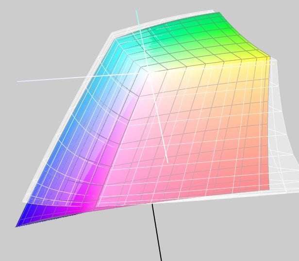
Gamut map: The colour tool for cross-media design

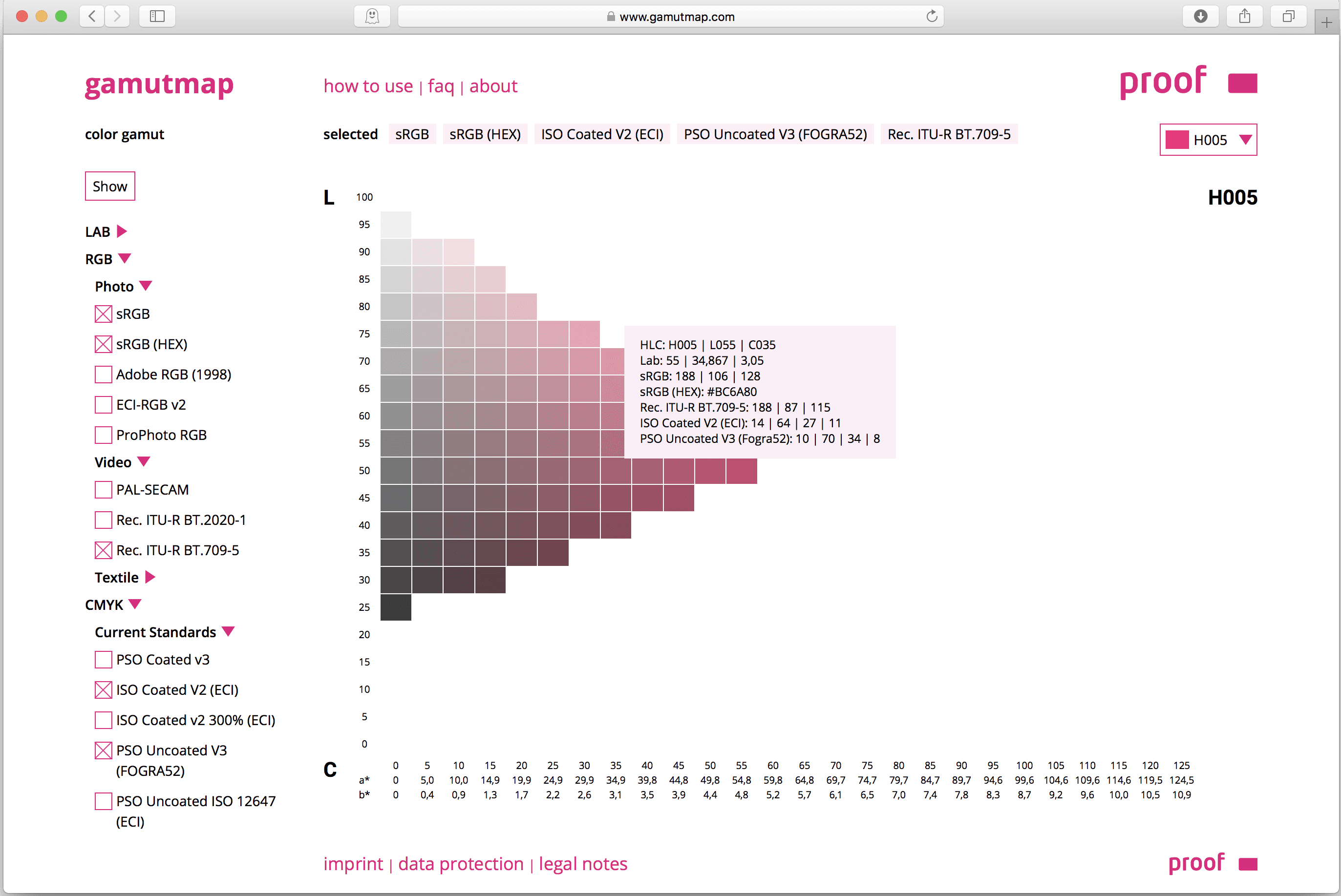
Due to our involvement with freeColour e.V., at the last meeting in Switzerland the desire for a cross-media tool for designers was expressed with which one can create intersections of colourspaces from the freieFarbe CIELAB HLC Colour Atlas XL. With Gamutmap, Proof GmbH has now created such a tool, which is available to all designers free of charge. With Gamutmap nearly 100 individual colour spaces can be indicated from 34.250 colours of the entire CIELAB colour space, or intersections from many combined colour spaces can be indicated. An example: As …

Read more

How CMYK and RGB profiles are handled in proofing

When we receive a file from you, the first thing we check is whether there are colours other than CMYK in the file. If the file is built exclusively in CMYK, it will be sent directly for proofing.

Handling wrong profiles with CMYK data / “Profile Mismatch
If we have only received CMYK data from you, we will ignore all input and output profiles and only use the CMYK values that we bring to the ordered output colour space.

Example 1: Data in ISOCoated, proof in ISOCoatedV2 ordered, thus wrong or no CMYK profile embedded.

You send a file with the profile ISOCoated and a colour area in CMYK 100/70/0/0 and order a proof according to ISOCoatedV2.
We ignore the ISOCoated profile and proof the pure colour value 100/70/0/0 according to ISOCoatedV2.

Read more

Color Selector - Adobe Photoshop

Easy conversion of Pantone – HKS – CMYK – RGB with Adobe Photoshop

Farbbücher Auswahl in Adobe Photoshop CC: HKS, Pantone, CMYK und vieles mehr

More often the question arises as to what kind of Pantone colour corresponds to the HKS 43 K. Or what CMYK value? And what kind of web color in RGB?

If you own Adobe Photoshop, you can do these conversions directly there. In Photoshop CC all well-known color books are stored with values.

Let’s assume we are looking for the Pantone equivalent and the matching CMYK color of HKS 43 K.

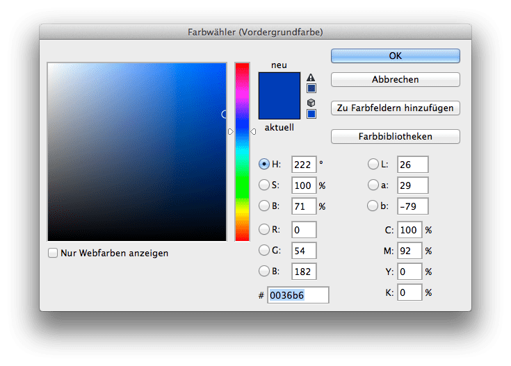
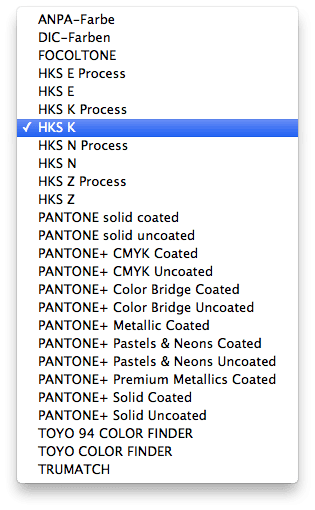
1: Open the color palette in Adobe Photoshop and select HKS K as the book and then the color HKS 43 K. All well-known colour books are directly stored in Photoshop.

Read more

Layout in RGB, print in CMYK. Problems?

Especially in larger companies today the layout in RGB is the rule rather than the exception. The advantages are obvious:

  • The layout takes place in a large, almost media-neutral color space
  • All Photoshop filters are available without restrictions
  • The process of color space conversion to CMYK is shifted to the production process as late as possible

In practice, however, there are two potential problems in particular.

Problem 1: CMYK conversion in the last step.
The catalogue is designed in InDesign, all data is perfectly matched, the last step before printing and proofing is the export to a printable PDF in CMYK. Usually this is done via a preset in InDesign, which defines the exact specifications for the color space conversion. In practice, however, this color space transfer can hardly be monitored. The problem: Even if you check the color values in Acrobat in the exported PDF file, for example, Acrobat does not really display the colors it contains. Acrobat brav would show you CMYK values even if the RGB images are still wrongly contained. However, other CMYK values can occur during printing when the data is processed again. Lately it looked like this:

Read more

Why monitor and paper don’t get along when it comes to colour.

Colour is colour, you’d think. That’s right. But have you ever tried to explain the colour of your new car or your new red wallet to a friend on the phone? You will notice that human colour recognition and the reproduction of the same in another medium is very difficult. The same applies to computers – better: monitors, and printers – i.e.: laser printers, inkjet printers or newspaper printing or offset brochure printing. Why is the red on a monitor different from exactly the same red printed on paper? It’s …

Read more

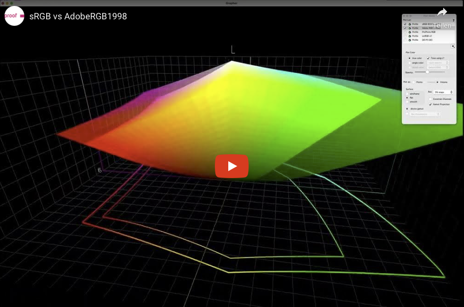
Comparison between eciRGB_V2 (white) and AdobeRGB 1998

Which RGB working colour space is suitable for colour-consistent work?

In the early days of color spaces Apple and e.g. Photoshop up to version 5.5 set the monitor color space as working color space by default. But it soon became clear that a design office would be working with 10 Macs in 10 different color spaces. A neutral concept was needed. There are many RGB Colour Spaces around. In the area of print media there are currently primarily three different variants: sRGB, AdobeRGB(1998) and eciRGB_V2. The sRGB color space is widely used in digital cameras and is the industry leader …

Read more

WordPress Cookie Plugin by Real Cookie Banner