A proof is only as good as the light under which it is viewed. Just going to the window or switching on the light at dusk is useless: between December and July, between 8 am and 8 pm, between cloudy and sunny days there is a huge difference in the lighting, which makes any colour evaluation impossible. And if you switch on the light, you normally switch on a bulb with 2700 Kelvin – or even worse: an energy-saving neon bulb that somehow shines in any spectra… a disaster!
The reasons for metamerism effects (in short: that two colors look identical under one light, but completely different under another) lie in the different printing technologies. Colors that look the same under a light bulb can suddenly look very different under a neon tube.
In recent years, ink-based digital proofs have established themselves in the proofing sector. Because it is printed in ink, specially coated paper must be used, which is not in any way similar to the subsequent production run. Anyone who has ever tried to print on glossy coated paper with an inkjet printer knows: the ink never lasts! Metamerism is therefore always involved when a proof is to be compared with offset printing.
The light under which proof and production run are viewed is particularly important.
ISO 3664 regulates standardized light, which is important for viewing proofs and prints. D50 is no longer D50: The International Lighting Commission CIE has revised ISO 3664 in recent years and adapted it to today’s circumstances. If UV components used to be strictly prohibited, they are now part of the standard. In the past, the focus was on consistency between slide and print, while today monitor, digital proof and offset printing are important. Therefore, proofs must always be viewed under D50 Standardized Light, so that they are really “colour-binding” in their perception.
If you want to check metamerism effects, we recommend the UGRA colour temperature indicator. With these strips, metamerism effects can be checked very quickly and clearly.

Even almost 9 years after the introduction of the successor colour space PSOCoatedV3, ISOCoatedV2 / FOGRA39 is still the most widespread colour space in Europe. We at Proof GmbH count around 200 jobs from time to time for the German Printing and Media Industries Federation, among others. In the last count, proofs in ISOCoatedV2 accounted for around 68% of all proof jobs at our company. This is a clear sign of the continued widespread use of the colour space. ISOCoatedV2: From the classic colour space to the beacon of the … read more

For some years now, the possibilities of colorimetric measurement of printing inks have become simpler and cheaper. And so it is often believed that measuring printing inks is simple, inexpensive and, above all, highly accurate. And this also across a wide variety of brands and generations of measuring devices. Is that true? If you look at a few studies, that does not necessarily seem to be the case. IFRA, for example, requires that when measuring BCRA ceramic tiles the colour differences between different measuring instruments should be below Delta-E 0.3. … read more

Since 2009, printers and proofing service providers have increasingly encountered a new D50 lighting standard: ISO 3664:2009, which defines how the new D50 standardized light, under which proofs and print products are to be evaluated, looks like. The new standard light contains UV components that address the optical brighteners that are frequently used in offset papers nowadays. The result: next to a bluish-white glowing sheet in the pressroom, there is a yellowish-pale proof. What is the reason for this? The standard came sort of as a surprise and was poorly … read more

Since 2009 PSOUncoated has been the standard profile for uncoated paper. Nevertheless, proof service providers often have the problem that at first glance proofs on PSOUncoated often differ significantly from the print result. Immediately visible: the white point of the paper. The PSOUncoated paper white looks very grayish. If, for example, PSOUncoated is proofed on an EFI 9120 XF paper, which actually has a neutral white coloration as paper, then the paper must be recolored by the printer in terms of paper white. This paper-white simulation makes the proof look … read more

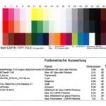
A proof is prepared according to the currently valid ISO standard 12647-7 and is legally binding with a UGRA-Fogra media wedge and measurement report. How does this check work? If you need a proof with UGRA/Fogra Media Wedge CMYK V3.0, there are two ways to add the test report to your data. With proofing devices in which a measuring device is integrated, the media wedge with 3×24 standardised colour fields is printed directly under the proof data. This media wedge is driven directly in the proofing device to a kind … read more

Every print shop in Germany adheres to a predefined standard, the process standard offset printing. This standard defines target and tolerance values for printed products. In order to prove that your proof delivered to the print shop meets these standards or is within the tolerances, the media wedge is measured and the values analysed in case of doubt – i.e. in case of a streak. If these measured values are correct, the print shop is obliged to adhere to and achieve these values. Practice generally shows the following: If you … read more

Customers are often unsettled when they hold a proof in their hands. “The proof of the picture is much darker than the picture on my monitor. Why is that so? And what do I do now?” There are many possible reasons for a deviation between the proof and, for example, the monitor display: The monitor is not calibrated Only calibrated monitors can accurately display color. When I buy a cheap monitor and connect it to my computer, I definitely can’t see any real color. As a rule of thumb, only … read more


