Already a few weeks ago we received an unusual request: The musician and aspiring art student Tobias Weh from Osnabrück experimented with line drawings based on anaglyphs and achieved very good results on the monitor. He created superimposed line drawings, which then delivered a different image when viewed through the left eye than when viewed through the right eye. The question was whether this could be reproduced better with the high color range of a proofing system than with a simple domestic inkjet printer.
Since such questions are of course very interesting at first sight, we were quickly prepared to support Mr Weh in his work. To get closer to the matter, we use an i1 Pro 2 and BabelColor Color Translator & Analyzer to measure the spectra for the two films, which are transmitted through standard anaglyph glasses.
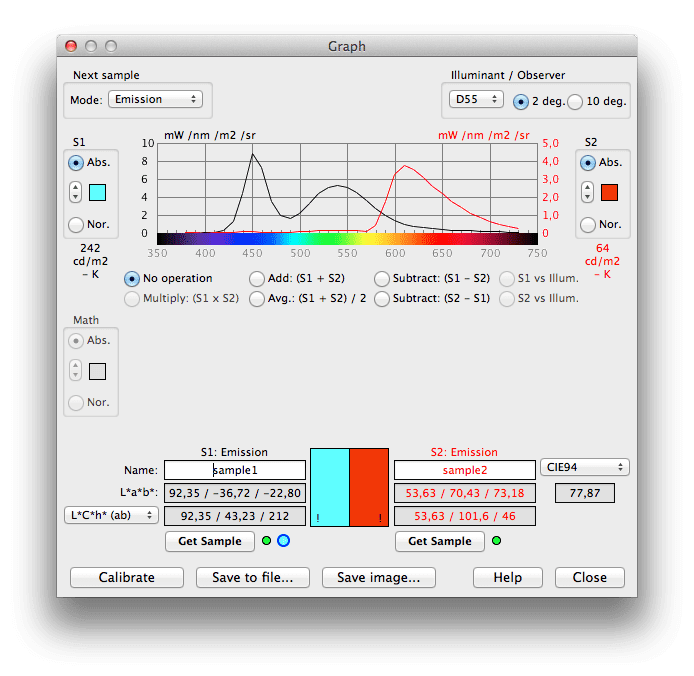 Actually a very satisfactory result. By choosing two colours as printing in the spectral ranges of 450 to 500 nanometres for blue and 650 to 700 nanometres for red, it should actually be possible to achieve quite a good result. The first idea was to use the LAB values measured by BabelColor to create the respective red and cyan color in the print. Unfortunately, however, this does not really work; the measured printed colours could unfortunately not be spectrally matched at all with the desired colour.
 So we continued to experiment and found two colors that should actually harmonize very well spectrally with the transmitted spectra of the glasses.
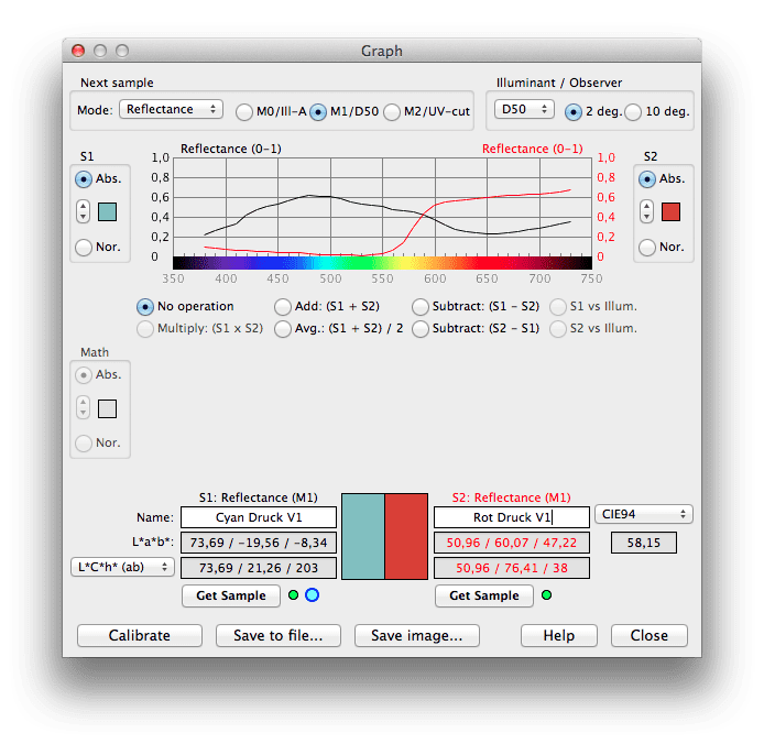
 But even here the result of the visual inspection was devastating. A strong ghosting in both colours was permanently predominant, a clear colour separation was not possible. Also a look through the foils of the anaglyph glasses on different Pantone fans in order to find by a visual color selection a color as suitable as possible did not bring any result. In red the glasses worked quite well, in the cyan area none of the Pantone colour fields disappeared even approximately in front of the human eye.
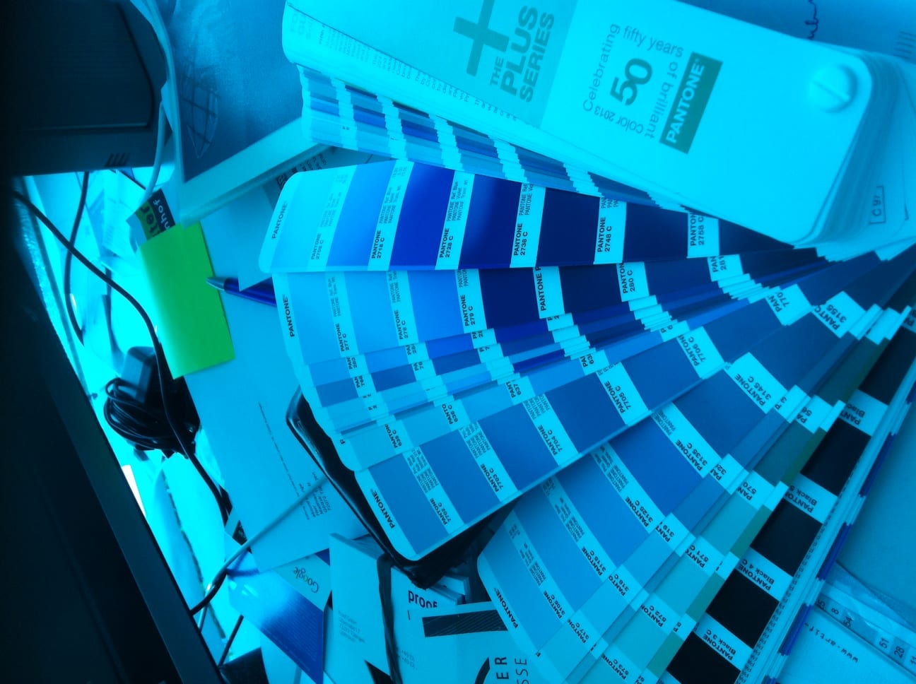
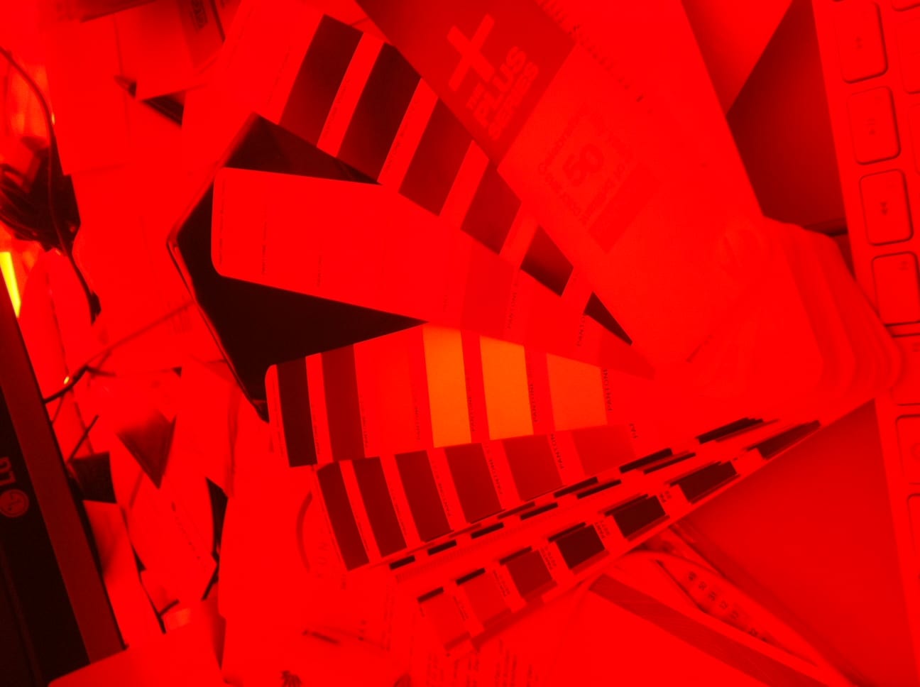
Amazing was also the effect that the Pantone neon colors like the Pantone 811 C delivered visibly brighter color results for the eye and even for a camera than the pure white paper. The two pictures above are snapshots of an iPhone camera through the two filter films of the anaglyph glasses. The red area clearly shows that some Pantone colours disappear completely through the film, while all Pantone colour strips are completely visible in blue.
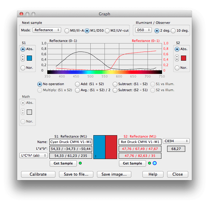
As the only pragmatic solution we finally developed a compromise: We brightened up the colours red and cyan to prevent ghosting and coloured the background of the paper slightly light grey instead of white. This minimized ghosting, especially in the cyan area, so that the desired visual effect of the anaglyph image was achieved.
Even with intensive research on the Internet, we were unable to produce any other or better result. In several articles by a Frenchman Eric Dubois, the dilemma is quite well outlined, but his results did not really help us with our problem of line representations.
Some important links about anaglyph printing that we stumbled across during our research:
http://www.site.uottawa.ca/~edubois/anaglyph/
https://forums.adobe.com/thread/377398
http://en.wikipedia.org/wiki/Anaglyph_3D
Tobias Weh fragte auch im Typografie-Forum nach Erfahrungswerten an.
http://www.typografie.info/3/topic/31883-anaglyphe-bilder-drucken-rot-grün-3d/
But here, too, there was no further evidence of a better approach.
Conclusion: The anaglyph area seems to work very well on screen. This is supported by a large number of Kindle eBook publications, which Amazon sells for little money. This is where the anaglyph effect really works, a high quality monitor is not necessary. However, this high-quality result cannot be reproduced in printing.
The hardcopy books currently available on the market with anaglyph images are mainly filled with historical stereographic images, which are based on a two-colour and thus grey background. This probably has two advantages: The two-tone grey minimizes ghosting, and in historical images our human tolerance threshold is simply higher than in modern photographs or line drawings.
If you have an idea how to produce a ghosting-free anaglyph image with modern printing systems, please contact us. We look forward to receiving further input and feedback on our deliberations.
More articles related to this topic:
Layout in RGB, print in CMYK. Problems?

Especially in larger companies today the layout in RGB is the rule rather than the exception. The advantages are obvious: In practice, however, there are two potential problems in particular. Problem 1: CMYK conversion in the last step.The catalogue is designed in InDesign, all data is perfectly matched, the last step before printing and proofing is the export to a printable PDF in CMYK. Usually this is done via a preset in InDesign, which defines the exact specifications for the color space conversion. In practice, however, this color space transfer … read more
PANTONE surveys users online about product and service direction

Today I received an email in which PANTONE asked how it should orientate its products and services in the future. The users were asked which countries, industries and company sizes they come from, but also what PANTONE products should look like in the future and what customers would be prepared to pay for PANTONE services in the future. Question: How much can PANTONE services cost? PANTONE appears to be orientating itself on the PANTONE Connect prices: All price queries have the lowest price category < $ 7,- / month, i.e. … read more
New iPhone colour measuring devices: xade nano+ in test

A new generation of colour measuring devices is entering the market: in contrast to the classic measuring devices, which are available as a fully encapsulated system either as a colourimeter or as a spectrophotometer, and then supply the data to a computer via an interface or app or display it directly, the new generation of colour measuring devices consist only of lighting and software, with the optics of a modern iPhone from Apple being used as the sensor. Until now, there have been two categories of measuring devices on the … read more
Gamut map: The colour tool for cross-media design

Due to our involvement with freeColour e.V., at the last meeting in Switzerland the desire for a cross-media tool for designers was expressed with which one can create intersections of colourspaces from the freieFarbe CIELAB HLC Colour Atlas XL. With Gamutmap, Proof GmbH has now created such a tool, which is available to all designers free of charge. With Gamutmap nearly 100 individual colour spaces can be indicated from 34.250 colours of the entire CIELAB colour space, or intersections from many combined colour spaces can be indicated. An example: As … read more
Proof GmbH is a partner of FreieFarbe e. V.

freeColor e. V. is a consortium of German and Swiss color experts who work to produce consistent color in all areas of application. Sounds reasonable? Exactly. That is the issue that is of central importance to our proofing customers. Therefore we are currently working in a project with the colleagues of FreieFarbe e. V. and are now also as Proof GmbH member and partner of FreieFarbe e. V. FreeColor relies on open standards such as LAB and HLC, which have long been integrated in computer software and want to show: … read more
Hi Matthias,
Thank you for the superbly detailed article.
Has anyone tried using Pantone Neons to solve the Cyan problem?
Perhaps 901c, 908c or 915c could help?
I’m interested in doing some prints myself and it would be really useful to know if anyone has solved this.
Andy
Have you had any success with this? I am trying to print out a binocular rivalry illusion and would need to use the same method. Thanks!