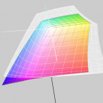
Especially in larger companies today the layout in RGB is the rule rather than the exception. The advantages are obvious:
- The layout takes place in a large, almost media-neutral color space
- All Photoshop filters are available without restrictions
- The process of color space conversion to CMYK is shifted to the production process as late as possible
In practice, however, there are two potential problems in particular.
Problem 1: CMYK conversion in the last step.
The catalogue is designed in InDesign, all data is perfectly matched, the last step before printing and proofing is the export to a printable PDF in CMYK. Usually this is done via a preset in InDesign, which defines the exact specifications for the color space conversion. In practice, however, this color space transfer can hardly be monitored. The problem: Even if you check the color values in Acrobat in the exported PDF file, for example, Acrobat does not really display the colors it contains. Acrobat brav would show you CMYK values even if the RGB images are still wrongly contained. However, other CMYK values can occur during printing when the data is processed again. Lately it looked like this:
- Customers supposedly send CMYK data to the proof.
- 1. data delivery: Most pictures are still in RGB. The customer did not notice this when looking through Acrobat.
- 2nd Data delivery: Data in CMYK, printable and proofable, therefore a proof is made. However, the data was converted using an incorrect profile, so all images were yellowish. In this case, the wrong color space conversion was only noticed in the proof.
- 3. data delivery correct. Data in the proof is also correct.
Another problem: finishing in the print shop
- A print shop receives Darten from Corel Draw, which were laid out in RGB and converted to CMYK during export.
- Original images from the photographer in ECI-RGB-V2
- Corel of the designer who takes the images from the photographer set to sRGB
The export is to a CMYK PDF. The designer doesn’t know if his Corel vector areas in RGB black were calculated differently than the RGB images embedded by the photographer, which hide their black via layer mask on these vector areas.
- Feedback from the print shop after data receipt: The black has too much ink application. The customer and the designer are completely insecure. Of course, nobody really knows how Corel handles RGB data – possibly profiled or unprofiled – when exporting to CMYK.
Granted: Such problems would never have arisen with a CMYK workflow. CMYK is the lowest common denominator between agency, photographer and printer. Nevertheless, I favour the RGB workflow for the future. Correctly applied and set up, it holds the chance of significantly better printing results, since the conversion to CMYK can take place as late as possible. But this also means that color management know-how must be available “as late as possible” in the process steps. And it is precisely here that many print shops simply have to fit. This is because most – including larger printing companies – proceed according to the principle:
“Somebody came along and installed the CTP. He was gone after three days, and it’s worked ever since. We put data in at the front, and printing plates come out the back. What’s in between? I don’t know. Why?”
This is what happened recently to a customer. For the printing of a brochure with photographs that run out into deep black and fall off the edges, the print shop received feedback that the images should be placed so that the black consists of 40/0/0/100.
Granted: That a deep black can have a CYAN admixture was certainly taught 30 years ago in vocational school. And 40/0/0/100 is also black. However, asking a photographer to align his RGB images to this black level is not really appropriate. But that’s exactly how it happened with a customer. Conclusion: RGB is good, but has not yet reached all printers. However, the printers who can look beyond their own horizons have certainly already dealt with the subject.

Peter Jäger is an expert in colour management that reliably works across the boundaries of printers and monitors, web and print – essentially: cross-media.

A few days ago we received a call from a customer in the field of design, who sent open Adobe InDesign data in ISOCoatedV2 300% with contained RGB images to the production company for a complex CD production on the advice of the producing company (“The printing company still has a prepress stage, which can then prepare your data optimally…”). The result of the finished printed CD booklets and inlays did not correspond at all to the calibrated monitor image of our customer, the client was also unhappy and requested … read more

Already a few weeks ago we received an unusual request: The musician and aspiring art student Tobias Weh from Osnabrück experimented with line drawings based on anaglyphs and achieved very good results on the monitor. He created superimposed line drawings, which then delivered a different image when viewed through the left eye than when viewed through the right eye. The question was whether this could be reproduced better with the high color range of a proofing system than with a simple domestic inkjet printer. Since such questions are of course … read more

Whether it’s a large global corporation or a small company, the following often applies to designs or redesigns today: we develop everything for digital first.

Due to our involvement with freeColour e.V., at the last meeting in Switzerland the desire for a cross-media tool for designers was expressed with which one can create intersections of colourspaces from the freieFarbe CIELAB HLC Colour Atlas XL. With Gamutmap, Proof GmbH has now created such a tool, which is available to all designers free of charge. With Gamutmap nearly 100 individual colour spaces can be indicated from 34.250 colours of the entire CIELAB colour space, or intersections from many combined colour spaces can be indicated. An example: As … read more

freeColor e. V. is a consortium of German and Swiss color experts who work to produce consistent color in all areas of application. Sounds reasonable? Exactly. That is the issue that is of central importance to our proofing customers. Therefore we are currently working in a project with the colleagues of FreieFarbe e. V. and are now also as Proof GmbH member and partner of FreieFarbe e. V. FreeColor relies on open standards such as LAB and HLC, which have long been integrated in computer software and want to show: … read more

RGB colour spaces are colour systems that represent different hues with the three primary colours red, green and blue. RGB colour spaces are used in digital image processing, photography and computer technology to precisely define colours. The most important RGB colour spaces and their special features are: sRGB sRGB is the most widely used RGB colour space and is used by most monitors, printers and digital cameras. It was developed by HP and Microsoft in the 1990s to create a standard for colour representation on the internet and on various … read more

When we receive a file from you, the first thing we check is whether there are colours other than CMYK in the file. If the file is built exclusively in CMYK, it will be sent directly for proofing. Handling wrong profiles with CMYK data / “Profile MismatchIf we have only received CMYK data from you, we will ignore all input and output profiles and only use the CMYK values that we bring to the ordered output colour space. Example 1: Data in ISOCoated, proof in ISOCoatedV2 ordered, thus wrong or … read more

Proof.de now offers DeviceLink colour conversions from numerous RGB and CMYK standards into other CMYK standards from offset and gravure printing.

More often the question arises as to what kind of Pantone colour corresponds to the HKS 43 K. Or what CMYK value? And what kind of web color in RGB? If you own Adobe Photoshop, you can do these conversions directly there. In Photoshop CC all well-known color books are stored with values. Let’s assume we are looking for the Pantone equivalent and the matching CMYK color of HKS 43 K. 1: Open the color palette in Adobe Photoshop and select HKS K as the book and then the color … read more


