
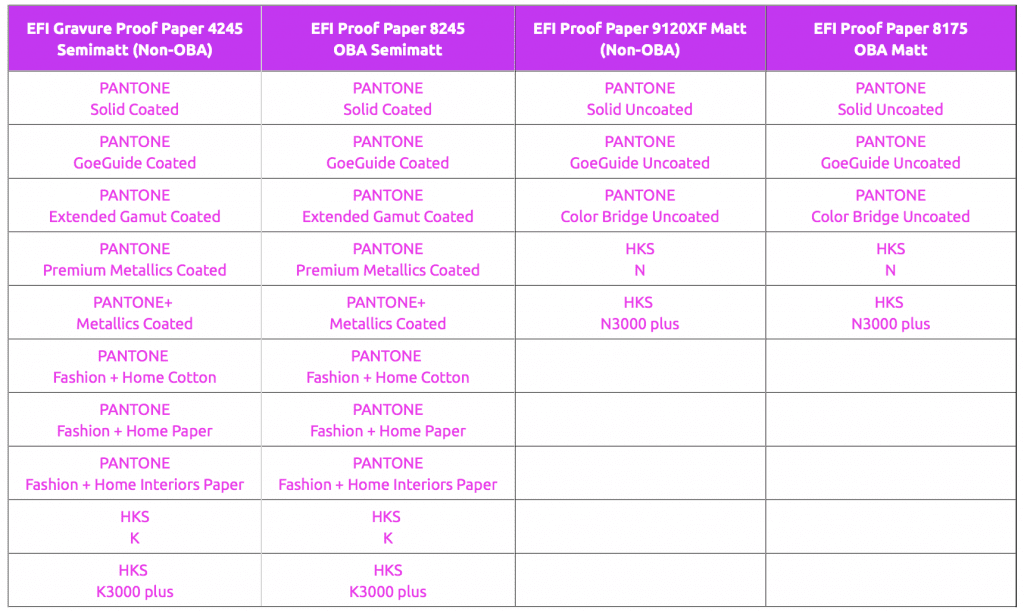
Current proofing systems can reproduce spot colours such as HKS or Pantone very well. With the Fiery XF 6.5.2 proofing software and the Epson SureColor-P9000V Spectro proof printer, we have evaluated the colour deviation in Delta-E00 with which the various PANTONE and HKS colours can be proofed. On shop.proof.de, the tables are now available for all important PANTONE and HKS colour systems, sorted by colour fans.
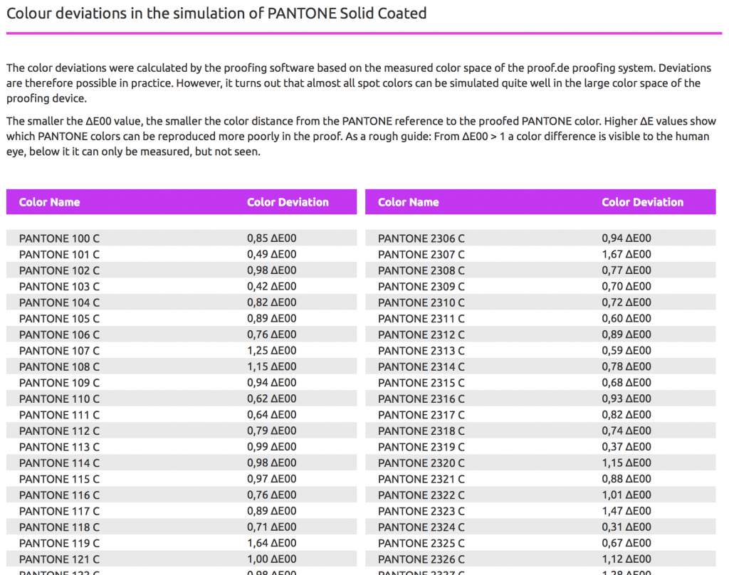
A distinction is made between the proofing substrates that we use, since the surface texture and the paper white also have an influence on the representability of the colours. The colour deviations were calculated by the proofing software on the basis of the measured colour space of the proof.de proofing system. Deviations are therefore possible in practice. However, it turns out that almost all spot colours can be simulated quite well in the large colour space of our proofing devices. The smaller the ∆E00 value, the smaller the colour distance from the spot colour reference to the proofed colour. Higher ∆E00 values show which colours can be reproduced more poorly in the digital proof.
As a rough guide: From ∆E00 > 1 a colour difference is visible to the human eye, below it it can only be measured, but not seen.
More articles related to this topic:
New edition of ISOCoatedV2 in M1 in sight?

Even almost 9 years after the introduction of the successor colour space PSOCoatedV3, ISOCoatedV2 / FOGRA39 is still the most widespread colour space in Europe. We at Proof GmbH count around 200 jobs from time to time for the German Printing and Media Industries Federation, among others. In the last count, proofs in ISOCoatedV2 accounted for around 68% of all proof jobs at our company. This is a clear sign of the continued widespread use of the colour space. ISOCoatedV2: From the classic colour space to the beacon of the … read more
MYIRO-9: New Spectrophotometer from KonicaMinolta in action

Over the last few months, we at Proof.de have been thinking about further improving our already very good colour measurement technology in terms of speed and measurement precision. Relatively quickly it became clear that only two devices would come into question: The KonicaMinolta MYIRO-9, the successor of the former FD-9, or the X-Rite ISIS 2 XL. The starting point: Since we at Proof GmbH have 5 proofing devices, the calibration of targets for profile optimisation is a time-critical undertaking for us. Therefore, we had been looking around for an upgrade of … read more
New iPhone colour measuring devices: xade nano+ in test

A new generation of colour measuring devices is entering the market: in contrast to the classic measuring devices, which are available as a fully encapsulated system either as a colourimeter or as a spectrophotometer, and then supply the data to a computer via an interface or app or display it directly, the new generation of colour measuring devices consist only of lighting and software, with the optics of a modern iPhone from Apple being used as the sensor. Until now, there have been two categories of measuring devices on the … read more
X-Rite i1Profiler no longer supports i1Pro2 and i1iO 2

Anyone who has reinstalled or updated their i1 Profiler app in the last few weeks has been confronted with disturbing news: X-Rite announced directly in the start window that it would no longer support its enormously popular i1Display and i1Pro2 devices. Users of the i1Pro 2 devices and i1iO 2 tables, which are extremely popular in printing and colour management, will be particularly hard hit by the announcement: An investment of €6,000 is quickly consigned to the electronic scrap heap. But what can you do if you own such a … read more
New certified proof papers at proof.de

In recent years, various problems have arisen with our previous proof paper supplier. On the one hand, we sometimes had to wait more than three months for paper deliveries; on the other hand, we sometimes had significant problems with batch-to-batch discrepancies, surface defects and much more. After lengthy deliberations, we decided in December to replace all the paper. We therefore received pallets of new paper at the turn of the year, which we are now gradually incorporating into our production. There will be no hard cut, but the new papers … read more
“Digital First” often means “Colour Problems Second!”

Whether it’s a large global corporation or a small company, the following often applies to designs or redesigns today: we develop everything for digital first.
Proofs with Digimarc EAN codes and verification
Digimarc is a digital watermark that can be used to embed information in images, videos or other media. Digimarc watermarks are invisible to the human eye, but remain recognisable to special software or devices. Digimarc is becoming increasingly popular in the packaging sector in particular, as this technology allows the digits of the EAN barcode and more to be applied invisibly to all areas of the packaging. Digimarc and EAN barcode at the supermarket checkout When scanning at the checkout, the checkout staff do not have to search for the … read more
Cross-media colour management really works

Peter Jäger is an expert in colour management that reliably works across the boundaries of printers and monitors, web and print – essentially: cross-media.
Fogra60 proofs for metal decor printing available
From now on you can order proofs for metal decor printing on white sheet metal at proof.de: The ICC profile for Fogra60 is Metal-Printing_MPC1_FOGRA60.icc
New feature: Orders & individual items can now be reordered with a single click

From now on, it’s much easier and faster: in the Proof Shop, you can call up and reorder entire orders or individual proofs directly from your order history. This saves you from having to re-enter every detail and gives you the assurance that all settings will be exactly the same as last time. With just a few clicks, your proofs are reordered – reliably, easily and in no time at all. What exactly is new? You can find your order history in your customer account. There are two new options … read more