Recently, we have been receiving more and more colour management consulting enquiries where “digital first” designs reach their limits: Namely, always when, after a few months or years, the first trade fair appearance, the first annual report or the first catalogue in classic online printing is due. And it is precisely at this moment that it occurs to everyone involved that they do not even know how their “digital first” colour strategy is supposed to look in print. But let’s take a look at the problem from the beginning:
Digital First = First priority for digital online media. But what if it’s time to print?
Whether it’s a large global corporation or a small company, the following often applies to designs or redesigns today: we develop everything for digital first. Agencies therefore create RGB colour worlds for the new corporate design, often with crisp, saturated screen colours and strong pastel tones. And if colours are used for different products or communication lines, then a complete corporate colour world with many corporate design colours in RGB is created, presented and approved, the online presentation portfolio is launched and the company is presented digitally in a new corporate design light.
The whole thing works well at first, and everyone looks at it on their monitor and is satisfied. But then, after a year, the first trade fair and the first printed annual report arrive. All right, think agency and client, let’s take our “digital-first” colours and print them in offset in our annual report and in digital print on our trade fair wall and on posters. But by the time the first design draft comes out of the laser printer and the printer has printed the first pages of the catalogue, a colour hangover breakfast is in order.
- “Oh no, that looks completely different from what I see online on my monitor.”
- “The blue is kind of too purple now, isn’t it? Or is the purple now blue?”
- “It kind of looked different and better in the presentation on the big screen TV, didn’t it?”
- “The crisp ultramarine is quite washed out and pale on the uncoated paper…”
- “Idea: If we print with PANTONE colours, it will be more colourful. But which ones?
- ” For John, the PANTONE fan was a great match for the screen, but for Hannah it wasn’t at all.”
- “And what, printing three PANTONE colours and CMYK costs a lot more?”
By now, at the latest, it is clear to all those involved that things are going to get difficult and that they have a lot of work ahead of them. Using a real-life example from the past, let’s assume: For more than 10 sRGB colour tones, matches for spot colours and CMYK for picture printing and uncoated paper have to be found quickly. This is where important questions arise:
- Who decided the colour design based on what view a year ago?
- Did they see the colours on the monitor? On the beamer? On the iPad? On the big-screen TV? Were the devices calibrated?
- Is it to be printed with PANTONE or with CMYK or both? Coated? Uncoated?
- “The printer was kind enough to select a PANTONE colour for all our shades.”
- A PANTONE colour? For coated and uncoated? What did they base it on? And how did they determine the best matching PANTONE colour? By eye? Measurement? Calculation?
Proof.de makes ” Digital First” colour worlds printable.
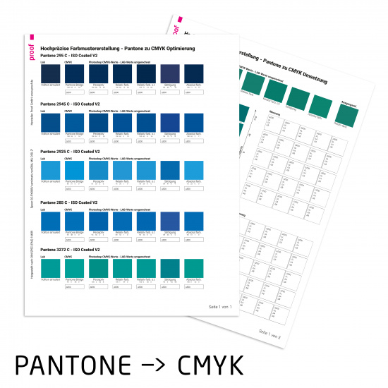
We have been able to assist many clients in making decisions and converting “Digital First” sRGB online colour worlds into printable colours. This does not mean that we have been able to find optimal CMYK or PANTONE spot colour conversions for all online colours. But it does mean that we were able to determine good conversion values for all colours and, in the case of strong deviations, explain why these occurred and on the basis of which criteria we decided on the best of the bad conversions. How far was the original colour “out of gamut”? Are we better off going for the greatest possible colourfulness, or for the best possible brightness match, which is then perhaps less colourful? Can we use the same PANTONE spot colour for picture printing and uncoated paper, or do we use different colours for coated and uncoated?
We do not rely on mumbo jumbo for such colour consulting jobs, but on measuring, determining and calculating colour distances.
It is often easier to talk about colours when you talk about measurements rather than feelings. With a colour matrix, it is often possible to show what more or less cyan and magenta would look like in a colour mix. With a sample or a fan as a reference, it is easier to sample colours and better understand where the limitations of a CMYK conversion and colour space lie.

In the end, we work with the customer to determine the best colour conversion for their application: If the layout is written in white on a colourful sRGB colour field, then it is probably more helpful to use a more saturated and therefore somewhat darker colour value, which increases the contrast and legibility of the white font to the colourful background. If, on the other hand, black is written on the surface, then it is often helpful to keep the brightness close to the sRGB or PANTONE original, and to do without “more” colourfulness. Do we define different PANTONE colours for coated and uncoated, or do we use only one colour for consistency and ease of communication? And for the same reasons, do we use the same CMYK values for image printing and uncoated paper, or different ones?
You need an sRGB to CMYK conversion? Talk to us.
If you have a need for a conversion of RGB colours from “Digital First” coproprate designs to CMYK, then please feel free to contact us at any time. We will advise and help you transparently and competently to achieve the best possible solution for you and with you.
More articles related to this topic:
Fogra Colour Management Symposium 2026 in Munich from 24 to 26 February

The most important colour management event takes place every two years in Munich: the Fogra Colour Management Symposium. Once again this year, all professionals are invited to make the pilgrimage to Munich: two days of lectures, discussions and a Bavarian evening await participants. Matthias Betz, owner of proof.de, will also be there again: for many years, he has been taking advantage of the opportunity to exchange ideas with colleagues and friends, learn about new technologies, hardware and software, and talk to colleagues from Fogra, freieFarbe, GMG and many more. In … read more
Cross-media colour management really works

Peter Jäger is an expert in colour management that reliably works across the boundaries of printers and monitors, web and print – essentially: cross-media.
RGB colour spaces explained

RGB colour spaces are colour systems that represent different hues with the three primary colours red, green and blue. RGB colour spaces are used in digital image processing, photography and computer technology to precisely define colours. The most important RGB colour spaces and their special features are: sRGB sRGB is the most widely used RGB colour space and is used by most monitors, printers and digital cameras. It was developed by HP and Microsoft in the 1990s to create a standard for colour representation on the internet and on various … read more
PANTONE surveys users online about product and service direction

Today I received an email in which PANTONE asked how it should orientate its products and services in the future. The users were asked which countries, industries and company sizes they come from, but also what PANTONE products should look like in the future and what customers would be prepared to pay for PANTONE services in the future. Question: How much can PANTONE services cost? PANTONE appears to be orientating itself on the PANTONE Connect prices: All price queries have the lowest price category < $ 7,- / month, i.e. … read more
Proof GmbH 2021 Certified Again by Fogra with Fogra “Spot cert”

In 2021 proof.de was again Fogra certified including Fogra “Spot cert” certification, i.e. for the display of spot colours such as PANTONE C and U.
New PANTONE Formula Guides with incorrect ink formulations

Several errors have crept into the new PANTONE 2023 fan decks. In both the PANTONE Solid Coated and the Solid Uncoated color fans, there are colours for which the new ink formulations are incorrect. In the PANTONE Formula Guide Solid Coated fan 2023, PANTONE 107 C and PANTONE 108 C have absolutely identical ink recipes, as well as PANTONE 113 C and PANTONE 114 C. As the colors differ, this cannot be the correct. Several errors in the PANTONE Solid Uncoated fan 2023 In the PANTONE Solid Uncoated fan 2023 … read more
Precise proofing of tonal values of spot colours

In recent weeks, there have been lengthy discussions on the Fogra digital printing mailing list as to whether a research project should be launched to define standardised tonal value gradations for spot colours. What is this all about? In the field of CMYK and seven-colour printing, the definition of clear, printable and proofable standards is well established and has been tried and tested in practice. If the paper or paper class is known and defined, a measuring standard such as M0/M1/M2 has been established and the content of optical brighteners … read more
PANTONE Find a Color No Longer Available Without Registration

Shortly after Adobe’s announcement to remove PANTONE colours from their products, PANTONE removed the popular PANTONE Find a Color from their website
Adobe Software Without PANTONE Colours

The announcement was hot: As of March 2022, Adobe software products will no longer contain PANTONE colour libraries. What follows now? Who loses, who wins?
Colour deviations in 2023 PANTONE Color Bridge Guides

After Eddy Hagen pointed out in this posts, that there were some major colour deviations between the brand new PANTONE Solid Coated Guide 2023 and the previous version especially for the PANTONE 2635 C, I was curious to lookup the same colours in the new PANTONE Color Bridge Coated Guide of 2023 and compare the colours with the previous version. I measured a dE00 of 8,15 between the two colours that Eddy mentioned, which is really far apart from how accurate PANTONE colours should match between the different PANTONE guides. … read more