Recently, we have been receiving more and more colour management consulting enquiries where “digital first” designs reach their limits: Namely, always when, after a few months or years, the first trade fair appearance, the first annual report or the first catalogue in classic online printing is due. And it is precisely at this moment that it occurs to everyone involved that they do not even know how their “digital first” colour strategy is supposed to look in print. But let’s take a look at the problem from the beginning:

RGB colour spaces explained
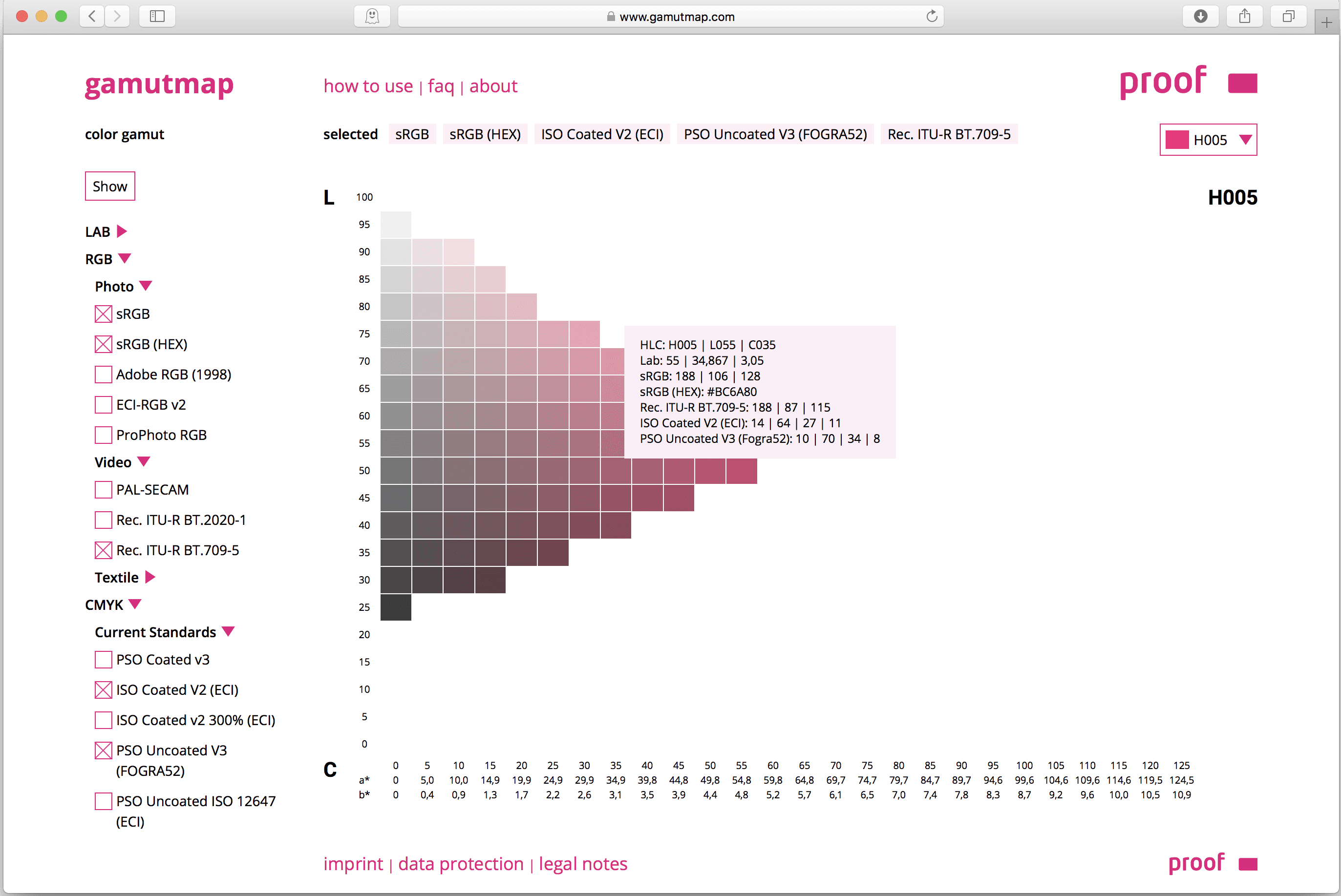
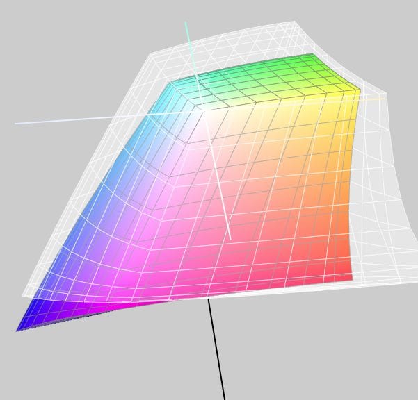
RGB colour spaces are colour systems that represent different hues with the three primary colours red, green and blue. RGB colour spaces are used in digital image processing, photography and computer technology to precisely define colours. The most important RGB colour spaces and their special features are: sRGB sRGB is the most widely used RGB colour space and is used by most monitors, printers and digital cameras. It was developed by HP and Microsoft in the 1990s to create a standard for colour representation on the internet and on various …