
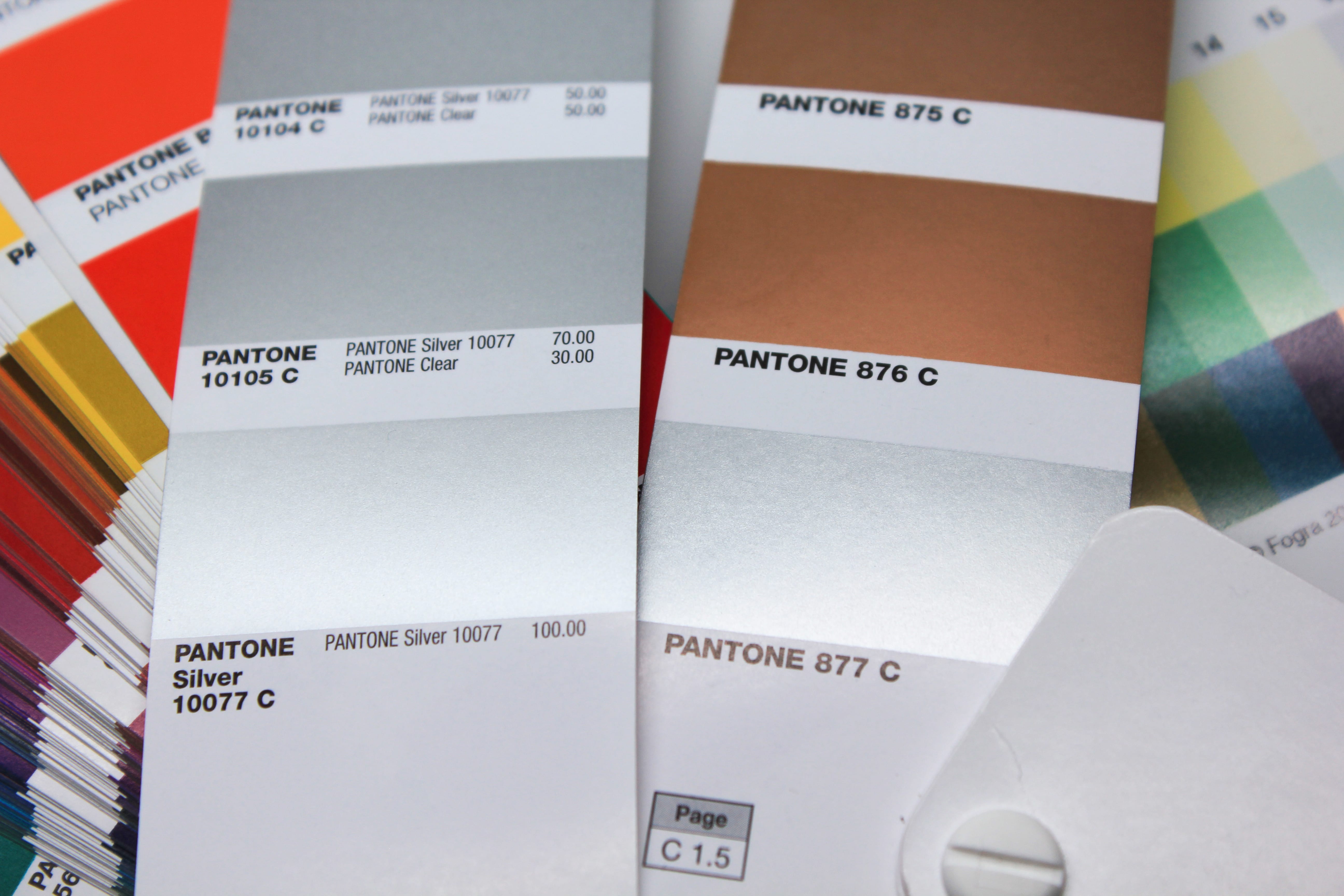
Currently, PANTONE has two parallel Metallics colour fans:
- PANTONE Metallics Coated: Contains the classic metallic shades available since the late 1980s.
- Main basic colours: PANTONE 877, 876, 875 …
- Typical colour names: PANTONE 8020, 8040, 8060, etc.
- PANTONE Premium Metallics Coated: The new Metallics fan, which has been in existence since 2012, showing new, finer metallic shades.
- Main basic colour: PANTONE Silver 10077 C
- Typical colour names: PANTONE 10142, 10158, 10214, etc.
The main differences between the two fans lie in the composition of their respective basic colours: Firstly, there is the different Pantone Silver: PANTONE 877 or PANTONE Silver 10077 C. On the other hand, in the PANTONE Metallics Coated the silver is supplemented by further gold basic colours, while in the PANTONE Premium Metallics Coated the newly defined silver is the only metallic basic colour and is tinted by PANTONE Goe basic colours.
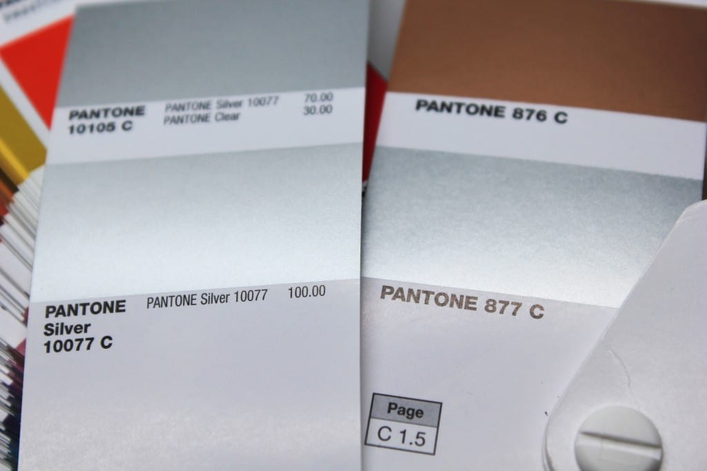
Pantone 877 and the gold inks contain metal flakes which, after the ink has dried on the paper, settle on the ink surface like leaves, creating a silver effect. This irregular surface structure can be very different and depends, among other things, on the drying time of the ink. As a result, the silver effect could vary from print to print. After varnishing, the silver effect was usually much weaker and less brilliant than before print finishing.
PANTONE Silver C(called PANTONE Silver 10077 C in the fan, but today mostly communicated by Pantone itself as PANTONE Silver C) consists of finely emulsified metal particles, which, in contrast to the metal flakes of the 877, are very evenly distributed on the paper due to the colour. The result is a more even, calm and brilliant silver surface that retains its shine and brilliance even after varnishing and is more stable in perspective than the previous colour. According to PANTONE, the durability of the ink has also been improved. The new silver is compatible with UV and water-based lacquers and can be laminated and foil embossed.
The Premium Metallics C colour fan from PANTONE shows colour reproduction with and without dispersion varnish. Important for printers: Due to the different composition, the manufacturer Eckhart recommends a different density: 1.0 for PANTONE 877 and only 0.7 for the new PANTONE Silver C, each measured with a polarized densitometer via the black filter.
One thing is not quite clear: The new 300 PANTONE Premium Metallics C colours are mixed from PANTONE Silver 10077 C and PANTONE Goe basic colours. However, GOE was discontinued in 2014. According to information from a Pantone employee, the colour shades will be converted to the 18 Pantone Matching System basic colours in a new fan generation – PANTONE Bright Orange (GOE) would then become PANTONE Orange 021 (PMS) as the basic colour. Since the basic colour is the same anyway, and has only differed in the thickness of the layer, this has no effect on the colourfulness.
Both PANTONE colour fans are stored as spot colours in our FIERY XF for the proof and can therefore be proofed as spot colours by Proof.de – in the context of the very poor proofability of metallic colours. As no metallic pigments are available for proofing, the silvery effect is only simulated by the velvety gloss of the proof paper. We use the EFI 4245 Gravure Proof Paper, which has a satin surface and allows a halfway decent silver simulation. However, a reasonable preview of the expected printing result is only possible in the PANTONE colour fan.
You can order PANTONE 877 or PANTONE Silver C Proofs here
More articles related to this topic:
Colour deviations in 2023 PANTONE Color Bridge Guides

After Eddy Hagen pointed out in this posts, that there were some major colour deviations between the brand new PANTONE Solid Coated Guide 2023 and the previous version especially for the PANTONE 2635 C, I was curious to lookup the same colours in the new PANTONE Color Bridge Coated Guide of 2023 and compare the colours with the previous version. I measured a dE00 of 8,15 between the two colours that Eddy mentioned, which is really far apart from how accurate PANTONE colours should match between the different PANTONE guides. … read more
“Digital First” often means “Colour Problems Second!”

Whether it’s a large global corporation or a small company, the following often applies to designs or redesigns today: we develop everything for digital first.
New certified proof papers at proof.de

In recent years, various problems have arisen with our previous proof paper supplier. On the one hand, we sometimes had to wait more than three months for paper deliveries; on the other hand, we sometimes had significant problems with batch-to-batch discrepancies, surface defects and much more. After lengthy deliberations, we decided in December to replace all the paper. We therefore received pallets of new paper at the turn of the year, which we are now gradually incorporating into our production. There will be no hard cut, but the new papers … read more
Cross-media colour management really works

Peter Jäger is an expert in colour management that reliably works across the boundaries of printers and monitors, web and print – essentially: cross-media.
Incorrect grayscale display in Adobe Photoshop and InDesign

Adobe products are ideal for image retouching and layout and handle RGB and CMYK colour profiles very well. However, when editing and retouching grayscale images, for example for a black-and-white photo book, the experience is quite different. Suddenly, images look completely different in InDesign than they do in Photoshop, and even when exporting the image to PDF, greyscale images are suddenly treated differently. This article explains where the problems lie with black-and-white images and greyscale profiles in InDesign and Photoshop layouts, and how you can work in a more ‘colour-accurate’ … read more
X-Rite i1Profiler no longer supports i1Pro2 and i1iO 2

Anyone who has reinstalled or updated their i1 Profiler app in the last few weeks has been confronted with disturbing news: X-Rite announced directly in the start window that it would no longer support its enormously popular i1Display and i1Pro2 devices. Users of the i1Pro 2 devices and i1iO 2 tables, which are extremely popular in printing and colour management, will be particularly hard hit by the announcement: An investment of €6,000 is quickly consigned to the electronic scrap heap. But what can you do if you own such a … read more
We passed the first proof certification for the 7C proof under FOGRA55

A few days ago Proof GmbH was the first company to be certified for proofing for the new 7C exchange colour space FOGRA55. Fogra has developed characterisation data for extended multicolour printing with the printing colours CMYKOGV – i.e. cyan, magenta, yellow, black (contrast), orange, green and violet – FOGRA55 as part of a research project over the past few years. The characterisation data and the ICC profile Ref-ECG-CMYKOGV_FOGRA55_TAC300.icc have been published on the Fogra website in recent weeks. We have now carried out the certification via GMG ColorProof, as … read more
Proof GmbH 2025 once again Fogra and Fogra “Spot Cert” certified

This year we once again created proofs for Fogra certification and sent them to Munich-Aschheim for testing. With these proof prints, which we print according to three different proof standards and on three different papers, we point out that we not only deliver excellent proof quality through internal quality controls and checks, but that the quality of our proofs is also measured and confirmed by external experts. We have now had test prints certified by Fogra for the 12th time. We have also been “Spot-cert” certified for the display of … read more
Proof.de is featured twice in the “Fogra Aktuell” magazine

In the current issue of Fogra News “Fogra Aktuell” Proof GmbH is involved in two places. Firstly, a summary of the Fogra report on our first FOGRA55 certification for seven-colour printing with extended colour space in CMYKOGV appeared. You can also find more information on our FOGRA55 certification on the Fogra website: https://fogra.org/en/press-releases/fogracert-erste-cpc-zertifizierung-fuer-fogra55-cmykogv-330 and on proofing.de: And secondly, there was a report on the completion of the research project for textile digital printing, FOGRA58, in which we were allowed to investigate and test the proof capability of the new textile … read more
New PANTONE Formula Guides with incorrect ink formulations

Several errors have crept into the new PANTONE 2023 fan decks. In both the PANTONE Solid Coated and the Solid Uncoated color fans, there are colours for which the new ink formulations are incorrect. In the PANTONE Formula Guide Solid Coated fan 2023, PANTONE 107 C and PANTONE 108 C have absolutely identical ink recipes, as well as PANTONE 113 C and PANTONE 114 C. As the colors differ, this cannot be the correct. Several errors in the PANTONE Solid Uncoated fan 2023 In the PANTONE Solid Uncoated fan 2023 … read more