Adobe products are ideal for image retouching and layout and handle RGB and CMYK colour profiles very well. However, when editing and retouching grayscale images, for example for a black-and-white photo book, the experience is quite different. Suddenly, images look completely different in InDesign than they do in Photoshop, and even when exporting the image to PDF, greyscale images are suddenly treated differently.
This article explains where the problems lie with black-and-white images and greyscale profiles in InDesign and Photoshop layouts, and how you can work in a more ‘colour-accurate’ manner in Photoshop and InDesign, even if the layouts are only colour-accurate in Adobe Acrobat.
How Adobe Photoshop processes grayscale images
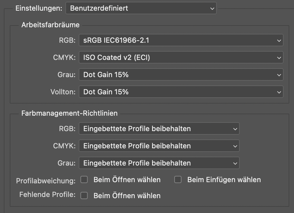
In the colour settings in Adobe Photoshop, you can select a greyscale ICC profile that Photoshop uses to display your greyscale images. The default setting in Photoshop is the greyscale profile ‘Dot Gain 15%’. This profile displays greyscale on a neutral grey axis as if you had a dot gain of 15 per cent. Of course, you can also choose other profiles with different dot gains or greyscale profiles with stored gamma curves, such as 1.8 or 2.2, the two classic gamma curves used by Mac and Windows PCs. Photoshop recognises and processes these profiles correctly, as shown by a test with a 50% value in four different greyscale profiles: All tones are displayed differently on the screen at the same grey value because they are assigned to different profiles and tone increases.
Unfortunately, all images look different when we import them into Adobe InDesign, export them as PDFs and print them at a print shop in ISOCoatedV2. So let’s take a look at how InDesign processes these greyscale images.

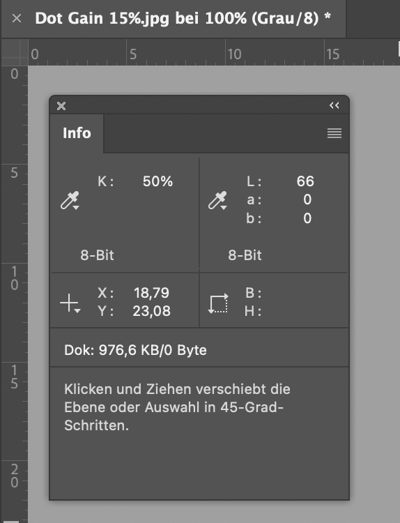
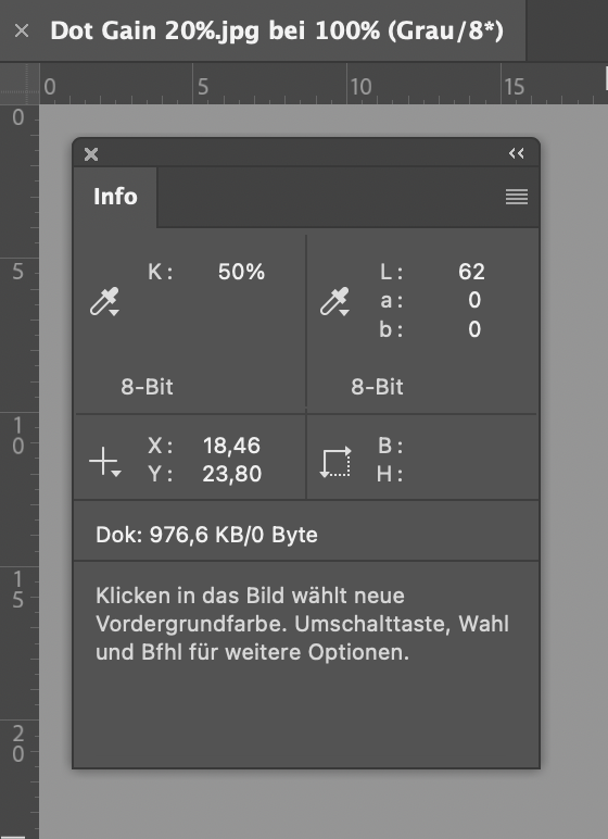
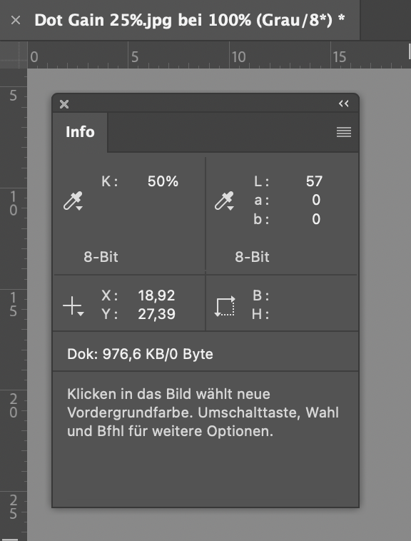
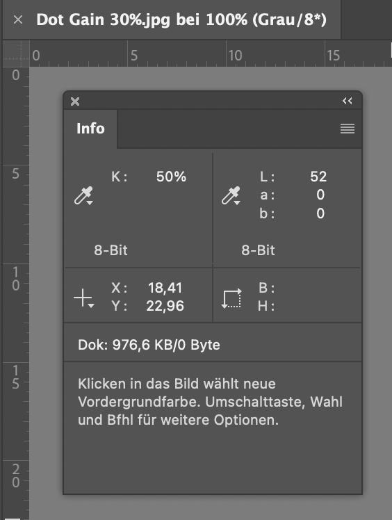
Good: All greyscale colour profiles are recognised and processed.
Bad: None would be printed as displayed!
How Adobe InDesign processes greyscale images
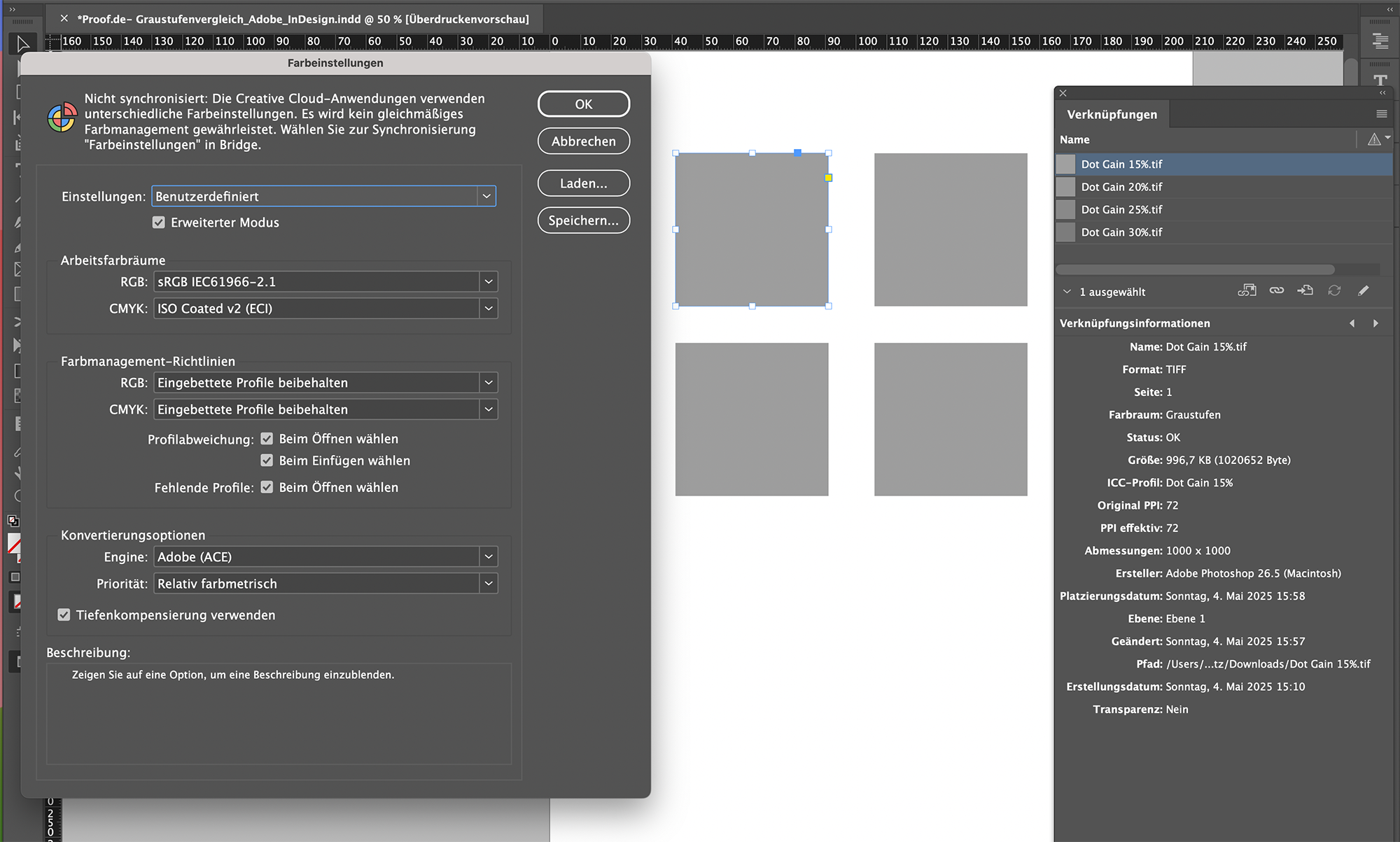
So what do the four greyscale images from Adobe Photoshop look like when we import them into Adobe InDesign? First, we open the colour settings in InDesign and set the correct profiles for RGB and CMYK. One thing immediately stands out: we can only specify RGB and CMYK profiles; there is no greyscale or spot colour profile in InDesign as there is in Photoshop. To be on the safe side, we click in InDesign to ensure that embedded profiles are retained, so that the greyscale profiles equipped with ICC profiles will hopefully also be processed correctly.
And? Does InDesign retain the greyscale colour profiles correctly? No, it doesn’t. Although it recognises the embedded profiles correctly and displays this in the link information, it displays all four of our images identically because it recognises the greyscale profiles in the background but does not apply them; it simply ignores them.
We can demonstrate this with a quick test: We import all images into Adobe InDesign.
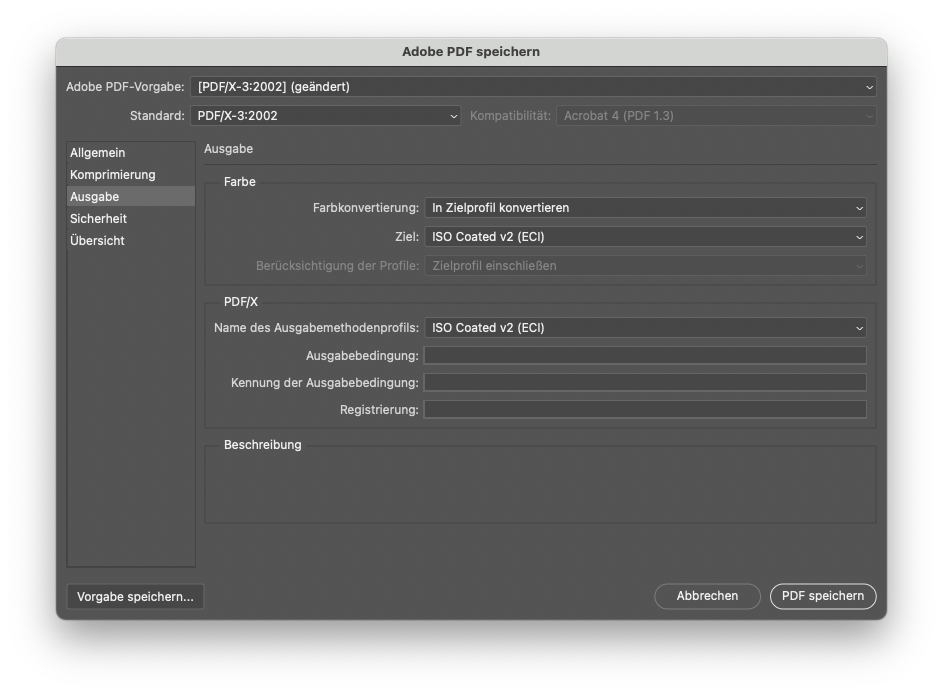
This is how Adobe InDesign exports greyscale images and colour profiles to a PDF for Acrobat
While Adobe InDesign still claims to retain the greyscale profiles, we see after exporting to PDF X-3 at the latest that there are no longer any profiles in Acrobat: all images are 50% black, all DeviceN colour space ‘black’, i.e. assigned to the black channel of ISOCoatedv2 with 50%.
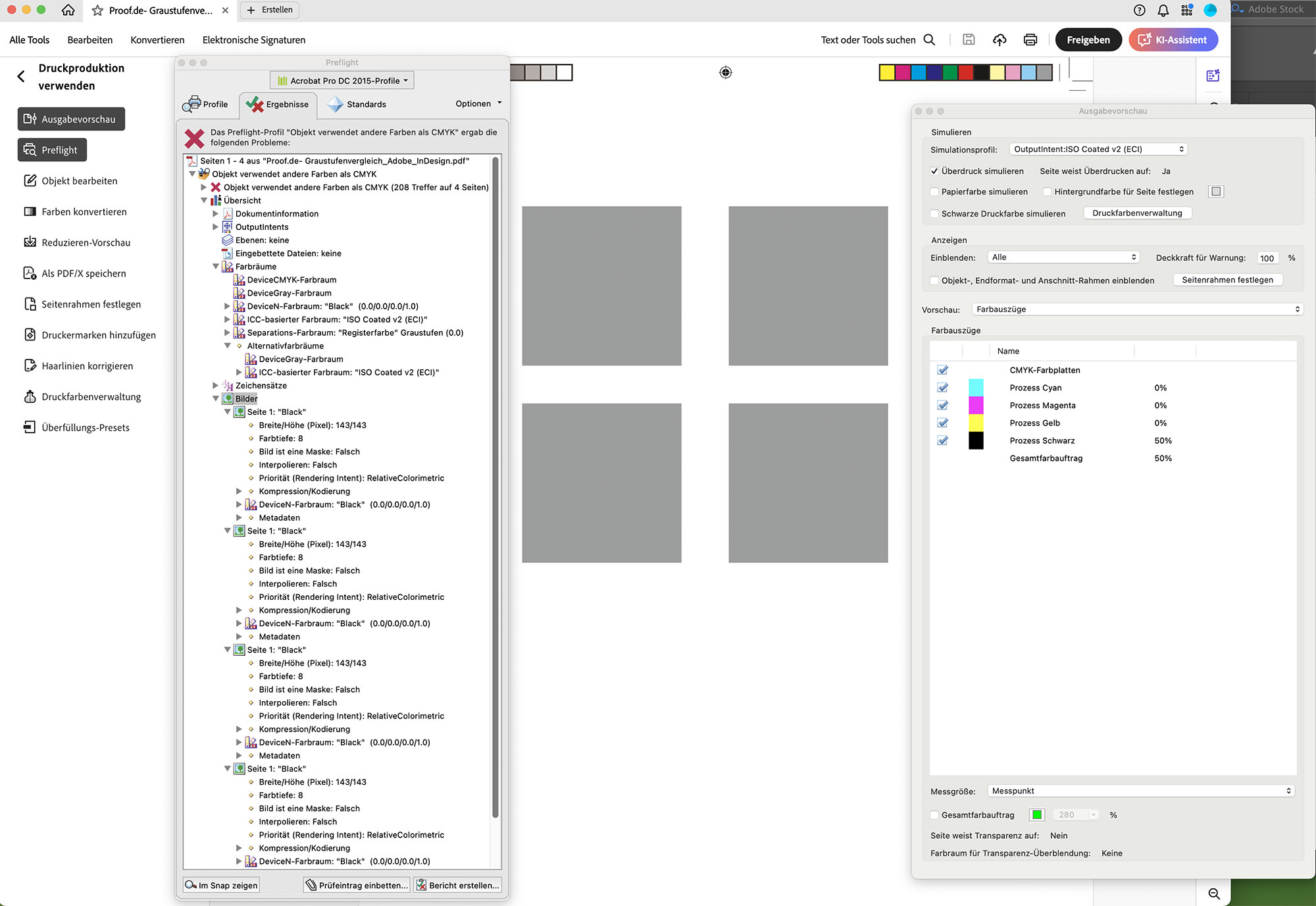
The error: Adobe InDesign ignores greyscale colour profiles and simply transfers the values to the black channel of the CMYK colour space.
We were able to clearly demonstrate that we could create four identical grey areas in InDesign using four greyscale images from Adobe Photoshop with colour profiles of 15%, 20%, 25% and 30% dot gain, all of which have different LAB values in Photoshop. These remain identical even after exporting to a PDF file, at 50% black from ISOCoatedV2. But does the 50% black value from ISOCoatedV2 at least match one of the LAB values from Photoshop? Unfortunately not. Here, a LAB value of 62/0/-2 is produced, which is due to the slightly bluish paper white of ISOCoatedv2. Conclusion: The resulting grey tone in InDesign and Acrobat is a fifth colour value that has nothing in common with any of the four LAB colours.
But what if I’m designing a photo book with black-and-white images? What if greyscale images are retouched in Photoshop and then transferred to Acrobat via InDesign, but always have to look identical? Which profile do I need to set as the greyscale profile in Photoshop?
Can Adobe Photoshop display a greyscale image as it would be printed in offset printing according to ISOCoatedV2?
So let’s consider the case of the 50% grey value from the four images: What settings would I need to use so that Photoshop displays the image as it would be printed by Flyeralarm if we were printing a black-and-white illustrated book, a black-and-white poster or a black-and-white postcard, i.e. ISOCoatedV2 300%? So, if we assume that the 50% area from Photoshop becomes a 50% area on the black printing plate, and this black is printed in accordance with ISOCoatedV2 300%? This setting is not included in Photoshop by default. So we have to use a trick here?
The classic dot gain 15% profile is very inaccurate in its representation. It has a lightest point of LAB 100/0/0 and a darkest point of LAB 0/0/0. Both are, of course, completely unrealistic in print. The white point of ISOCoatedV2 300% is LAB 95/0/-2 and the darkest pure 100% K black is 16/0/0.
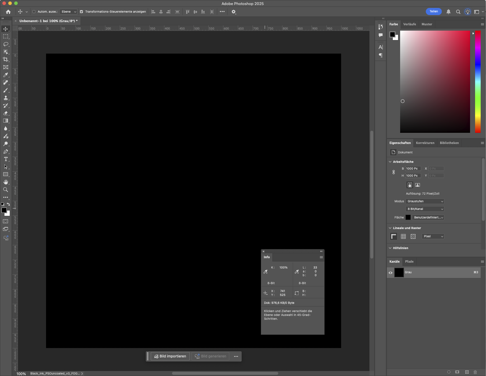
When we set up a colour proof for ISOCoatedV2 in the display, the grey scale file display changes significantly. However, the info box still shows the incorrect values for black and white.
Create a black channel for a print profile for Adobe Photoshop
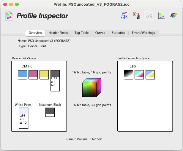
To use the black channel of ISOCoatedV2 300% as a greyscale profile, we use a trick: simply select ISOCoatedV2 300% as the greyscale profile. Photoshop immediately switches automatically and displays ‘Black channel of ISOCoatedV2 300%’ as the profile for greyscale. You can now even save this new greyscale profile directly from Photoshop as an ICC profile.
If you have now selected this black channel profile as a greyscale profile in Photoshop, you will still see the incorrect LAB values in Photoshop in the normal view. However, if you now activate the colour proof in Photoshop in the appropriate CMYK profile, you will see the greyscale file displayed correctly in terms of brightness. But only in terms of brightness: all values are correct only in ‘L’, but are always neutral on the A and B axes of LAB.
Photoshop only displays brightness correctly, but always remains in neutral grey.
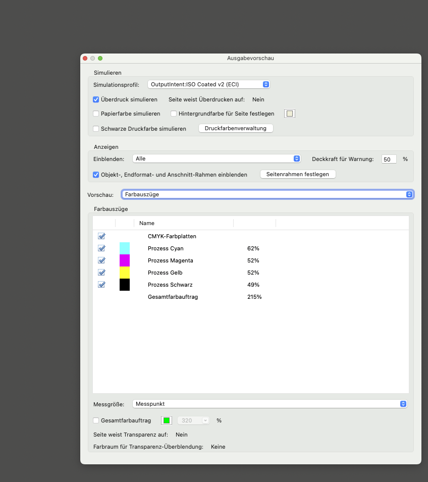
A bright white-blueish paper white such as PSOUncoatedV3 is not displayed by Photoshop; Photoshop completely ignores the -10 on the ‘b’ axis. However, you can now see the correct ‘L’ value, i.e. the correct brightness, in the Photoshop info window, and the value is also displayed correctly in the Digital Colour Meter. This is a significant improvement, even though it is not ideal. The same applies to Adobe InDesign: if the ‘black channel of ISOCoatedV2’ image is imported into an ‘ISOCoatedV2 300%’ design, the entire grey axis looks the same, but is only displayed correctly on the brightness axis. Only after exporting to PDF is the correct colour value displayed in Adobe Acrobat with black and paper white simulation enabled.
The idea behind this could be that the eye always performs a very quick white balance on paper and therefore always recognises grey scales as fairly neutral: Example: If you print the image of a white shirt on bright white uncoated paper, we immediately recognise the shirt as white, even though it is actually very bluish. The same applies to newsprint, although in this case the shirt can only be light brown at best, but never white, due to the light brown colour of the newsprint.
So is it worth the effort? Absolutely. The advantage is obvious: with a black channel profile that matches your final colour profile, you can work consistently from Photoshop to InDesign – at least in terms of brightness – and display areas correctly in images. After exporting to PDF, you will also have the correct display in Acrobat, including paper white and colouring.
You can also use the Info window in Photoshop to measure the correct brightness values and assess whether the grey scales correspond to your desired display, or whether, for example, details in the depths are lost or there is too little contrast in the mid-tones.

What happens if I export a greyscale image directly from Photoshop to a PDF?
There are two options: Either Photoshop exports a PDF in the selected greyscale profile, or Photoshop exports to your target colour space, e.g. ISOCoatedV2, in the original with 330% area coverage. However, this means that not only is the black channel filled, but the colour appears in all colour channels in the PDF. The greyscale profile is therefore separated into all channels like an RGB when exporting. Since black in an RGB image would become a deep CMYK black in the CMYK PDF, a deep black in a greyscale image is also converted to a deep black. Incidentally: to the exact same deep black CMYK 95/95/45/95 with the exact highest area coverage of 330% and a LAB of 9 / 3 / -3. This is understandable, as both are LAB 0/0/0 in their original file.

Conclusion: Colour-critical black-and-white images should use the black channel of the output profile in Photoshop and not Dot Gain 15%.
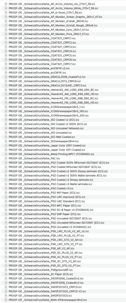
So you see: with the default dot gain of 15%, you are always automatically wrong. Selecting a black channel from your output profile is therefore always much better and will be displayed correctly in terms of brightness by all programmes. To save you a little work, we have already created greyscale profiles for the black channel for the most important colour profiles used in classic printing methods, which you can easily download here. You can simply copy the required profiles to your colour profile folder, restart Photoshop, select the appropriate black channel as a greyscale profile, and start working directly in the black channel of your output colour space.
You can download the ZIP file containing the profiles here. The following profiles are included:
More articles related to this topic:
Adobe Software Without PANTONE Colours

The announcement was hot: As of March 2022, Adobe software products will no longer contain PANTONE colour libraries. What follows now? Who loses, who wins?
Cross-media colour management really works

Peter Jäger is an expert in colour management that reliably works across the boundaries of printers and monitors, web and print – essentially: cross-media.