
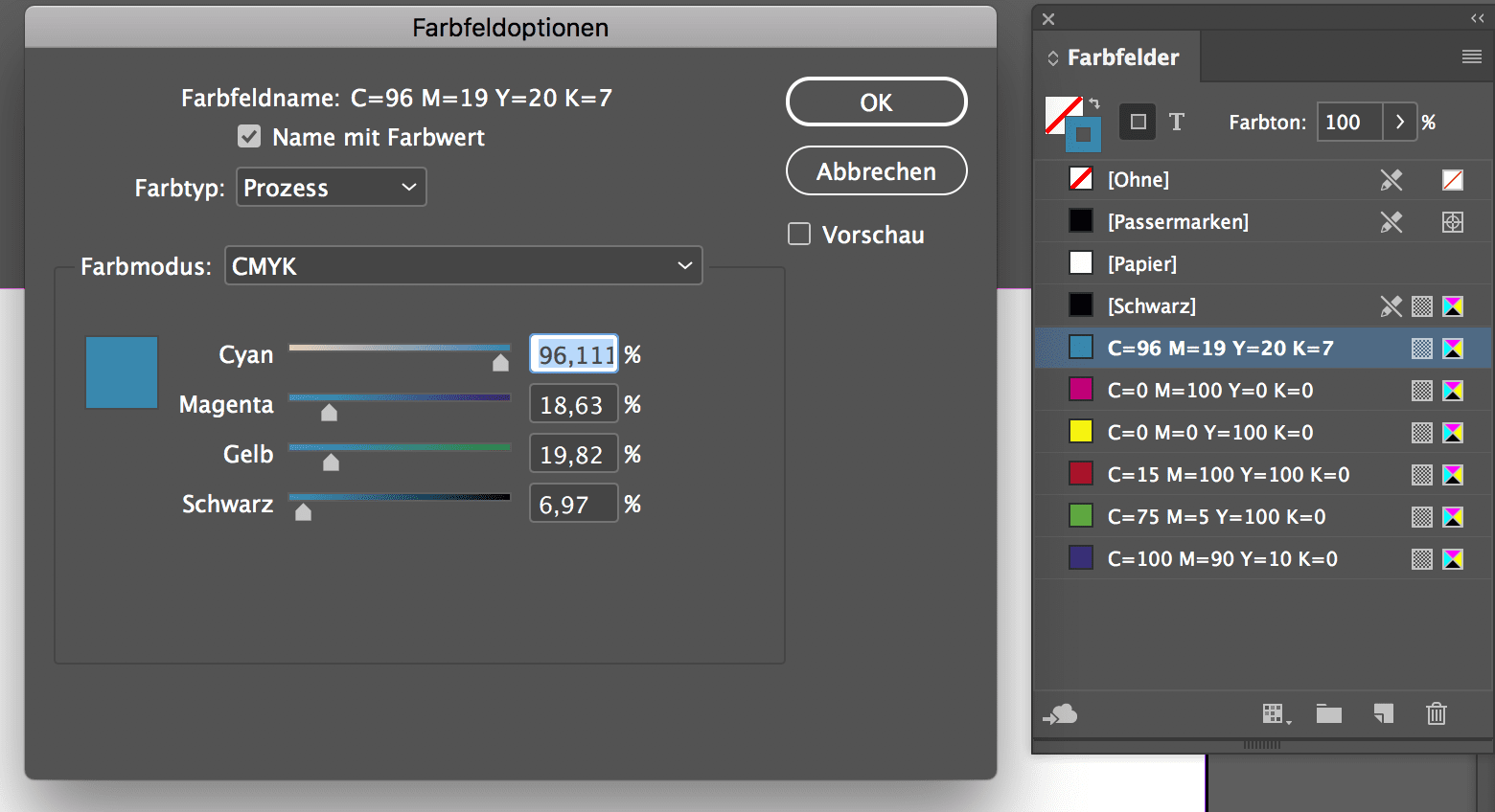
Adobe has updated its colour picker in the 2019 version. Especially in Adobe InDesign 2019, decimal places are now possible for LAB and CMYK during colour input, which is a long-desired feature especially in the high-end colour area. Up to now it was already possible in Adobe InDesign to enter colour values e.g. in CMYK with decimal places and to write them into the PDF during PDF export, but only integer values were displayed.
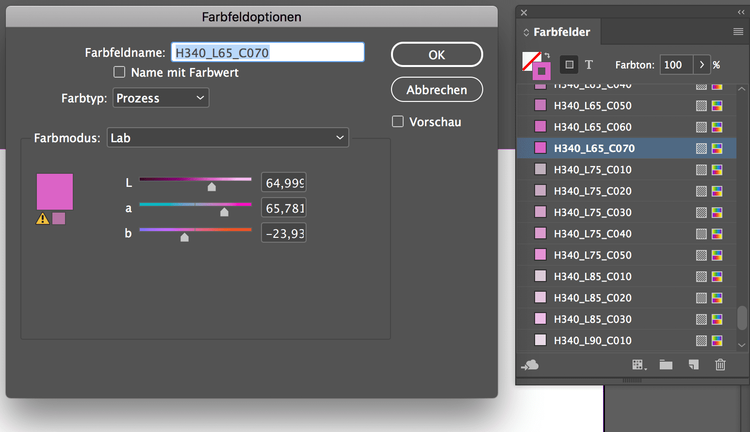
In Adobe InDesign 2019, three decimal places can now be entered for LAB and CMYK and can also be read out again. However, these values are not adopted in the automatic labelling of the colour fields, although this can always be adjusted manually.
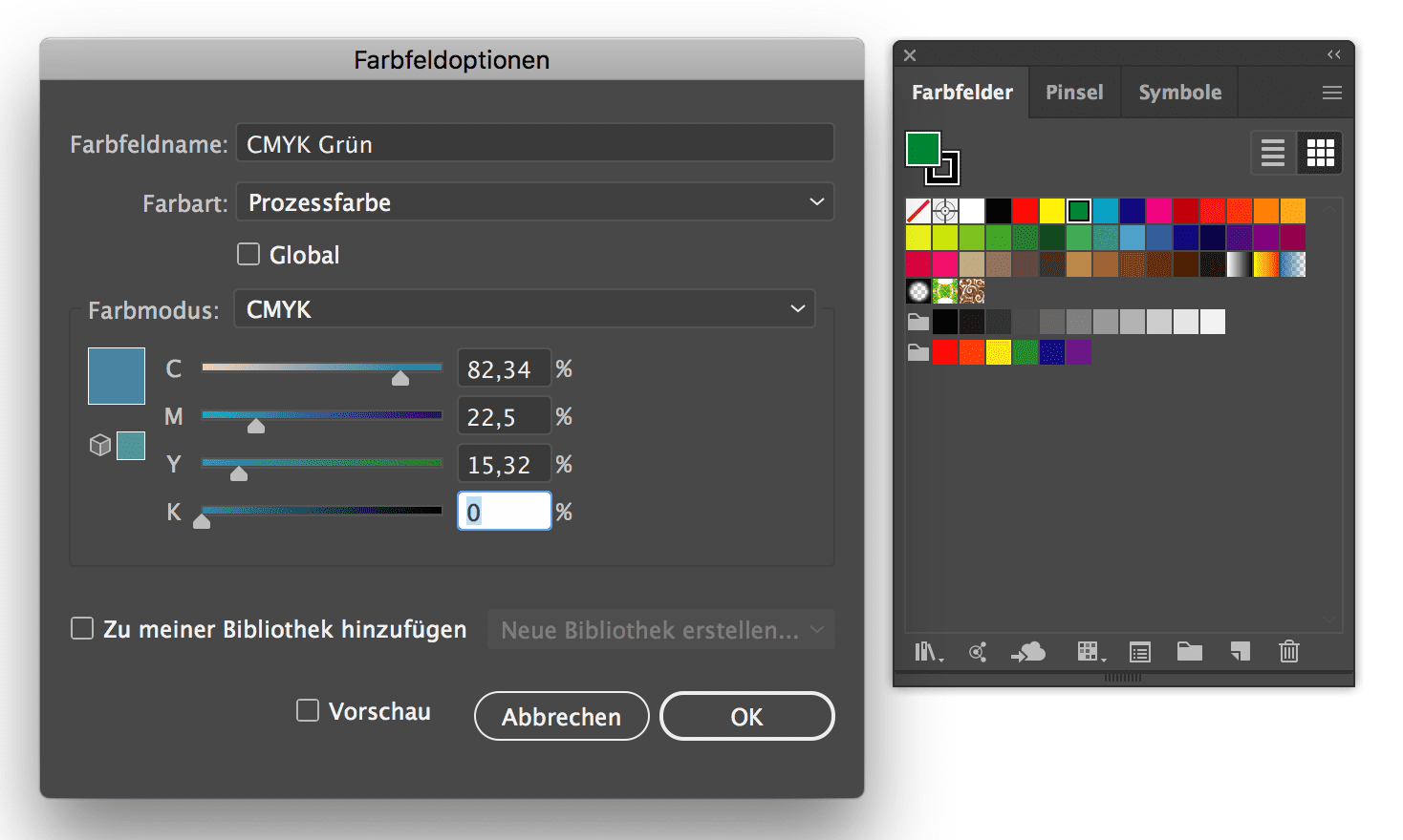
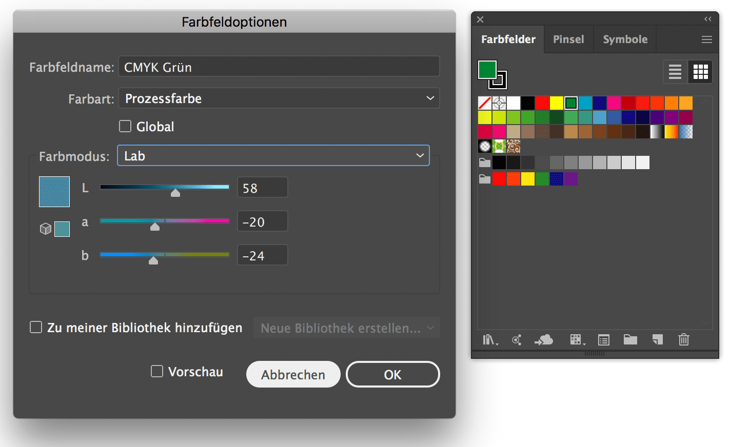
Also in Adobe Illustrator 2019 CMYK inputs with decimal places are now possible, although only two decimal places are possible here. With LAB, only an integer entry is still possible.
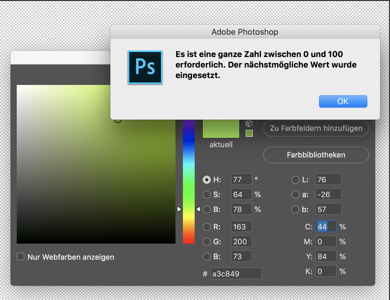
Only Adobe Photoshop still does not allow any decimal places, but only whole numbers, it does not matter whether the file is in 8Bit or 16Bit. This applies equally to LAB, RGB, CMYK and grayscale: In none of the colour systems is a specification with decimal places allowed.
It is not really clear why only in some software solutions Adobe allows decimal places in colour definitions. But InDesign is clearly more important here than Photoshop and Illustrator; possibly because it is the last software in the production chain that has to merge data from different sources, and so the highest requirements apply here.
The import of ASE colour swatch data was not accelerated, the 2040 colour swatches of the freieFarbe e.V. CIELAB HLC Colour Atlas take almost 2 minutes even on a current Macbook Pro. But the colour swatches are now displayed with full decimal values; a real improvement for the user who also needs high-precision colour data.
More articles related to this topic:
Proofs with Digimarc EAN codes and verification
Digimarc is a digital watermark that can be used to embed information in images, videos or other media. Digimarc watermarks are invisible to the human eye, but remain recognisable to special software or devices. Digimarc is becoming increasingly popular in the packaging sector in particular, as this technology allows the digits of the EAN barcode and more to be applied invisibly to all areas of the packaging. Digimarc and EAN barcode at the supermarket checkout When scanning at the checkout, the checkout staff do not have to search for the … read more
Precise proofing of tonal values of spot colours

In recent weeks, there have been lengthy discussions on the Fogra digital printing mailing list as to whether a research project should be launched to define standardised tonal value gradations for spot colours. What is this all about? In the field of CMYK and seven-colour printing, the definition of clear, printable and proofable standards is well established and has been tried and tested in practice. If the paper or paper class is known and defined, a measuring standard such as M0/M1/M2 has been established and the content of optical brighteners … read more
New edition of ISOCoatedV2 in M1 in sight?

Even almost 9 years after the introduction of the successor colour space PSOCoatedV3, ISOCoatedV2 / FOGRA39 is still the most widespread colour space in Europe. We at Proof GmbH count around 200 jobs from time to time for the German Printing and Media Industries Federation, among others. In the last count, proofs in ISOCoatedV2 accounted for around 68% of all proof jobs at our company. This is a clear sign of the continued widespread use of the colour space. ISOCoatedV2: From the classic colour space to the beacon of the … read more
Cross-media colour management really works

Peter Jäger is an expert in colour management that reliably works across the boundaries of printers and monitors, web and print – essentially: cross-media.
New feature: Orders & individual items can now be reordered with a single click

From now on, it’s much easier and faster: in the Proof Shop, you can call up and reorder entire orders or individual proofs directly from your order history. This saves you from having to re-enter every detail and gives you the assurance that all settings will be exactly the same as last time. With just a few clicks, your proofs are reordered – reliably, easily and in no time at all. What exactly is new? You can find your order history in your customer account. There are two new options … read more
Fogra60 proofs for metal decor printing available
From now on you can order proofs for metal decor printing on white sheet metal at proof.de: The ICC profile for Fogra60 is Metal-Printing_MPC1_FOGRA60.icc
X-Rite i1Profiler no longer supports i1Pro2 and i1iO 2

Anyone who has reinstalled or updated their i1 Profiler app in the last few weeks has been confronted with disturbing news: X-Rite announced directly in the start window that it would no longer support its enormously popular i1Display and i1Pro2 devices. Users of the i1Pro 2 devices and i1iO 2 tables, which are extremely popular in printing and colour management, will be particularly hard hit by the announcement: An investment of €6,000 is quickly consigned to the electronic scrap heap. But what can you do if you own such a … read more
RGB colour spaces explained

RGB colour spaces are colour systems that represent different hues with the three primary colours red, green and blue. RGB colour spaces are used in digital image processing, photography and computer technology to precisely define colours. The most important RGB colour spaces and their special features are: sRGB sRGB is the most widely used RGB colour space and is used by most monitors, printers and digital cameras. It was developed by HP and Microsoft in the 1990s to create a standard for colour representation on the internet and on various … read more
Incorrect grayscale display in Adobe Photoshop and InDesign

Adobe products are ideal for image retouching and layout and handle RGB and CMYK colour profiles very well. However, when editing and retouching grayscale images, for example for a black-and-white photo book, the experience is quite different. Suddenly, images look completely different in InDesign than they do in Photoshop, and even when exporting the image to PDF, greyscale images are suddenly treated differently. This article explains where the problems lie with black-and-white images and greyscale profiles in InDesign and Photoshop layouts, and how you can work in a more ‘colour-accurate’ … read more
New certified proof papers at proof.de

In recent years, various problems have arisen with our previous proof paper supplier. On the one hand, we sometimes had to wait more than three months for paper deliveries; on the other hand, we sometimes had significant problems with batch-to-batch discrepancies, surface defects and much more. After lengthy deliberations, we decided in December to replace all the paper. We therefore received pallets of new paper at the turn of the year, which we are now gradually incorporating into our production. There will be no hard cut, but the new papers … read more