
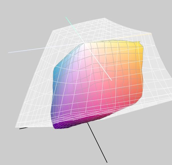
We received a call from a new customer today: He proofs for Chinese suppliers, and up to now he is producing proofs in Japan Color 2001 Coated (JapanColor2001Coated.icc). We had not yet set up the profile in our RIP, but within a short time we were able to load the profile into our RIP, create workflows, and make the profile available for order in the shop.
We will gladly integrate your individual ICC proof profiles and create proofs for you.
We proof more than 50 international proof standards, but there are always one or two standards that we do not yet offer. Often ink manufacturers or paper producers also offer ICC profiles like Aniva or Heaven42 and the Munken, Amber and Arctic paper series from Arctic Paper. Or have you measured a house standard for your printing parameters which you would like to use for proofs? Then please contact us. We will be happy to support you.
More articles related to this topic:
New edition of ISOCoatedV2 in M1 in sight?

Even almost 9 years after the introduction of the successor colour space PSOCoatedV3, ISOCoatedV2 / FOGRA39 is still the most widespread colour space in Europe. We at Proof GmbH count around 200 jobs from time to time for the German Printing and Media Industries Federation, among others. In the last count, proofs in ISOCoatedV2 accounted for around 68% of all proof jobs at our company. This is a clear sign of the continued widespread use of the colour space. ISOCoatedV2: From the classic colour space to the beacon of the … read more
New certified proof papers at proof.de

In recent years, various problems have arisen with our previous proof paper supplier. On the one hand, we sometimes had to wait more than three months for paper deliveries; on the other hand, we sometimes had significant problems with batch-to-batch discrepancies, surface defects and much more. After lengthy deliberations, we decided in December to replace all the paper. We therefore received pallets of new paper at the turn of the year, which we are now gradually incorporating into our production. There will be no hard cut, but the new papers … read more
“Digital First” often means “Colour Problems Second!”

Whether it’s a large global corporation or a small company, the following often applies to designs or redesigns today: we develop everything for digital first.
X-Rite i1Profiler no longer supports i1Pro2 and i1iO 2

Anyone who has reinstalled or updated their i1 Profiler app in the last few weeks has been confronted with disturbing news: X-Rite announced directly in the start window that it would no longer support its enormously popular i1Display and i1Pro2 devices. Users of the i1Pro 2 devices and i1iO 2 tables, which are extremely popular in printing and colour management, will be particularly hard hit by the announcement: An investment of €6,000 is quickly consigned to the electronic scrap heap. But what can you do if you own such a … read more
New in the Proof Shop: Separate invoice email

At long last, we are able to fulfil a request made by many of our customers: from now on, you can register two email addresses in the Proof Shop – one for logging in and receiving status or tracking emails, and a separate one solely for receiving digital PDF invoices. Over the past few years, we have already switched many Proof customers to digital invoicing at their request, i.e. we generated a PDF invoice and then sent it manually to a second email address on file with us in the … read more
Proof GmbH 2025 once again Fogra and Fogra “Spot Cert” certified

This year we once again created proofs for Fogra certification and sent them to Munich-Aschheim for testing. With these proof prints, which we print according to three different proof standards and on three different papers, we point out that we not only deliver excellent proof quality through internal quality controls and checks, but that the quality of our proofs is also measured and confirmed by external experts. We have now had test prints certified by Fogra for the 12th time. We have also been “Spot-cert” certified for the display of … read more
MYIRO-9: New Spectrophotometer from KonicaMinolta in action

Over the last few months, we at Proof.de have been thinking about further improving our already very good colour measurement technology in terms of speed and measurement precision. Relatively quickly it became clear that only two devices would come into question: The KonicaMinolta MYIRO-9, the successor of the former FD-9, or the X-Rite ISIS 2 XL. The starting point: Since we at Proof GmbH have 5 proofing devices, the calibration of targets for profile optimisation is a time-critical undertaking for us. Therefore, we had been looking around for an upgrade of … read more
Proofs with Digimarc EAN codes and verification

Digimarc is a digital watermark that can be used to embed information in images, videos or other media. Digimarc watermarks are invisible to the human eye, but remain recognisable to special software or devices. Digimarc is becoming increasingly popular in the packaging sector in particular, as this technology allows the digits of the EAN barcode and more to be applied invisibly to all areas of the packaging. Digimarc and EAN barcode at the supermarket checkout When scanning at the checkout, the checkout staff do not have to search for the … read more
New feature: Orders & individual items can now be reordered with a single click

From now on, it’s much easier and faster: in the Proof Shop, you can call up and reorder entire orders or individual proofs directly from your order history. This saves you from having to re-enter every detail and gives you the assurance that all settings will be exactly the same as last time. With just a few clicks, your proofs are reordered – reliably, easily and in no time at all. What exactly is new? You can find your order history in your customer account. There are two new options … read more
RGB colour spaces explained

RGB colour spaces are colour systems that represent different hues with the three primary colours red, green and blue. RGB colour spaces are used in digital image processing, photography and computer technology to precisely define colours. The most important RGB colour spaces and their special features are: sRGB sRGB is the most widely used RGB colour space and is used by most monitors, printers and digital cameras. It was developed by HP and Microsoft in the 1990s to create a standard for colour representation on the internet and on various … read more