A very frequent topic for us in the area of proofing is the optimal conversion of PANTONE colours in CMYK for classic, inexpensive four-colour printing. In the last few days, there has been a lively discussion on this topic in the Adobe Forum and in the colour management forum of hilfdirselbst.ch, which I would like to summarise briefly, as our customers often struggle with the same issues.
PANTONE and the PANTONE CMYK values from Bridge: The Problem
The central question is to which standard or colour profile a CMYK value of a PANTONE colour in Bridge actually refers. Specifically, a user asked for the conversion of PANTONE 116 C, a colour tone that is specified in the PANTONE Bridge fan in CMYK 0/14/100/0 (here you can see the original value in PANTONE). But if you now convert the underlying PANTONE Lab color value in InDesign or Photoshop into different CMYK profiles, you will get different, significantly different color values. “What does the PANTONE Bridge CMYK colour value refer to” was the original question of the discussion.
The starting point of the PANTONE Bridge fan
In the PANTONE Bridge Fan, “equivalents” of the PANTONE spot colours on a coated and an uncoated paper grade, separated with 4 Pantone scale colours, are visualised and the CMYK values are specified.
But one thing is clear: without precise information on the substrate, print density, inks used, etc., the information provided there has only limited validity. If, for example, one converts the LAB colour value of PANTONE 116 C into the SWOP Web coated commonly used in the USA, then one reaches a value of 20 in magenta instead of 14 as indicated in the PANTONE Bridge Fan.
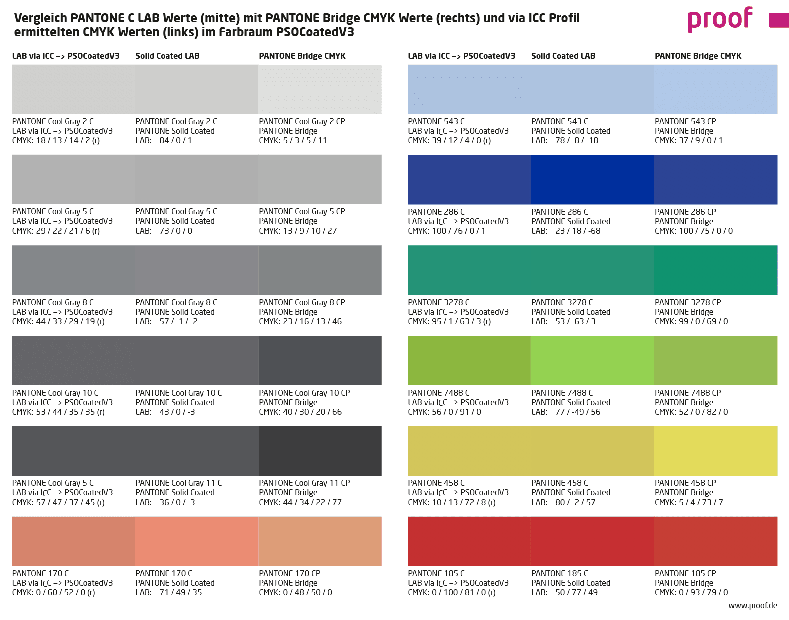
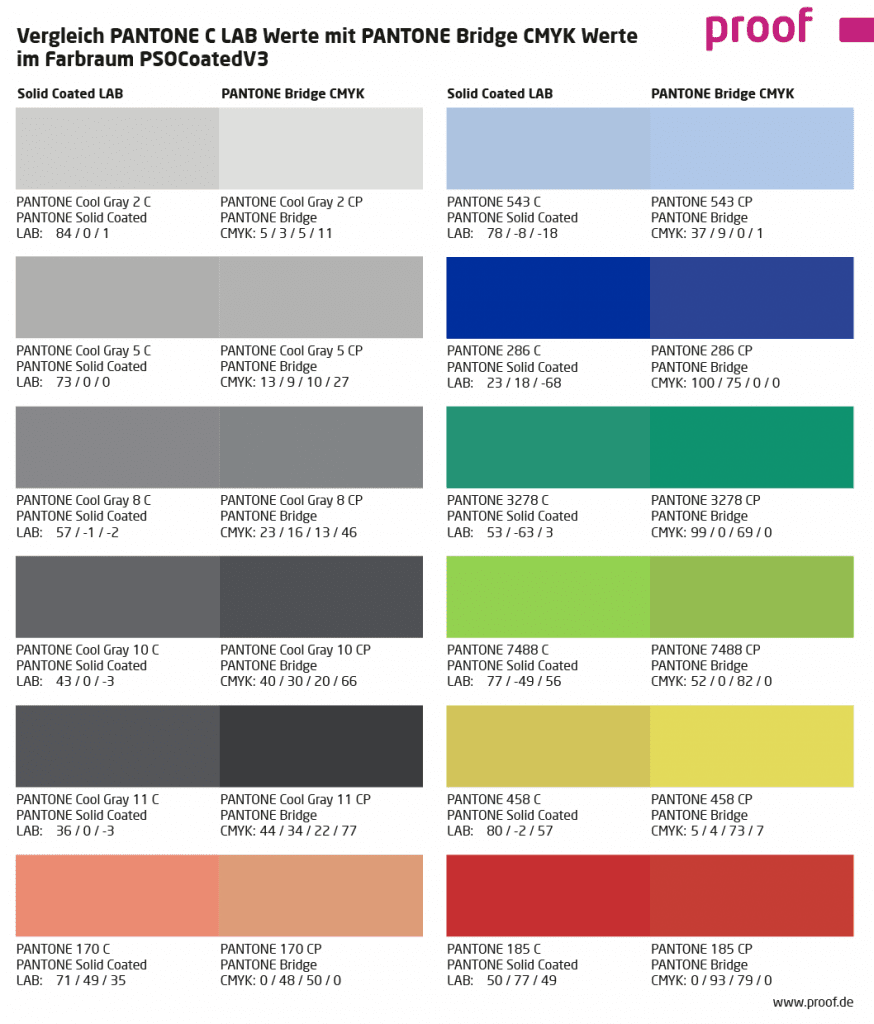
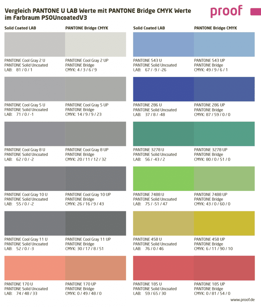
Comparison of PANTONE LAB values with PANTONE Bridge CMYK values in PSOUncoatedV3 and PSOCoatedV3
If you compare the original PANTONE LAB values and the PANTONE Bridge CMYK values in European standards such as ISOCoatedV2 or PSOCoatedV3 for coated or PSOUncoated or PSOUncoatedV3 for uncoated paper, there are sometimes serious colour deviations. The PANTONE Cool Gray 2 is much too light in CMYK conversion, the PANTONE Cool Gray 11 is always much too dark. For the PANTONE 3278 C, the Bridge CMYK value for PSOCoatedV3 fits quite well, but the same comparison for Uncoated is noticeably worse. What is the reason for this?
The question was therefore specified once again:
- How can PANTONE specify “official” CMYK values for a particular colour if it is not clear what paper white, print density, ink coverage, etc. the values refer to?
- How does PANTONE arrive at the specified colour values?
- Which ICC profiles are possibly the basis?
- Are there errors if programs such as Photoshop or Affinity Publisher do not show the same values when converting a Pantone color as those specified by Pantone?
Thesis 1: Why should a spot colour manufacturer deliver perfect CMYK replacement values for his products? That would be detrimental to business.
One thing is clear: there are no system errors. PANTONE knows what they do. But it is surprising that the bridge values have apparently been fluctuating by several percentage points for many years. Perhaps one reason for this is that different base pigments have been used over the years and the values have therefore been adjusted. But it was not possible in any way to find out how the values are created, what profiles or logic could be behind the values. Some discussion participants thought of a deliberate system error: “Cui bono? Why should a spot colour manufacturer deliver perfect CMYK replacement values for his products? That would be detrimental to business.”
This is an exciting approach which, at second glance at the latest, does not lack a certain logic. If the head of the company has only seen bad CMYK conversions of his PANTONE spot colour for long enough, he will sigh and agree to any surcharge for a five-colour print, only to finally find his corporate colour correctly reproduced again.
But another thesis is also very plausible:
Thesis 2: The sales department defines the CMYK values
Let’s assume that a PANTONE “Green1” corresponds colorimetrically to a CMYK of 30/0/100/0. If two more saturated green tones (“Green2” and “Green3”) are displayed in the fan, which theoretically should be displayed with CMYK 35/0/110/0 and CMYK 40/0/120/0, what then?
To set all three green tones to CMYK 30/0/100/0, i.e. the next CMYK value that can be achieved absolutely colorimetrically? That would actually be the most obvious way, especially since it is very unlikely in practice that two adjacent PANTONE colours would ever be used in CMYK conversions. Because a company has either green1 or green2 as its corporate colour, but hardly both at the same time.
On the other hand, buyers of PANTONE Bridge fans would probably be very surprised if different PANTONE colours in the fan had the same CMYK value.
Therefore, a psychological-sales-department correction is obvious: In order to avoid identical CMYK values, we set the most saturated green tone to the not matching CMYK 30/0/100/0, and then the less saturated colors to 25/0/0/90/0 and 20/0/0/80/0, i.e. also not matching CMYK values. Now nothing fits anymore, but at least all colors have different CMYK values.
Practice shows: An adjusted conversion via ICC profiles often provides a better CMYK color value for the conversion of PANTONE colors like the CMYK value from the PANTONE Bridge.
We have converted the PANTONE colours used in the above mentioned graphics also via ICC profiles partly absolutely colorimetrically and relatively colorimetrically with depth compensation (marked with an “r” behind the CMYK colour value) into the two output colour spaces PSOCoatedV3 and PSOUncoatedV3 and have mapped the visually best match in each case.
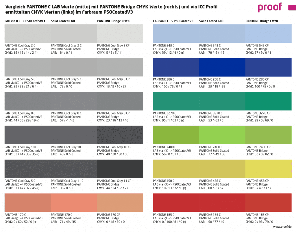
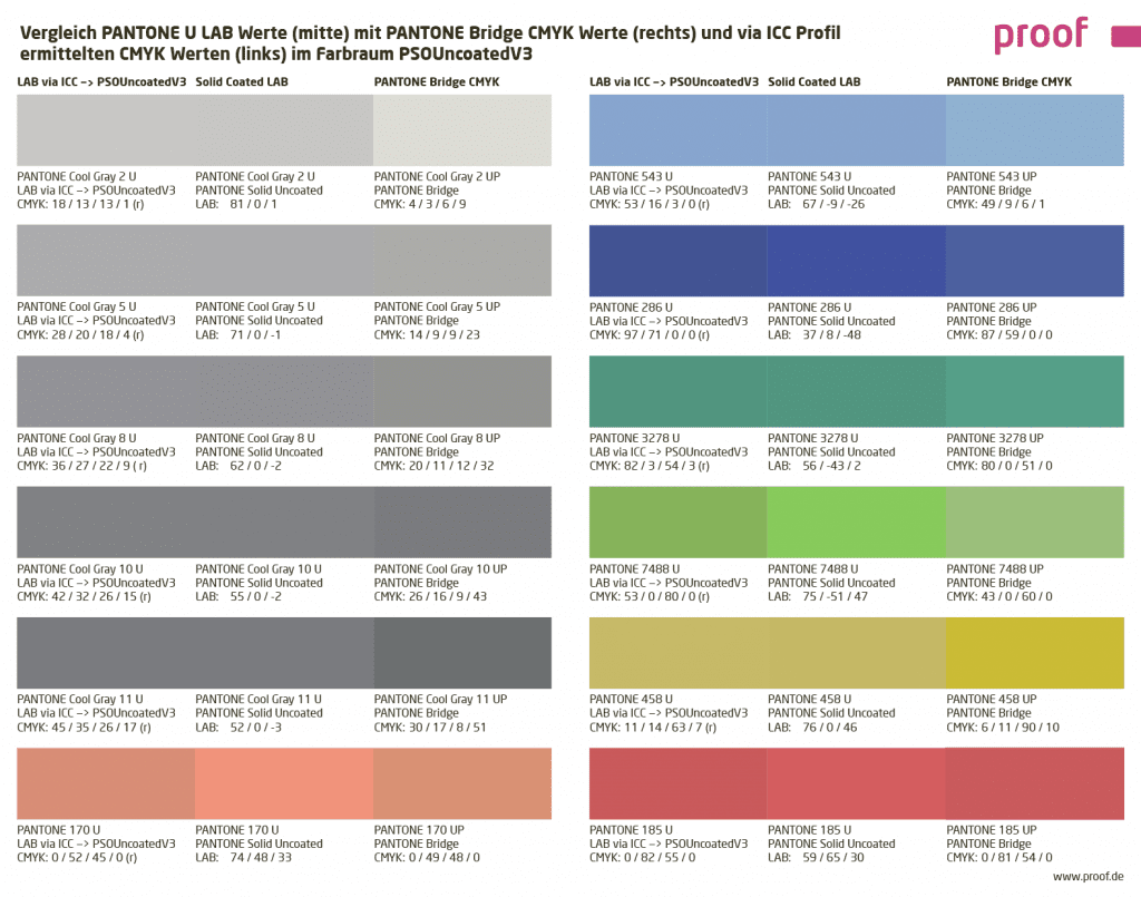
In most cases, this conversion adapted to the output color space delivers the significantly better results. See for yourself:
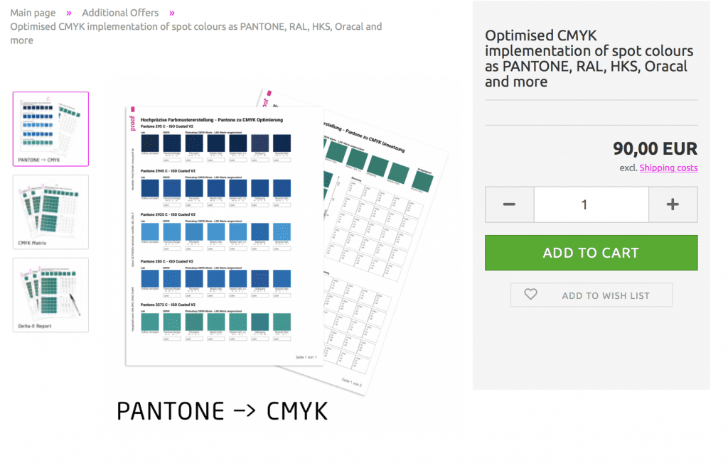
We support you in determining the optimal CMYK conversions for your PANTONE house colours
If you need the best possible conversion of one or more PANTONE colours to CMYK, we will be happy to support you with our know-how and our measuring and proofing technology. We determine and compare different imaging variants of a PANTONE colour in CMYK and show you the best determined conversions in CMYK with metrological evaluations in Delta-E00.
More articles related to this topic:
New PANTONE Formula Guides with incorrect ink formulations

Several errors have crept into the new PANTONE 2023 fan decks. In both the PANTONE Solid Coated and the Solid Uncoated color fans, there are colours for which the new ink formulations are incorrect. In the PANTONE Formula Guide Solid Coated fan 2023, PANTONE 107 C and PANTONE 108 C have absolutely identical ink recipes, as well as PANTONE 113 C and PANTONE 114 C. As the colors differ, this cannot be the correct. Several errors in the PANTONE Solid Uncoated fan 2023 In the PANTONE Solid Uncoated fan 2023 … read more
Fogra Colour Management Symposium 2026 in Munich from 24 to 26 February

The most important colour management event takes place every two years in Munich: the Fogra Colour Management Symposium. Once again this year, all professionals are invited to make the pilgrimage to Munich: two days of lectures, discussions and a Bavarian evening await participants. Matthias Betz, owner of proof.de, will also be there again: for many years, he has been taking advantage of the opportunity to exchange ideas with colleagues and friends, learn about new technologies, hardware and software, and talk to colleagues from Fogra, freieFarbe, GMG and many more. In … read more
Fogra60 proofs for metal decor printing available
From now on you can order proofs for metal decor printing on white sheet metal at proof.de: The ICC profile for Fogra60 is Metal-Printing_MPC1_FOGRA60.icc
New iPhone colour measuring devices: xade nano+ in test

A new generation of colour measuring devices is entering the market: in contrast to the classic measuring devices, which are available as a fully encapsulated system either as a colourimeter or as a spectrophotometer, and then supply the data to a computer via an interface or app or display it directly, the new generation of colour measuring devices consist only of lighting and software, with the optics of a modern iPhone from Apple being used as the sensor. Until now, there have been two categories of measuring devices on the … read more
“Digital First” often means “Colour Problems Second!”

Whether it’s a large global corporation or a small company, the following often applies to designs or redesigns today: we develop everything for digital first.
Proof GmbH 2025 once again Fogra and Fogra “Spot Cert” certified

This year we once again created proofs for Fogra certification and sent them to Munich-Aschheim for testing. With these proof prints, which we print according to three different proof standards and on three different papers, we point out that we not only deliver excellent proof quality through internal quality controls and checks, but that the quality of our proofs is also measured and confirmed by external experts. We have now had test prints certified by Fogra for the 12th time. We have also been “Spot-cert” certified for the display of … read more
Incorrect grayscale display in Adobe Photoshop and InDesign

Adobe products are ideal for image retouching and layout and handle RGB and CMYK colour profiles very well. However, when editing and retouching grayscale images, for example for a black-and-white photo book, the experience is quite different. Suddenly, images look completely different in InDesign than they do in Photoshop, and even when exporting the image to PDF, greyscale images are suddenly treated differently. This article explains where the problems lie with black-and-white images and greyscale profiles in InDesign and Photoshop layouts, and how you can work in a more ‘colour-accurate’ … read more
MYIRO-9: New Spectrophotometer from KonicaMinolta in action

Over the last few months, we at Proof.de have been thinking about further improving our already very good colour measurement technology in terms of speed and measurement precision. Relatively quickly it became clear that only two devices would come into question: The KonicaMinolta MYIRO-9, the successor of the former FD-9, or the X-Rite ISIS 2 XL. The starting point: Since we at Proof GmbH have 5 proofing devices, the calibration of targets for profile optimisation is a time-critical undertaking for us. Therefore, we had been looking around for an upgrade of … read more
Colour deviations in 2023 PANTONE Color Bridge Guides

After Eddy Hagen pointed out in this posts, that there were some major colour deviations between the brand new PANTONE Solid Coated Guide 2023 and the previous version especially for the PANTONE 2635 C, I was curious to lookup the same colours in the new PANTONE Color Bridge Coated Guide of 2023 and compare the colours with the previous version. I measured a dE00 of 8,15 between the two colours that Eddy mentioned, which is really far apart from how accurate PANTONE colours should match between the different PANTONE guides. … read more
RGB colour spaces explained

RGB colour spaces are colour systems that represent different hues with the three primary colours red, green and blue. RGB colour spaces are used in digital image processing, photography and computer technology to precisely define colours. The most important RGB colour spaces and their special features are: sRGB sRGB is the most widely used RGB colour space and is used by most monitors, printers and digital cameras. It was developed by HP and Microsoft in the 1990s to create a standard for colour representation on the internet and on various … read more