Pantone has added a further 84 colours to ist Pantone Plus colour palette in March 2014. The the total amount of the Pantone Plus colour now extends to 1755 colours as Pantone writes on his website. The colours were – matching the Pantone colour of the year: Radiant Orchid – expanded in the Rouge and Pink range, based on the previous base colours.
Two other changes compared to the previous 50th Anniversary PANTONE guides are visible:
- The cover sheets have been redesigned
- The order of colour arrangement has now changed by going to chromatic criteria and now corresponds to the chromatically correct order. The colours from 2010 and 2012 have now been logically integrated into the new colour fans.
For the CMYK guides and the Premium Metallics and Neons & pastel colour guides only the cover pages have been updated. Graphic artists and the printing industry should forthwith upgrade its Solid Coated and Solid Uncoated guides to those of 2014 or newer.
Customers are annoyed by Pantone Product Policy
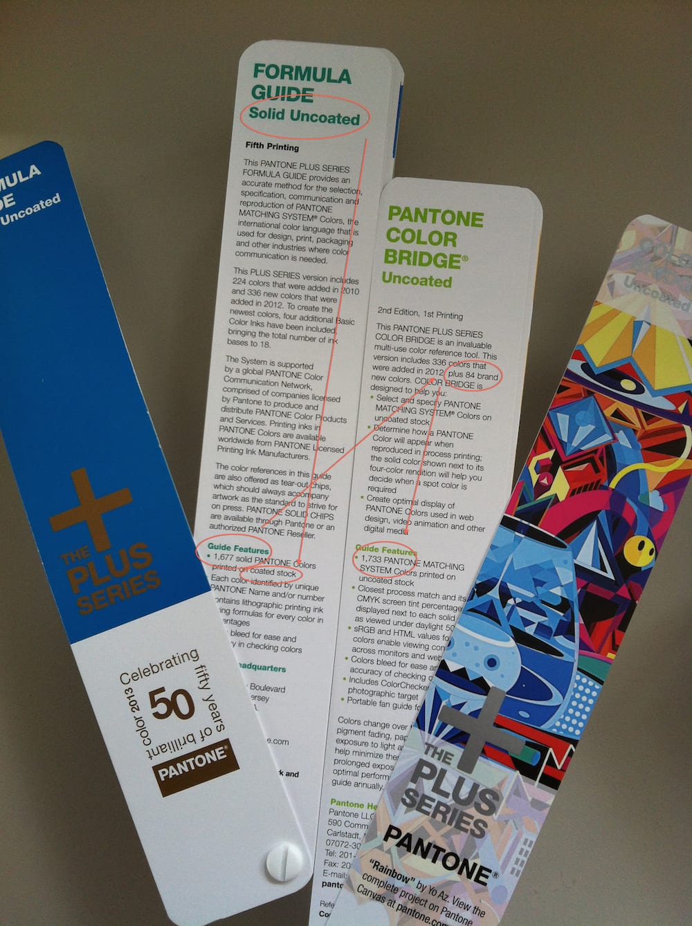
Since the year 2010, there has been chaos in the PANTONE Plus colour portfolio, which is not improved by the new colour guides generation. At present, there are four parallel Pantone Plus colour guides on the market, three of them with different number of colours included in the guide, although that is hardly communicated by Pantone.
The same is true for the Pantone product partners such as Adobe: Hardly any graphic designer knows what Pantone Plus colour are integrated into Adobe the specific Version since neither Pantone nor Adobe characterize their colour guide generation different. Pantone’s statement: “Compatible with today’s digital workflows – colours can be easily updated in leading design applications” translates rather: “What Pantone colours you see in your application, is pure cuincidence – depending on the update status and your manual intervention.”
Even Pantone has no idea about Pantone Plus
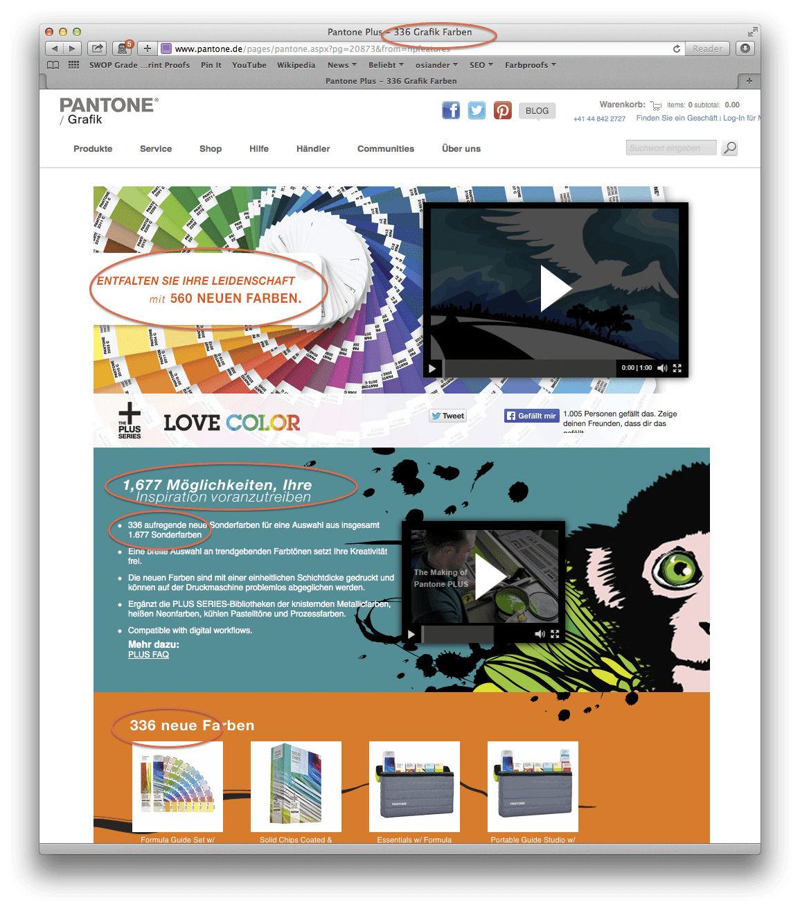
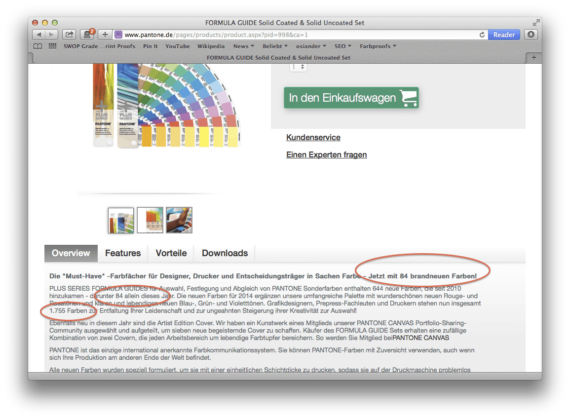
In the last post on proofing.de about Pantone Plus two screenshots of Pantone websites were shown, where Pantone has released completely different figures on the newly added colours. On Pantone.de the Pantone Plus page showed as follows:
At least the total number of colours is however indisputable: 1677 spot colours.
Equally undisputed that Pantone has new colours added so far 84 new colours. A simple addition helps: 1761 colours. Right?
False. According to Pantone, there are 1755. Whether Pantone has forgotten six colours, or six colours have been removed from the current colour guide, remains a mystery.
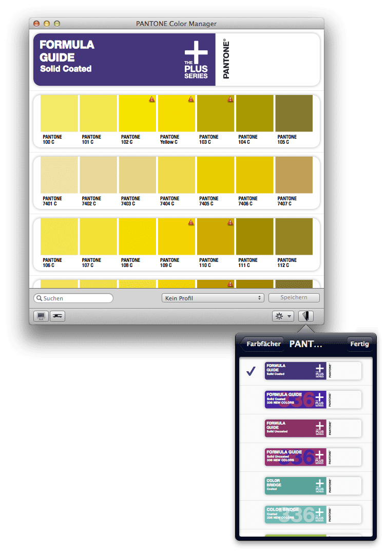
It fits into the picture that the current version of the 39 Euro Pantone Color Manager knows neither the current nor the Pantone Plus subjects previously available in the Pantone 50th Anniversary colour guide. When Pantone will integrate its own colours in its own products, thus remains to be seen.

Addendum 15.03.2014:
After I had informed Pantone about my annoyance I received from Pantone the following explanations:
The colours in the Pantone Color Manager are submitted as soon as possible
The six colours are missing because six PANTONE GOE basic colours have been removed, as they were not used as basic colours by PANTONE anymore.
My knowledge was so, that at the last update, four new basic colours from the Pantone GOE range had been added to PANTONE Plus: Pantone Bright Red, Pink, Medium Purple and Dark Blue, and that therefore the number of Pantone Matching System base colours would rise from 14 to 18. If this case, however, two colours would indeed still be missing. Pantone wrote me this: “When the two systems were separated, 6 Goe Colors Base were the exact same colours found in the Pantone Matching System When we printed these base inks, they had very slightly different ink film so we called them different BaseNames:
Goe PANTONE MATCHING SYSTEM
PANTONE Medium Yellow = PANTONE Yellow 012
PANTONE Bright Orange = PANTONE Orange 021
PANTONE STRONG Red = PANTONE Rubine Red
PANTONE Medium Blue = PANTONE Process Blue
PANTONE Bright Green = Green PANTONE
PANTONE Neutral Black = Black PANTONE
Now that the Goe has been discontinued we only used the PANTONE MATCHING SYSTEM name for these base colours.”
This now explains the lack of colours: 6 Pantone Goe basic colours disappeared due to the unification. This is the number of really active colour preferences:
1755 PANTONE MATCHING SYSTEM Colours.
And the number of Pantone base colours has risen in Pantone Plus by four to now:
18 PANTONE MATCHING SYSTEM Base Colours
Grafipress announced plans to deliver the new colour guides from Monday, March 17, 2014as they are by now only announced by PANTONE.
Addendum 18.03.2014
We’ve received the new Pantone colour guides today. For curiosities sake, I compared the first few pages and yes: found some inconsistencies. My request for Pantone remained unanswered until now unfortunately … 🙂

Addendum 03.04.2014
After a long conversation with an employee of PANTONE Germany it is clear: the lack of colour of PANTONE Bridge subjects are the PANTONE metallics and neon basic colours, as the colours are no longer included in the standard solid Uncoated colour guide. They were left out due to poor representability in CMYK in Bridge subjects. Only the Panone base colours that are part of the PANTONE Matching System are included in the colour guides, resulting in the different number of colours. The false statement on the German Pantone website is to be corrected as soon as possible.
This explains some errors, but makes others still not really logical. The most important good news for PANTONE user is: The conversion and extension of the PANTONE Plus colour palette due to the discontinuation of PANTONE GOE seems completed in 2014. Aside from minor adjustments such as the adaptation of the the PANTONE GOE base colours in Premium Metallics guide, according to the staff member no large innovations and additions are still to come. It remains to be hoped that after 2014 little rest will come in the PANTONE colour cosmos.


