
Today a customer called who wanted to order a proof of several HKS N spot colours on an uncoated paper. “Which proof profile should I choose? And how exactly can you match my spot colours in the proof? I probably have to proof several HKS N red tones in comparison. By the way, the printing is to be done on Fly Cream, a slightly yellowish paper.”
What is the paper white of the production paper?
First of all, I searched with the customer for the production paper in our paper white database. A quick look via full text search revealed that we have measured Fly Cream from Papier Union:
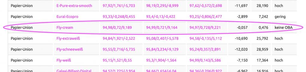
With a B-value in LAB of 9.2, Fly Cream is really not just a little yellowish, as the customer said, but clearly yellowish, chamois, creamy … whatever you want to call it. So it was natural to check the proof profile “ISOUncoatedYellowish”, Fogra 30, to see to what extent the paper white could match.
What is the paper white of the possible proof standard?
Together with the customer we looked up our “paper white of proof profiles” table:
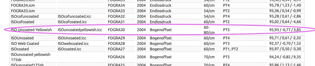
Contrary to the customer’s expectations, the paper white of ISOUncoatedYellowish is not even as yellowish as the paper white of the edition paper Fly cream, which is more yellowish by more than 5 steps on the B axis. So it was clear: PSOUncoated as a brighter-free uncoated paper proof standard is clearly too white, ISOUncoatedYellowish is much more suitable.
On what kind of proof paper will this proof standard be printed?
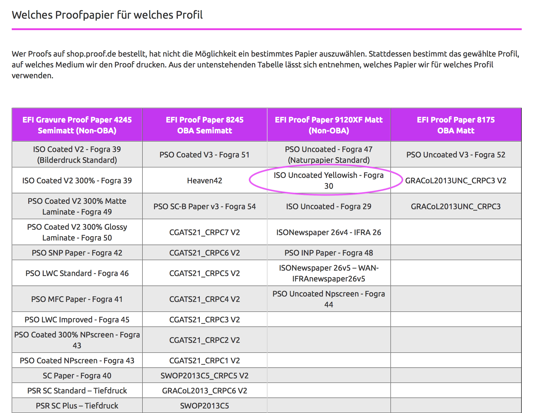
As the paper white of the edition paper was determined by Papier-Union and the proof standard ISOUncoatedYellowish turned out to be suitable, the next step was to check on which paper we would proof ISOUncoatedYellowish. Because once we know this, we can also check how well we can match the spot colour red tones of the HKS N on this paper. We also have an overview of this on the page Proofing Papers. There you will find a table showing which proof standard we proof on which paper.
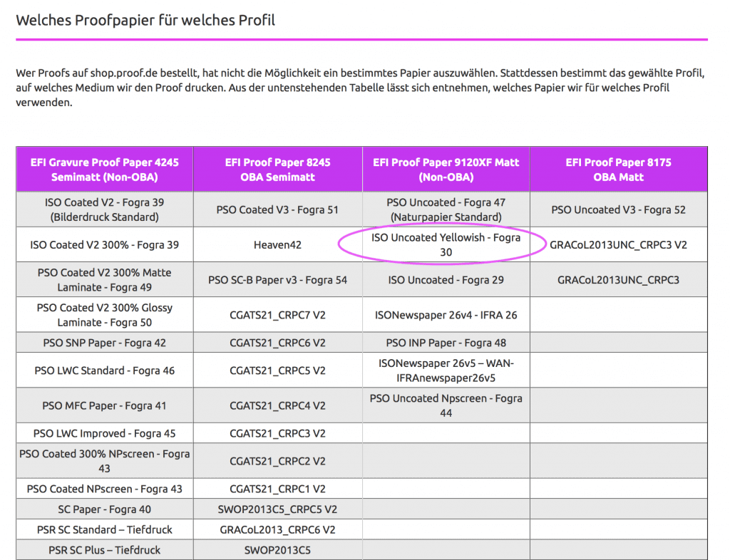
Now that the proof paper was clear with EFI 9120 XF, we could move on to the last table: The precision of the colour reproduction of spot colours on our respective proof papers. These tables can be found on the page: PANTONE and HKS Proofing
Colour deviations when proofing HKS and PANTONE colours
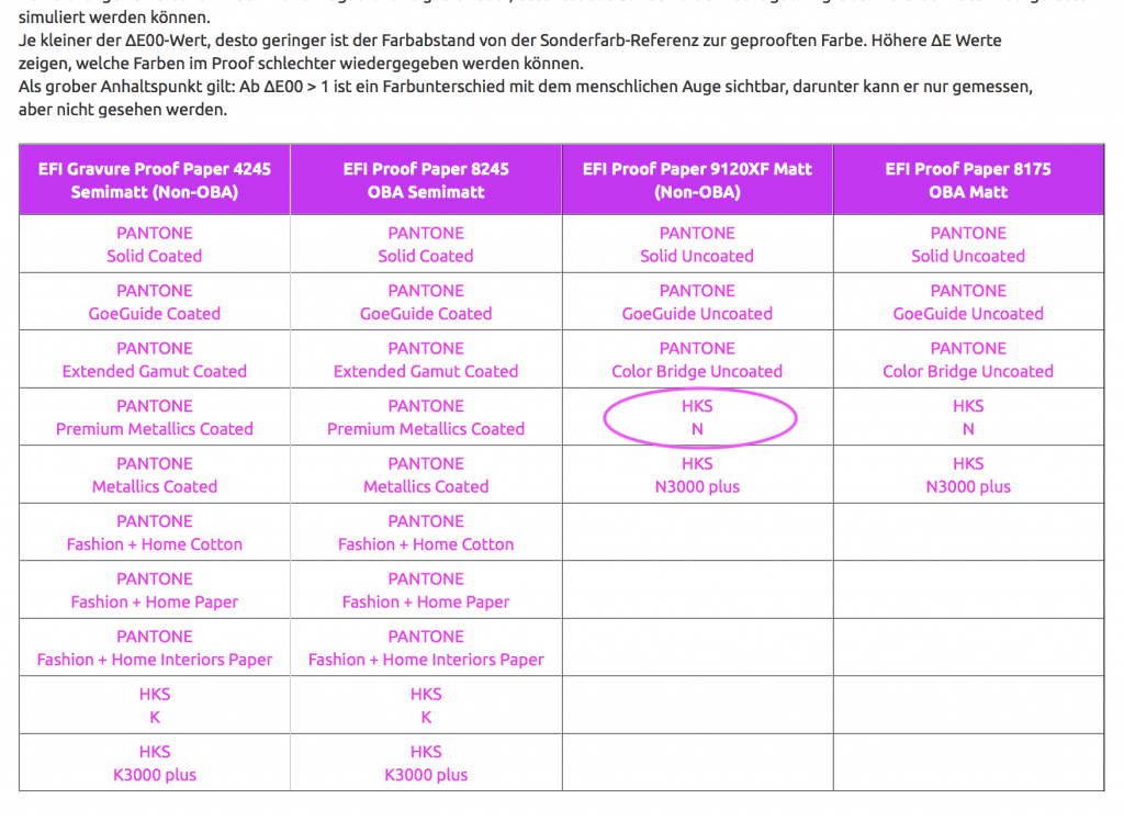
Now we can move on to the last table: Color deviations of HKS N colors in proofing on EFI 9120 proof paper. Here our customer can check, even before the proof, how well we can technically match his HKS N spot colours in the proof. We can achieve his potential HKS N red tones very well with values well below Delta-E00 = 1, so a difference in the visual perception of his HKS N colours compared to the original HKS reference will be hardly visible.
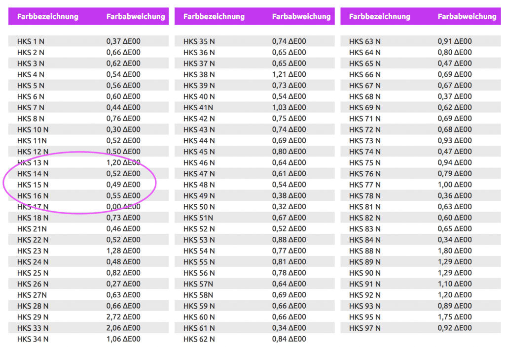
Conclusion: The measurement and analysis work of the last few months is paying off noticeably for our proofing customers.
This example clearly shows that our customers can use our paper-white tables and our tables with spot colour deviations in proofing to make competent preliminary decisions about the usefulness of a proof with spot colours and also inform their customers in advance about the accuracy of fit between the paper white of the proof and the production paper. And all this without ever having had a sheet of the production paper or a spot colour fan of the selected spot colour in their hands.
What we do not simulate in the concrete case should also be said at this point: If the customer now orders a proof with four HKS N spot colours in the proof standard ISOUncoatedYellowish, then he must be aware of the fact that we do not really simulate the paper white of the production paper Papier-Union Fly Cream but only the standard-compliant paper white value of the selected proof profile ISOUncoatedYellowish. What we also don’t simulate is the shift of the HKS N red tones in direction to yellow due to the chosen production paper or proof standards, as we concentrate on the LAB value of the spot colour definition of HKS N that is stored in the proof system. The red tones will therefore also appear somewhat warmer and more yellowish in the print run on Fly Cream than in the proof.
More articles related to this topic:
Incorrect grayscale display in Adobe Photoshop and InDesign

Adobe products are ideal for image retouching and layout and handle RGB and CMYK colour profiles very well. However, when editing and retouching grayscale images, for example for a black-and-white photo book, the experience is quite different. Suddenly, images look completely different in InDesign than they do in Photoshop, and even when exporting the image to PDF, greyscale images are suddenly treated differently. This article explains where the problems lie with black-and-white images and greyscale profiles in InDesign and Photoshop layouts, and how you can work in a more ‘colour-accurate’ … read more
New iPhone colour measuring devices: xade nano+ in test

A new generation of colour measuring devices is entering the market: in contrast to the classic measuring devices, which are available as a fully encapsulated system either as a colourimeter or as a spectrophotometer, and then supply the data to a computer via an interface or app or display it directly, the new generation of colour measuring devices consist only of lighting and software, with the optics of a modern iPhone from Apple being used as the sensor. Until now, there have been two categories of measuring devices on the … read more
New PANTONE Formula Guides with incorrect ink formulations

Several errors have crept into the new PANTONE 2023 fan decks. In both the PANTONE Solid Coated and the Solid Uncoated color fans, there are colours for which the new ink formulations are incorrect. In the PANTONE Formula Guide Solid Coated fan 2023, PANTONE 107 C and PANTONE 108 C have absolutely identical ink recipes, as well as PANTONE 113 C and PANTONE 114 C. As the colors differ, this cannot be the correct. Several errors in the PANTONE Solid Uncoated fan 2023 In the PANTONE Solid Uncoated fan 2023 … read more
Proof GmbH 2025 once again Fogra and Fogra “Spot Cert” certified

This year we once again created proofs for Fogra certification and sent them to Munich-Aschheim for testing. With these proof prints, which we print according to three different proof standards and on three different papers, we point out that we not only deliver excellent proof quality through internal quality controls and checks, but that the quality of our proofs is also measured and confirmed by external experts. We have now had test prints certified by Fogra for the 12th time. We have also been “Spot-cert” certified for the display of … read more
New edition of ISOCoatedV2 in M1 in sight?

Even almost 9 years after the introduction of the successor colour space PSOCoatedV3, ISOCoatedV2 / FOGRA39 is still the most widespread colour space in Europe. We at Proof GmbH count around 200 jobs from time to time for the German Printing and Media Industries Federation, among others. In the last count, proofs in ISOCoatedV2 accounted for around 68% of all proof jobs at our company. This is a clear sign of the continued widespread use of the colour space. ISOCoatedV2: From the classic colour space to the beacon of the … read more
New in the Proof Shop: Separate invoice email

At long last, we are able to fulfil a request made by many of our customers: from now on, you can register two email addresses in the Proof Shop – one for logging in and receiving status or tracking emails, and a separate one solely for receiving digital PDF invoices. Over the past few years, we have already switched many Proof customers to digital invoicing at their request, i.e. we generated a PDF invoice and then sent it manually to a second email address on file with us in the … read more
X-Rite i1Profiler no longer supports i1Pro2 and i1iO 2

Anyone who has reinstalled or updated their i1 Profiler app in the last few weeks has been confronted with disturbing news: X-Rite announced directly in the start window that it would no longer support its enormously popular i1Display and i1Pro2 devices. Users of the i1Pro 2 devices and i1iO 2 tables, which are extremely popular in printing and colour management, will be particularly hard hit by the announcement: An investment of €6,000 is quickly consigned to the electronic scrap heap. But what can you do if you own such a … read more
Proof.de is featured twice in the “Fogra Aktuell” magazine

In the current issue of Fogra News “Fogra Aktuell” Proof GmbH is involved in two places. Firstly, a summary of the Fogra report on our first FOGRA55 certification for seven-colour printing with extended colour space in CMYKOGV appeared. You can also find more information on our FOGRA55 certification on the Fogra website: https://fogra.org/en/press-releases/fogracert-erste-cpc-zertifizierung-fuer-fogra55-cmykogv-330 and on proofing.de: And secondly, there was a report on the completion of the research project for textile digital printing, FOGRA58, in which we were allowed to investigate and test the proof capability of the new textile … read more
MYIRO-9: New Spectrophotometer from KonicaMinolta in action

Over the last few months, we at Proof.de have been thinking about further improving our already very good colour measurement technology in terms of speed and measurement precision. Relatively quickly it became clear that only two devices would come into question: The KonicaMinolta MYIRO-9, the successor of the former FD-9, or the X-Rite ISIS 2 XL. The starting point: Since we at Proof GmbH have 5 proofing devices, the calibration of targets for profile optimisation is a time-critical undertaking for us. Therefore, we had been looking around for an upgrade of … read more
Precise proofing of tonal values of spot colours

In recent weeks, there have been lengthy discussions on the Fogra digital printing mailing list as to whether a research project should be launched to define standardised tonal value gradations for spot colours. What is this all about? In the field of CMYK and seven-colour printing, the definition of clear, printable and proofable standards is well established and has been tried and tested in practice. If the paper or paper class is known and defined, a measuring standard such as M0/M1/M2 has been established and the content of optical brighteners … read more