Proof. de offers proofs according to the latest tolerance criteria of ISO 12647-7:2016

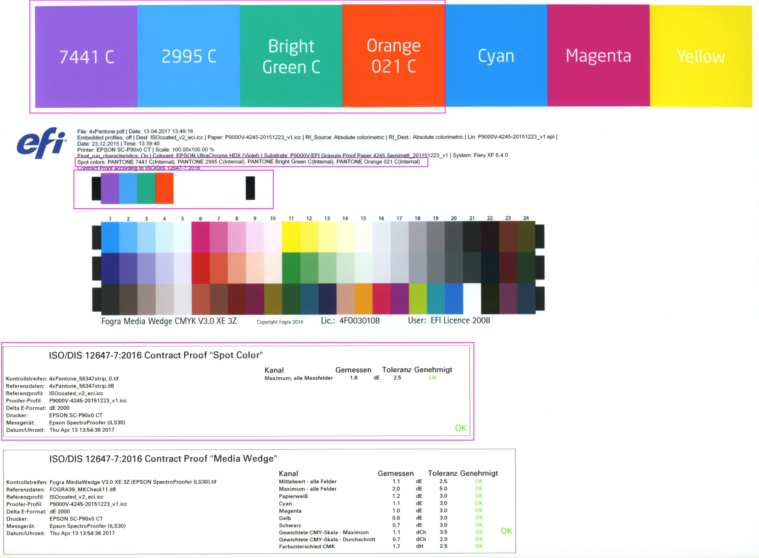
The ISO 12647-7 proofing standard was revised in November 2016 and the test criteria for FograCert contract proof creation were adapted. We have now incorporated these changed criteria into our proofing system and are now working to the stricter tolerances of the latest ISO 12647-7:2016.

Why hardly anything changes for our Proof customers

The good news is: you won’t notice that our proofs are now precisely produced according to the latest standards. Why? Quite simply: Because our demands on our proofing system, our FIERY proofing software, our EFI proofing papers and the X-Rite measuring decvices are already so high that all components of our proofing system – and of course our proofs themselves – have been meeting the new criteria of the revised November 2016 standard for years.

The most important new features of the new Proof Norm in brief

1. colour accuracy

The new standard brings the classical formula for the colour distance Delta-E from the traditional definition of 1976 (CIELAB 1976) to the updated version of 2000 (CIEDE2000). Since the values cannot be converted directly, new tolerances for the test report are introduced, which are valid immediately. These new tolerances and new criteria are also the only difference that you will notice on our proof when you take a closer look at it.

Why this change: Fogra used measurements from the 116 Contract Proof Certifications from 2016 to show that the old and new tolerances of the old? These colors have so far had a? E-value that is too high in relation to the visual assessment. The new Delta-E values, on the other hand, are much more “equidistant”, i. e. with the human assessment of the colour distance, which Fogra has also demonstrated in tests.

The deviations of the gray axis and hue are now also determined more precisely, the evaluation of the hue spacing? You can also see this on the test report. The Fogra writes:”Since HC mainly depends on the hue angle, the evaluation of neutral grey or similar colours with sometimes very large differences in brightness and saturation did not yield meaningful results. The measure?Ch now describes the actual distance of a color pair in the CIEa*b* plane and is therefore no longer suitable only for the evaluation of the colorfulness difference of very rich colors.

2. durability of proofing papers

The ageing tests for proof papers were clarified more clearly with the introduction of the new standard. All certified proof papers undergo the following tests:

Read more

Easy conversion of Pantone – HKS – CMYK – RGB with Adobe Photoshop

Color Selector - Adobe Photoshop

Farbbücher Auswahl in Adobe Photoshop CC: HKS, Pantone, CMYK und vieles mehr

More often the question arises as to what kind of Pantone colour corresponds to the HKS 43 K. Or what CMYK value? And what kind of web color in RGB?

If you own Adobe Photoshop, you can do these conversions directly there. In Photoshop CC all well-known color books are stored with values.

Let’s assume we are looking for the Pantone equivalent and the matching CMYK color of HKS 43 K.

1: Open the color palette in Adobe Photoshop and select HKS K as the book and then the color HKS 43 K. All well-known colour books are directly stored in Photoshop.

Farbauswahl von HKS 43 K im Buch HKS K in Adobe Photoshop CCThe color corresponds to a Lab value of 26/29/-79 and a CMYK value is already stored here. Simply select the book HKS K Process:

Read more

Can spot colours be proofed?

Since many printed matter contains spot colours such as Pantone or HKS, the question often arises whether these colours can be proofed at all. The answer is “no”. Only an approximate simulation of these colors is possible.
The reason: Each special ink is a specially mixed, “real” ink and therefore cannot be mixed from the 4 printing inks (cyan, magenta, yellow and black).

Today, modern proofing machines have up to 12 different printing colours and, in addition to the classic primary colours, also have, for example, orange and green and violet as real colour pigments in the machine. Proof printers such as the Epson SureColor P9000V are therefore capable of displaying significantly larger color spaces than, for example, ISOCoatedV2. The spot color simulation in these devices is therefore sometimes very good when controlled via a Contone driver, which can access the entire color space of the proof printer. Epson himself points out, for example, that “98% of all Pantone colors” can be covered. This may be doubted, but a number of over 90% of all Pantone colors is realistic from our point of view.

In the past, Pantone and HKS colors were simply converted by the proofing systems to CMYK and then simulated in the standard color space, i.e. mostly ISOCoatedV2. The representation of the colors here is mostly completely insufficient. For the reproduction of Pantone and HKS colours in a proof it is therefore immensely important to have a modern proof printer with many colours and a high colour gamut and a modern proofing software which is also able to precisely control the printed gamut.

Differences in the quality of the simulation of spot colors can quickly be seen in the different printing systems: If the proofing service provider prints with an older 6-color or 8-color system (Cyan, Light Cyan, Magenta, Light Magenta, Yellow and Black or Light Black), spot colors are simulated worse than, for example, with a modern 11-color system with Cyan, Light Cyan, Orange, Yellow, Magenta, Light Magenta, Photo Black, Matte Black, Light Black, Light light Black and Green.

The higher simulation quality of the spot colors is generated by the fact that orange, for example, already exists as a separate color and does not have to be mixed from magenta and yellow before the spot color simulation.

Of course, it must be said that there are limits, especially in the area of metallic or fluorescent colours; these colours are currently not reproducible in proofing.

The spot-colour simulation of gradations is also critical

In most proofing systems, only the 100% values of a Pantone or HKS color are underlaid. If, for example, a font logo with 100% color application of a Pantone color is to be simulated, this is precise and is well represented in most proofing systems.

However, it becomes more difficult if the logo contains not only 100% areas but also a 30% Pantone colour area, since this is not defined in the proofing system, but is simulated by the proofing system. In some cases, considerable deviations from e.g. HKS colour fans can be observed.

It becomes even more difficult if, for example, a grayscale TIFF lies on a 100% HKS area and overprints. For the graphic professional it is immediately comprehensible that the HKS surface simply has to become correspondingly darker at this point due to an overprinting 30% black. However, the proofing software must recognize this effect correctly, calculate it correctly and then simulate it correctly with the 11 colors available from the proof printer. It is easy to understand that countless errors can occur. And the supreme discipline: 7-colour Pantone files with lots of overlaying and overprinting Pantone colours or HKS colours with overprinting CMYK elements can at best be calculated even by the most modern proofing systems, but can by no means be colour-accurately simulated.

The bad news is that a proof with spot colors is therefore never as color-binding according to the current state of the art and varies more depending on the proofing system.

But the good news is that spot colors, especially solid colors, can now be simulated well by modern proofing systems. A modern proofing system therefore also offers the possibility of getting a realistic impression of spot color prints at a fraction of the cost of a test print on a offset press.

WordPress Cookie Plugin by Real Cookie Banner