More articles related to this topic:
Proof.de is featured twice in the “Fogra Aktuell” magazine

In the current issue of Fogra News “Fogra Aktuell” Proof GmbH is involved in two places. Firstly, a summary of the Fogra report on our first FOGRA55 certification for seven-colour printing with extended colour space in CMYKOGV appeared. You can also find more information on our FOGRA55 certification on the Fogra website: https://fogra.org/en/press-releases/fogracert-erste-cpc-zertifizierung-fuer-fogra55-cmykogv-330 and on proofing.de: And secondly, there was a report on the completion of the research project for textile digital printing, FOGRA58, in which we were allowed to investigate and test the proof capability of the new textile … read more
MYIRO-9: New Spectrophotometer from KonicaMinolta in action

Over the last few months, we at Proof.de have been thinking about further improving our already very good colour measurement technology in terms of speed and measurement precision. Relatively quickly it became clear that only two devices would come into question: The KonicaMinolta MYIRO-9, the successor of the former FD-9, or the X-Rite ISIS 2 XL. The starting point: Since we at Proof GmbH have 5 proofing devices, the calibration of targets for profile optimisation is a time-critical undertaking for us. Therefore, we had been looking around for an upgrade of … read more
Proofs with Digimarc EAN codes and verification
Digimarc is a digital watermark that can be used to embed information in images, videos or other media. Digimarc watermarks are invisible to the human eye, but remain recognisable to special software or devices. Digimarc is becoming increasingly popular in the packaging sector in particular, as this technology allows the digits of the EAN barcode and more to be applied invisibly to all areas of the packaging. Digimarc and EAN barcode at the supermarket checkout When scanning at the checkout, the checkout staff do not have to search for the … read more
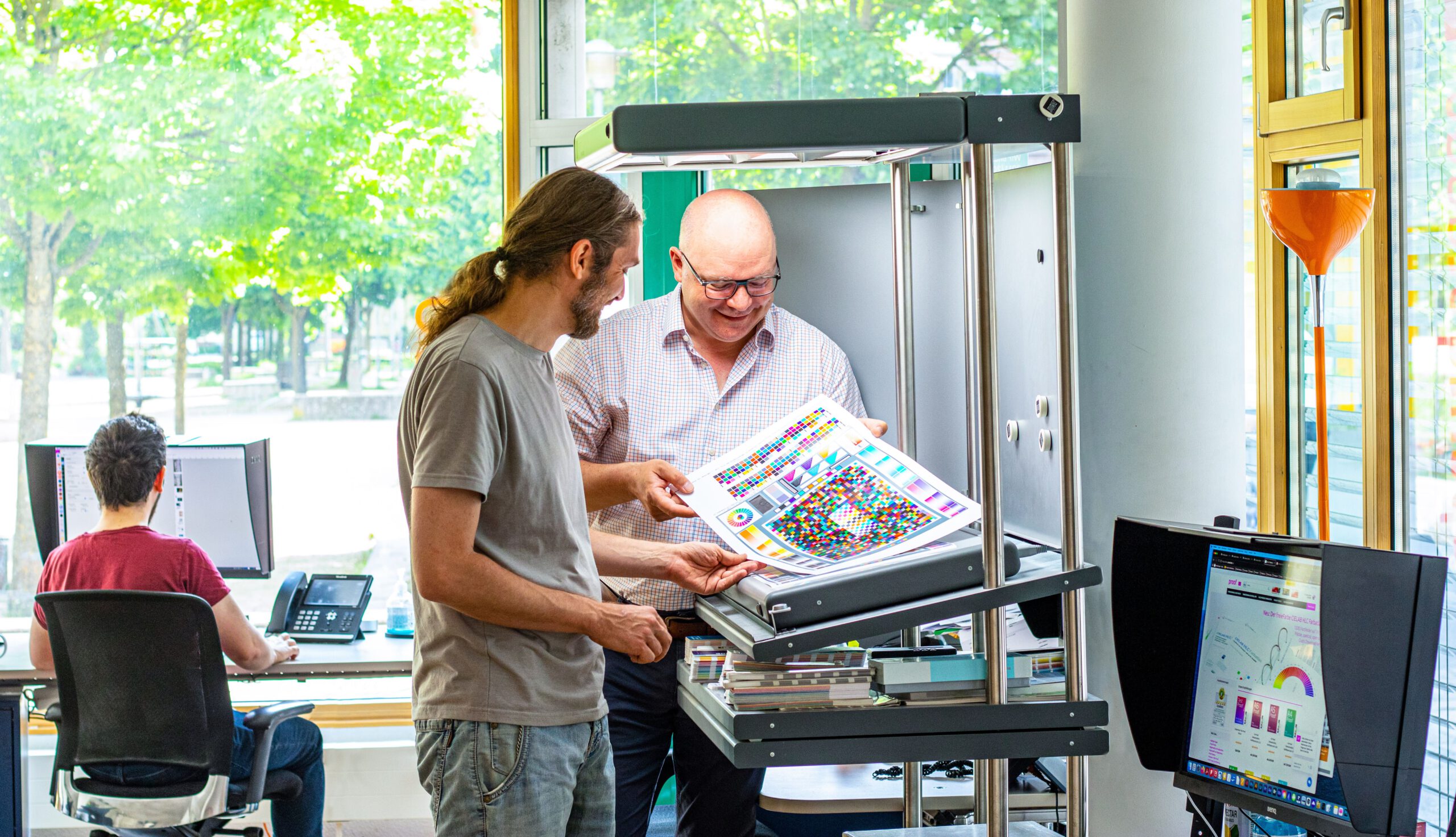
Proof GmbH 2025 once again Fogra and Fogra “Spot Cert” certified

This year we once again created proofs for Fogra certification and sent them to Munich-Aschheim for testing. With these proof prints, which we print according to three different proof standards and on three different papers, we point out that we not only deliver excellent proof quality through internal quality controls and checks, but that the quality of our proofs is also measured and confirmed by external experts. We have now had test prints certified by Fogra for the 12th time. We have also been “Spot-cert” certified for the display of … read more
Precise proofing of tonal values of spot colours

In recent weeks, there have been lengthy discussions on the Fogra digital printing mailing list as to whether a research project should be launched to define standardised tonal value gradations for spot colours. What is this all about? In the field of CMYK and seven-colour printing, the definition of clear, printable and proofable standards is well established and has been tried and tested in practice. If the paper or paper class is known and defined, a measuring standard such as M0/M1/M2 has been established and the content of optical brighteners … read more
New certified proof papers at proof.de

In recent years, various problems have arisen with our previous proof paper supplier. On the one hand, we sometimes had to wait more than three months for paper deliveries; on the other hand, we sometimes had significant problems with batch-to-batch discrepancies, surface defects and much more. After lengthy deliberations, we decided in December to replace all the paper. We therefore received pallets of new paper at the turn of the year, which we are now gradually incorporating into our production. There will be no hard cut, but the new papers … read more
New edition of ISOCoatedV2 in M1 in sight?

Even almost 9 years after the introduction of the successor colour space PSOCoatedV3, ISOCoatedV2 / FOGRA39 is still the most widespread colour space in Europe. We at Proof GmbH count around 200 jobs from time to time for the German Printing and Media Industries Federation, among others. In the last count, proofs in ISOCoatedV2 accounted for around 68% of all proof jobs at our company. This is a clear sign of the continued widespread use of the colour space. ISOCoatedV2: From the classic colour space to the beacon of the … read more
New PANTONE Formula Guides with incorrect ink formulations

Several errors have crept into the new PANTONE 2023 fan decks. In both the PANTONE Solid Coated and the Solid Uncoated color fans, there are colours for which the new ink formulations are incorrect. In the PANTONE Formula Guide Solid Coated fan 2023, PANTONE 107 C and PANTONE 108 C have absolutely identical ink recipes, as well as PANTONE 113 C and PANTONE 114 C. As the colors differ, this cannot be the correct. Several errors in the PANTONE Solid Uncoated fan 2023 In the PANTONE Solid Uncoated fan 2023 … read more
Fogra60 proofs for metal decor printing available
From now on you can order proofs for metal decor printing on white sheet metal at proof.de: The ICC profile for Fogra60 is Metal-Printing_MPC1_FOGRA60.icc
“Digital First” often means “Colour Problems Second!”

Whether it’s a large global corporation or a small company, the following often applies to designs or redesigns today: we develop everything for digital first.