
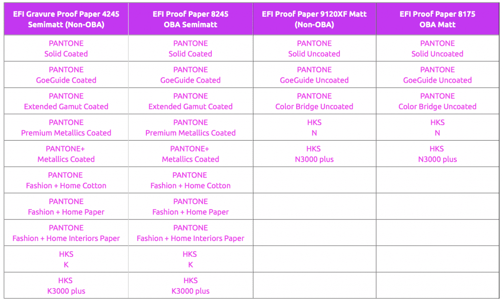
Current proofing systems can reproduce spot colours such as HKS or Pantone very well. With the Fiery XF 6.5.2 proofing software and the Epson SureColor-P9000V Spectro proof printer, we have evaluated the colour deviation in Delta-E00 with which the various PANTONE and HKS colours can be proofed. On shop.proof.de, the tables are now available for all important PANTONE and HKS colour systems, sorted by colour fans.
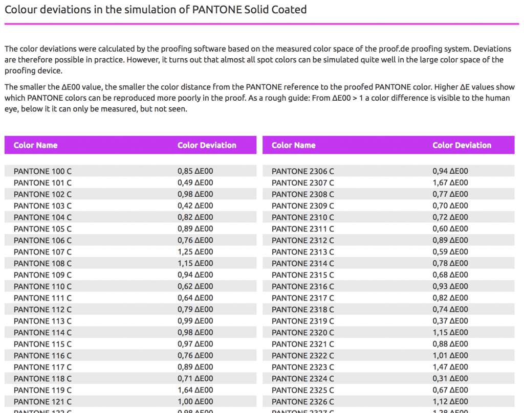
A distinction is made between the proofing substrates that we use, since the surface texture and the paper white also have an influence on the representability of the colours. The colour deviations were calculated by the proofing software on the basis of the measured colour space of the proof.de proofing system. Deviations are therefore possible in practice. However, it turns out that almost all spot colours can be simulated quite well in the large colour space of our proofing devices. The smaller the ∆E00 value, the smaller the colour distance from the spot colour reference to the proofed colour. Higher ∆E00 values show which colours can be reproduced more poorly in the digital proof.
As a rough guide: From ∆E00 > 1 a colour difference is visible to the human eye, below it it can only be measured, but not seen.
More articles related to this topic:
New PANTONE Formula Guides with incorrect ink formulations

Several errors have crept into the new PANTONE 2023 fan decks. In both the PANTONE Solid Coated and the Solid Uncoated color fans, there are colours for which the new ink formulations are incorrect. In the PANTONE Formula Guide Solid Coated fan 2023, PANTONE 107 C and PANTONE 108 C have absolutely identical ink recipes, as well as PANTONE 113 C and PANTONE 114 C. As the colors differ, this cannot be the correct. Several errors in the PANTONE Solid Uncoated fan 2023 In the PANTONE Solid Uncoated fan 2023 … read more
RGB colour spaces explained

RGB colour spaces are colour systems that represent different hues with the three primary colours red, green and blue. RGB colour spaces are used in digital image processing, photography and computer technology to precisely define colours. The most important RGB colour spaces and their special features are: sRGB sRGB is the most widely used RGB colour space and is used by most monitors, printers and digital cameras. It was developed by HP and Microsoft in the 1990s to create a standard for colour representation on the internet and on various … read more
New edition of ISOCoatedV2 in M1 in sight?

Even almost 9 years after the introduction of the successor colour space PSOCoatedV3, ISOCoatedV2 / FOGRA39 is still the most widespread colour space in Europe. We at Proof GmbH count around 200 jobs from time to time for the German Printing and Media Industries Federation, among others. In the last count, proofs in ISOCoatedV2 accounted for around 68% of all proof jobs at our company. This is a clear sign of the continued widespread use of the colour space. ISOCoatedV2: From the classic colour space to the beacon of the … read more
New certified proof papers at proof.de

In recent years, various problems have arisen with our previous proof paper supplier. On the one hand, we sometimes had to wait more than three months for paper deliveries; on the other hand, we sometimes had significant problems with batch-to-batch discrepancies, surface defects and much more. After lengthy deliberations, we decided in December to replace all the paper. We therefore received pallets of new paper at the turn of the year, which we are now gradually incorporating into our production. There will be no hard cut, but the new papers … read more
PANTONE surveys users online about product and service direction

Today I received an email in which PANTONE asked how it should orientate its products and services in the future. The users were asked which countries, industries and company sizes they come from, but also what PANTONE products should look like in the future and what customers would be prepared to pay for PANTONE services in the future. Question: How much can PANTONE services cost? PANTONE appears to be orientating itself on the PANTONE Connect prices: All price queries have the lowest price category < $ 7,- / month, i.e. … read more
We passed the first proof certification for the 7C proof under FOGRA55

A few days ago Proof GmbH was the first company to be certified for proofing for the new 7C exchange colour space FOGRA55. Fogra has developed characterisation data for extended multicolour printing with the printing colours CMYKOGV – i.e. cyan, magenta, yellow, black (contrast), orange, green and violet – FOGRA55 as part of a research project over the past few years. The characterisation data and the ICC profile Ref-ECG-CMYKOGV_FOGRA55_TAC300.icc have been published on the Fogra website in recent weeks. We have now carried out the certification via GMG ColorProof, as … read more
Fogra Colour Management Symposium 2026 in Munich from 24 to 26 February

The most important colour management event takes place every two years in Munich: the Fogra Colour Management Symposium. Once again this year, all professionals are invited to make the pilgrimage to Munich: two days of lectures, discussions and a Bavarian evening await participants. Matthias Betz, owner of proof.de, will also be there again: for many years, he has been taking advantage of the opportunity to exchange ideas with colleagues and friends, learn about new technologies, hardware and software, and talk to colleagues from Fogra, freieFarbe, GMG and many more. In … read more
New iPhone colour measuring devices: xade nano+ in test

A new generation of colour measuring devices is entering the market: in contrast to the classic measuring devices, which are available as a fully encapsulated system either as a colourimeter or as a spectrophotometer, and then supply the data to a computer via an interface or app or display it directly, the new generation of colour measuring devices consist only of lighting and software, with the optics of a modern iPhone from Apple being used as the sensor. Until now, there have been two categories of measuring devices on the … read more
Colour deviations in 2023 PANTONE Color Bridge Guides

After Eddy Hagen pointed out in this posts, that there were some major colour deviations between the brand new PANTONE Solid Coated Guide 2023 and the previous version especially for the PANTONE 2635 C, I was curious to lookup the same colours in the new PANTONE Color Bridge Coated Guide of 2023 and compare the colours with the previous version. I measured a dE00 of 8,15 between the two colours that Eddy mentioned, which is really far apart from how accurate PANTONE colours should match between the different PANTONE guides. … read more
X-Rite i1Profiler no longer supports i1Pro2 and i1iO 2

Anyone who has reinstalled or updated their i1 Profiler app in the last few weeks has been confronted with disturbing news: X-Rite announced directly in the start window that it would no longer support its enormously popular i1Display and i1Pro2 devices. Users of the i1Pro 2 devices and i1iO 2 tables, which are extremely popular in printing and colour management, will be particularly hard hit by the announcement: An investment of €6,000 is quickly consigned to the electronic scrap heap. But what can you do if you own such a … read more