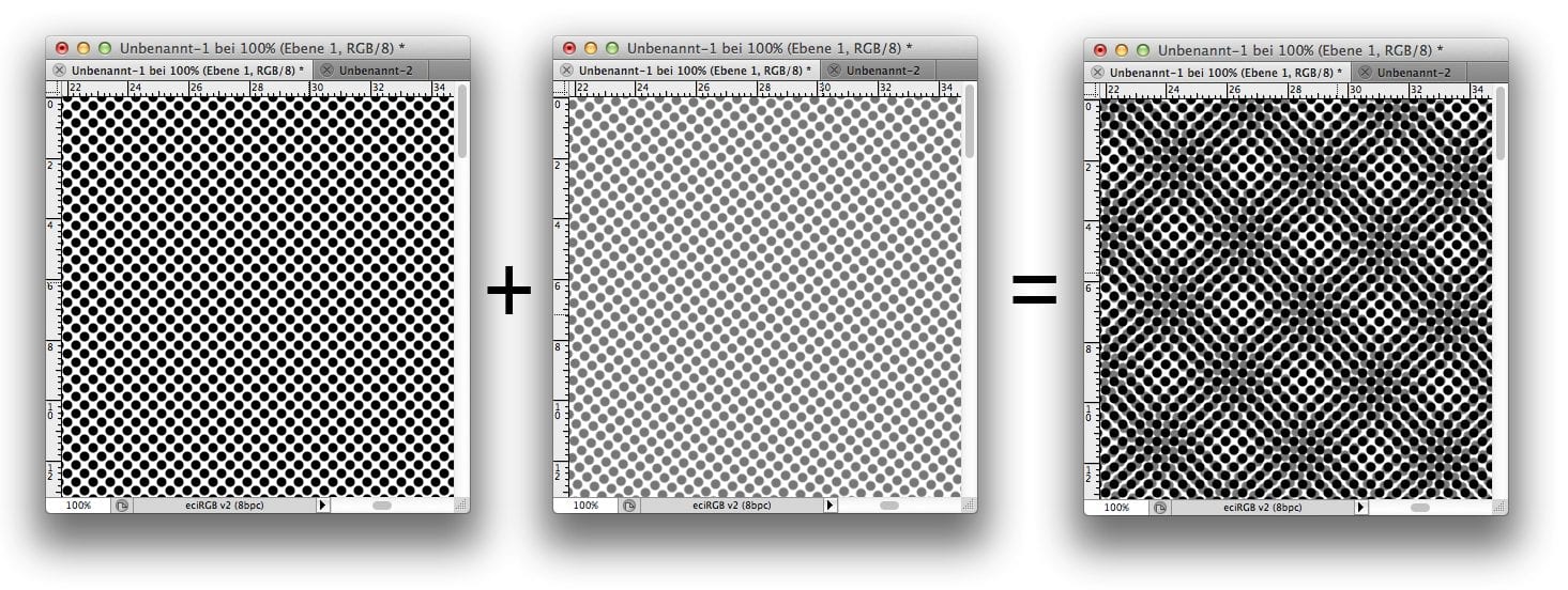
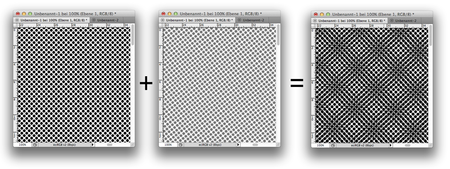
The Moiré effect, or in other words a halftone screen overlay, is a common phenomenon when viewing prints. It occurs when two even patterns overlap unevenly.
When does Moiré appear?
Moire is always created when screens overlap. Typical examples:
- You have scanned in a newspaper ad and print it in another newspaper.
- You print the portrait of a managing director wearing a jacket with a fine houndstooth pattern, a checkered shirt and a finely patterned tie. Regardless of the printing process, complete moiré chaos is guaranteed to break out here.
- A brick building is reproduced in offset printing.
- The photograph of a ventilation grille is viewed on a monitor
No Moiré occurs when:
- The motif is printed large enough, e.g. on a trade fair wall, so that no grid overlapping occurs. The print screen is sufficiently fine to reproduce the image screen completely.
- The motif is printed small enough so that no screen overlay occurs. If the check shirt is printed so small that no more check can be reproduced, Moiré will no longer appear.
- Printed in a frequency modulated screen. If the screen is distributed seemingly chaotically over the page, the chance of an overlay is significantly minimized.
You will find numerous examples of Moiré images in the Google image search. Particularly exciting: checkered shirts in different magnification levels. Have a look and search!
For the most part, moiré cannot be checked in a proof.
All common proofing systems concentrate on the reproduction of colours during proofing, but not on the reproduction of the typical offset screen and offset rosette. Why is that?
Printers work with different screen widths and screen angles. From 54 to 80 screens in sheetfed offset to 32 screens in newspaper printing, there are many screens on the market. Sometimes the screen dot is round, sometimes square, sometimes diamond-shaped. In addition, the screen angle of CMYK and spot colours also varies from printer to printer. And some printing companies also print a frequency-modulated screen that is not subject to screen angles but is produced practically randomly by the RIP. As a result, proofing companies mainly concentrate on the reproduction of colours, but not of screens and offset rosettes.
The most common proofs are produced as detailed as possible in inkjet printing without raster reproduction. In addition, proofing software manufacturers often use other calculation algorithms to make the proofs look more realistic. While in practice EFI proofs often look much fuzzier than modern offset prints printed via CTP, GMG uses artificial noise to make its proofs “look bad” and thus possibly better match the printed result. It remains to be seen whether this is useful and effective, but it also leads even further away from a recognizable Moiré.
Reliably detecting Moiré is expensive.
The only way to reliably predict possible Moiré is a press proof according to the precisely identical screen and screen angle specifications of the printer who prints the run, i.e. optimally a press proof at the same printer with the same prepress and on the same press on which the final print will later run. This is expensive, but it accurately shows the final print.
A test print at Flyeralarm is no solution.
Although Flyeralarm mainly prints the supplied data in a very high quality and accurate way, screen spacing and screen angle are certainly not identical to those of the local printing house. The Moiré at Flyeralarm is therefore certainly not comparable with that of the local printing house.
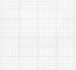
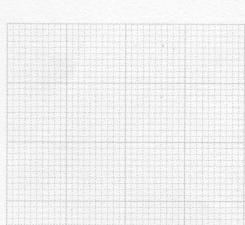
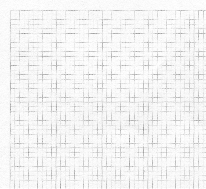
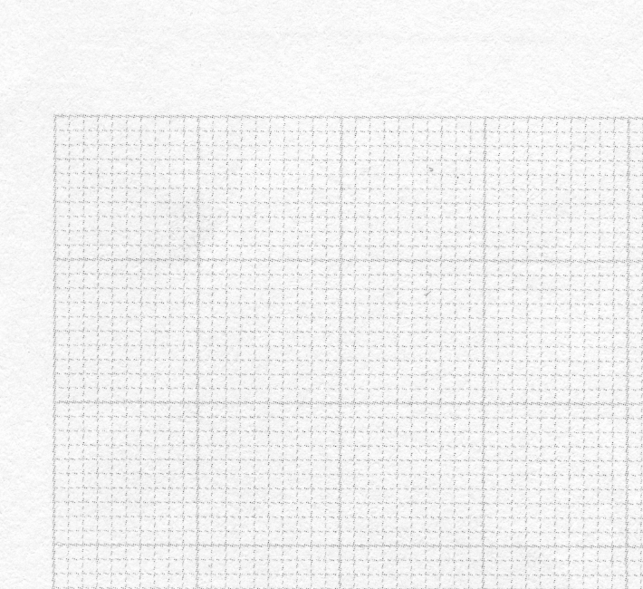
We recently had a very exciting example at hand. A notepad was printed with a millimetre grid in screened black. Picture 1 on the left shows the millimetre grid with a 45° screen angle in black and a 70 screen. Sometimes vertical lines are missing and at the bottom horizontal lines are completely missing due to the screen overlay. Figure 2 on the right shows the same millimetre grid with 15° grid angle in an 80 screen. The millimetre grid is reproduced evenly.
Both notepads were produced on the same day in the same printing company.
Interestingly, the repro company that produced the printing plates had manually changed the print screen from 15° to 45° for the first set of plates on the left because they thought it would give the best result. However, the unsatisfactory result was immediately apparent during the press proof. A notepad with missing lines will certainly not be accepted by the customer. After resetting to the original screen angle of 15° and increasing the screen from 70 to 80, a harmonious reproduction of the millimetre screen could be achieved without difficulty.
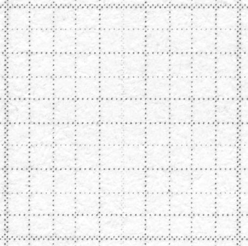
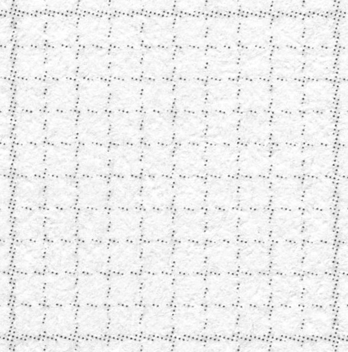
Below are the two excerpts in more detail:
More articles related to this topic:
Incorrect grayscale display in Adobe Photoshop and InDesign

Adobe products are ideal for image retouching and layout and handle RGB and CMYK colour profiles very well. However, when editing and retouching grayscale images, for example for a black-and-white photo book, the experience is quite different. Suddenly, images look completely different in InDesign than they do in Photoshop, and even when exporting the image to PDF, greyscale images are suddenly treated differently. This article explains where the problems lie with black-and-white images and greyscale profiles in InDesign and Photoshop layouts, and how you can work in a more ‘colour-accurate’ … read more
New iPhone colour measuring devices: xade nano+ in test

A new generation of colour measuring devices is entering the market: in contrast to the classic measuring devices, which are available as a fully encapsulated system either as a colourimeter or as a spectrophotometer, and then supply the data to a computer via an interface or app or display it directly, the new generation of colour measuring devices consist only of lighting and software, with the optics of a modern iPhone from Apple being used as the sensor. Until now, there have been two categories of measuring devices on the … read more
Fogra60 proofs for metal decor printing available
New feature: Orders & individual items can now be reordered with a single click

From now on, it’s much easier and faster: in the Proof Shop, you can call up and reorder entire orders or individual proofs directly from your order history. This saves you from having to re-enter every detail and gives you the assurance that all settings will be exactly the same as last time. With just a few clicks, your proofs are reordered – reliably, easily and in no time at all. What exactly is new? You can find your order history in your customer account. There are two new options … read more
X-Rite i1Profiler no longer supports i1Pro2 and i1iO 2

Anyone who has reinstalled or updated their i1 Profiler app in the last few weeks has been confronted with disturbing news: X-Rite announced directly in the start window that it would no longer support its enormously popular i1Display and i1Pro2 devices. Users of the i1Pro 2 devices and i1iO 2 tables, which are extremely popular in printing and colour management, will be particularly hard hit by the announcement: An investment of €6,000 is quickly consigned to the electronic scrap heap. But what can you do if you own such a … read more
MYIRO-9: New Spectrophotometer from KonicaMinolta in action

Over the last few months, we at Proof.de have been thinking about further improving our already very good colour measurement technology in terms of speed and measurement precision. Relatively quickly it became clear that only two devices would come into question: The KonicaMinolta MYIRO-9, the successor of the former FD-9, or the X-Rite ISIS 2 XL. The starting point: Since we at Proof GmbH have 5 proofing devices, the calibration of targets for profile optimisation is a time-critical undertaking for us. Therefore, we had been looking around for an upgrade of … read more
Proof GmbH 2025 once again Fogra and Fogra “Spot Cert” certified

This year we once again created proofs for Fogra certification and sent them to Munich-Aschheim for testing. With these proof prints, which we print according to three different proof standards and on three different papers, we point out that we not only deliver excellent proof quality through internal quality controls and checks, but that the quality of our proofs is also measured and confirmed by external experts. We have now had test prints certified by Fogra for the 12th time. We have also been “Spot-cert” certified for the display of … read more
Proof.de is featured twice in the “Fogra Aktuell” magazine

In the current issue of Fogra News “Fogra Aktuell” Proof GmbH is involved in two places. Firstly, a summary of the Fogra report on our first FOGRA55 certification for seven-colour printing with extended colour space in CMYKOGV appeared. You can also find more information on our FOGRA55 certification on the Fogra website: https://fogra.org/en/press-releases/fogracert-erste-cpc-zertifizierung-fuer-fogra55-cmykogv-330 and on proofing.de: And secondly, there was a report on the completion of the research project for textile digital printing, FOGRA58, in which we were allowed to investigate and test the proof capability of the new textile … read more
New PANTONE Formula Guides with incorrect ink formulations

Several errors have crept into the new PANTONE 2023 fan decks. In both the PANTONE Solid Coated and the Solid Uncoated color fans, there are colours for which the new ink formulations are incorrect. In the PANTONE Formula Guide Solid Coated fan 2023, PANTONE 107 C and PANTONE 108 C have absolutely identical ink recipes, as well as PANTONE 113 C and PANTONE 114 C. As the colors differ, this cannot be the correct. Several errors in the PANTONE Solid Uncoated fan 2023 In the PANTONE Solid Uncoated fan 2023 … read more
New certified proof papers at proof.de

In recent years, various problems have arisen with our previous proof paper supplier. On the one hand, we sometimes had to wait more than three months for paper deliveries; on the other hand, we sometimes had significant problems with batch-to-batch discrepancies, surface defects and much more. After lengthy deliberations, we decided in December to replace all the paper. We therefore received pallets of new paper at the turn of the year, which we are now gradually incorporating into our production. There will be no hard cut, but the new papers … read more