In recent weeks, there have been lengthy discussions on the Fogra digital printing mailing list as to whether a research project should be launched to define standardised tonal value gradations for spot colours. What is this all about?
In the field of CMYK and seven-colour printing, the definition of clear, printable and proofable standards is well established and has been tried and tested in practice. If the paper or paper class is known and defined, a measuring standard such as M0/M1/M2 has been established and the content of optical brighteners is known, an outstandingly precise representation of the subsequent print can be achieved in the proof. The ISO 12647-7 and -8 standards provide a very good basis for this. And if a precise proof representation is possible, designers and graphic artists can also work reliably, as they can create exact, colour-accurate layouts on the basis of predictable print and proof results.
Are spot colours in the proof colour binding?
However, spot colours such as PANTONE can significantly disrupt this reliable production process: They are usually selected by graphic designers and brand owners from colour fans and used as a specification for printing. In addition to PANTONE, other systems such as HKS, Toyo, DIC and many more are also available on the market. Good proofability and simulatability is also given here if it is available either spectrally or as a LAB value with a defined measurement condition and the proofing system can cover this colour in its colour space.
Unfortunately, only full tones have been defined for the proof so far. The current ISO 12647-7 states the same:
There is no standard way to communicate the hue of a solid colour, so target values and tolerances for the hue of a solid colour must be defined by a separate agreement between the participants.
This could also work with the help of a physical reference sample or a PDF/X with a CxF/X-4a measurement with spectral values of the solid colour, for example. Several graded colour tone values could also be defined in the same way, for example 10% gradations. But here, too, uncertainties remain, such as the question of whether the spot colour should be transferred from an original paper white to the substrate of the proof profile to be simulated.
For us as proof manufacturers, there are therefore numerous challenges when proofing spot colours that are not or only insufficiently defined in standards:
- Have we found the correct LAB value for the colour name of the colour?
- Is the paper white of the proof standard identical or at least similar to the paper white of the printed fan?
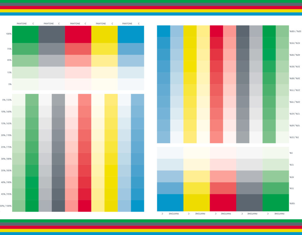
- What does 50% of a PANTONE spot colour look like? What colour is created if the proof paper white matches the fan paper white? And what colour is created if the proof standard has defined a different paper white? How must the 50% colour then be adjusted?
- What happens when a PANTONE solid colour area or a 50% area is overprinted on a CMYK image? What colour is created?
- What if the ink manufacturer has adjusted the PANTONE formulation to better match the colour to a different paper white? How can I simulate this in the proof?
As a proofing service provider, we are actually responsible for the correct referencing of colours. If we receive PDF files with PANTONE or HKS colours, we use the appropriate LAB colour values from the manufacturer’s digital databases.
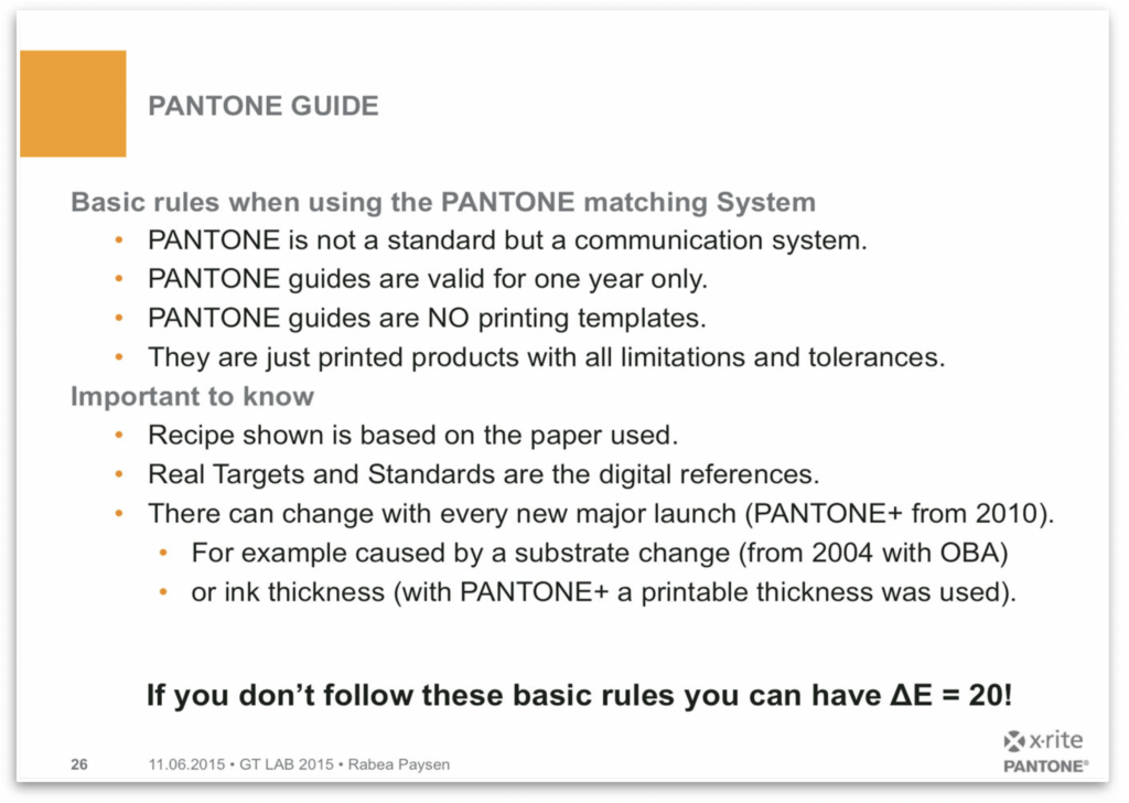
But here we have to be careful again, as the colour values of the digital databases and those of the colour fans often do not match. As we have shown in previous posts, deviations from DeltaE00 of more than 8 can easily be found even in current colour fans. Rabea Payson from X-Rite/PANTONE has illustrated this in a slide as follows, and warns against colour deviations of DeltaE 20:

But what is the binding spot colour for the proof? Is it the printed spot colour of the colour fan, as if I were to cut it out and stick it on the proof? Or do I proof the colour that would be created if this spot colour was actually printed on the final paper? There are three ideas in the PSD.
- If no agreement has been made, absolute reproduction (without any substrate adjustment) is used (by default).
- If CIELAB values do not contain any further information, they should be interpreted as if they had been derived with M2 and white backing for reasons of compatibility.
- linear SCTV behaviour should be assumed for undefined gradations

Are tonal value gradations of a spot colour in the proof colour binding?
Let’s go back to our third question above: What does 50% of a PANTONE spot colour look like?
Tone values of spot colours cannot currently be reliably reproduced if no detailed information on the tone value gradations is available. The paper white issues are only one thing, but other effects also occur here: In offset printing, a wide variety of deviations occur here in a wide variety of directions. Deviations of DeltaE 10 quickly arise between standard AM screens and frequency-modulated screens for the same spot colour. And the paper surface also has a major influence: the rougher the surface, the more critical, the more OBA, the more difficult.
As long as no binding measurement data for the individual “tints”, i.e. percentage gradations, are available for a spot colour in a CxF file, for example, no binding proof of spot colour gradations can be made due to the various calculation models for predicting these gradations, but only ever a “sophisticated guess”, i.e. the proofing system can at best make a “good guess”, but never a binding representation.
Should the reproduction of spot colour tones be defined in a standard?
There was an interesting discussion on this topic in Fogra’s digital printing working group. It brought together a wide range of different voices and opinions, some of which I would like to summarise briefly. The answers can be roughly categorised into three tendencies:
No, the definition would be too complex. Designers don’t need tonal values anyway, as they usually only work with the full tone.
- “Spot colours are usually selected as a solid from a fan and used in logos. As only the solid colour can be viewed in the PANTONE fan, only the solid colour is used in logos and trademarks.”
- “If tonal values are used, then they are decorative at best and are therefore not worth the effort of being summarised in a standard, which would then only be binding on average. If the designer does not use the 100% PANTONE solid tone, he is actually “abusing” the PANTONE system, which cannot be the problem of print shops and proofing service providers.”
- “Even the representation of spot colours via contract proofs is already complex and requires specialised software applications. In order to achieve an appropriate simulation of a PANTONE tone value, the dot gain (SCTV) must be taken into account, as any colour simulation would be misleading without dot gain. However, this can hardly be realised on the final print material at the latest. “
- “What are users supposed to compare the printed colour with? There is no reference, so how can you develop a method that solves this problem?”
- “If users want PANTONE colours, they should ask X-Rite for a PANTONE tint fan with reference libraries. X-Rite is certainly looking forward to making even more money with PANTONE.”
A second participant in the discussion wrote: “We asked Pantone about this – they saw no need, their colour guides were only guides and it was difficult to print several colours with the correct TVI. Calculating and publishing values with SCTV was also not interesting for PANTONE at the time.”
No, brand owners don’t need this, as they have already perfectly defined, measured and matched their brand colour to the print substrates. Branded articles would therefore always be better than the standard and therefore do not need it.
- “Brand owners usually have every printing process, every substrate and every colour precisely defined for their brand colour products and work with special settings, colour sets and colour formulations that are perfectly matched to their spot colour anyway. They would therefore not work according to a standard, as they know and can control their colour even better, so a standard would be more of a step backwards for brand owners.”
- “There is no general “reference” that the big players in the market would like to have. They all have their own references and will never accept a proof that wants to be “correct” with a DeltaE of 3.”
- “Do we have to develop standards and methods for everything users do? Designers think that a PANTONE fan is a reference, when it’s not. A digital library with reference values will not solve this problem because nobody really knows how to use a digital library. When a user changes the opacity or transparency of a Pantone colour in InDesign, it deviates from the already flawed spot colour system and makes it even less usable.”
Yes, every manufacturer of proofing software or soft proof solutions calculates spot colour tone values anyway, so a standardised representation of the spot colour tone values would make sense in order to harmonise the proof and soft proof representation.
- “A specification would be useful for service providers and software manufacturers in the proof and soft proof sector, as everyone currently introduces their own ideas into their software and proofs from different software RIPs of the same PDF file with spot colours can look completely different. A harmonised proof would be absolutely desirable for designers, proof printers and smaller print shops.”
- As there is no reference, any software can claim to be the “right” one. We should therefore evaluate for which applications the absolute and for which the media-adapted colour location is better and what is the best method for interpolation based on these values.”
Andreas Kraushaar from Fogra would also like to start a research project on the topic based on the feedback. He summarises the discussion from Fogra’s point of view as follows:
“The practical problem is that you know a specific spot colour and its CIELAB values and spectrum when it is applied as a solid shade. But nothing more. Designers’ drafts often contain shades of this solid colour and the question is: how can this colour be reliably proofed and reproduced? So far, no one has been able to solve this problem exactly. However, if we apply colour and printing knowledge and modern tonal value methods (such as SCTV), we may be able to recommend a method that can be used both for RIPs to proof such colour tones and for printers to apply a TVI curve or RIP correction. The aim would be to propose such a method to facilitate colour communication. Of course, nobody has to adhere to it and can do what they want. Standardisation is merely an offer from Fogra to the industry for predictable print production. For spot colours, however, such standardised print production is currently not possible.”


