My customer wants to print on a tin can. Pantone? CMYK? Can this be simulated in the proof?

Requests such as the proof of a printed tin can often reach us. Why can’t such a printed can be “proofed”?

A proof is a standardized product. Take the classic ISOCoatedV2 proof, for example; the standard proof for coated printing paper. Here is the definition in brief:

“Paper type 1 and 2, glossy and matt coated paper, dot gain curves A (CMY) and B (K) from ISO 12647-2:2004” (Source: farbproofs.de)

Metal is printed with a varnish. Neither the colour of the metal of the tin can nor the colour of the lacquer is clearly defined, nor the thickness of the lacquer application and the printing process in which the lacquer is applied (digital print / screen printing, pad printing etc.) is defined.

A contract proof refers to very tight tolerances and precisely defined framework conditions. This includes not only the densitometric and colorimetric reference of the printing ink, but also, for example, the paper white, which is simulated very precisely in the proof. For exactly this reason there is no proof for recycled paper: The papers and paper whites are simply so different that no uniform, standardized “color” of a recycled paper can be defined. From classic recycled paper with a neutral grey or yellowish-grey colouring to de-inked, almost white recycled papers, everything is available on the market. Just not by default.

Therefore, a proof always refers to offset or gravure printing under standardized conditions. Changed surfaces such as metal or changed paper colours such as recycled or high-quality image papers with inclusions or printing on coloured papers have not yet been standardised and therefore cannot be proofed.

White lines appearing in print PDFs in Adobe Acrobat

The question often arises why when creating a PDF-X/3:2002 file in Adobe Acrobat, white lines often appear in the preview when there are no lines at all in the file.

The answer is simple: In contrast to current PDF printing standards such as PDF/X-4:2010, which is exported as PDF 1.6 standard, the PDF-X/3:2002 standard often required by printers uses PDF format 1.3, in which transparency is prohibited. As a result, when you create drop shadows in Adobe InDesign, for example, they are converted into rectangular images. If such drop shadows are still used on background images, the white lines appear, which run horizontally and vertically through the PDF at the shadow points. But why do these lines disappear in print and are not visible in other applications like MacOS Preview?

Acrobat has a preview that applies anti-aliasing to vector elements to make edges as smooth as possible. However, this setting also affects paths and masks that are not actually visible at all. The pixel images of the reduced transparencies are therefore slightly blurred. And this is exactly where the white lines of the blur appear, which are actually zero in size and therefore disappear when printed on postscript-capable printers. Not PS printers partially print the screen display, whereby the lines remain disturbingly.

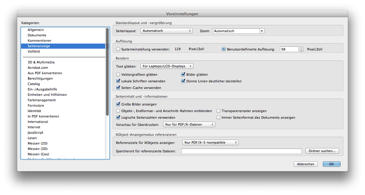
Most graphic artists know the effect, have postscript printers and simply live with it. However, if you are very annoyed by the white lines or if they also appear in the printout, you can simply switch off anti-aliasing in the Acrobat preferences. Under Acrobat > Preferences > Page Display you can simply deselect the checkbox “Smooth vector graphics”. This makes the edges of vector data slightly more pixelated, but the white lines of anti-aliasing disappear immediately.

Here you can simply deselect the option "Smooth vector graphics"
Screenshot from the Preferences of the Preview in Adobe Acrobat


A proof without profile. Is that possible?

Proofing service providers are often asked the question: “I have to have a proof done, but I don’t know for which profile. Can I also have a proof made without a profile?”

Proofs are standardized products that are created and tested according to a certain set of values. This is exactly the point that distinguishes them from any “colourful printouts”.
Specifically: A proof for coated printing paper is produced according to the standard values of ISOCoated V2 (paper type 1 and 2, glossy and matt coated image printing, dot gain curves A (CMY) and B (K) from ISO 12647-2:2004) and checked according to a set of values (FOGRA39L). A proof for uncoated paper (e.g. PSOUncoated or ISOUncoated) is produced and checked according to completely different value sets. Logically, because a print on uncoated paper looks definitely different in terms of colour and white value than a print on picture printing paper.

A proof must therefore always be prepared according to a standard and be verifiable according to a reference value set. A list of the current Proof Profiles (as of 2012) can be found here.

The problem: Many printing processes such as digital printing on a color laser or printing on a large format printing system (LFP) are not standardized and therefore there are no valid profiles and specifications.

So what to do? The most frequently used standard has established itself as the “de facto basis”: ISOCoated V2.

This is understandable, because colour-critical prints, catalogues etc. are mainly produced in offset printing on picture printing paper and are therefore subject to this standard. It is therefore generally assumed that a digital printer or an LFP printer, for example, should follow this standard and at least achieve this colour result.

So if you need to make a proof but don’t have the exact details of the profile you need, proof ISOCoated V2, which has become the industry’s most widely used standard and will always be accepted as the basic proof.

Unfortunately, a proof without a profile cannot be produced, because that would just be “colored paper from a proofing system”, but not a valid, ISO-compliant proof.

Paper white simulation of PSOUncoated

Since 2009 PSOUncoated has been the standard profile for uncoated paper. Nevertheless, proof service providers often have the problem that at first glance proofs on PSOUncoated often differ significantly from the print result. Immediately visible: the white point of the paper.

The PSOUncoated paper white looks very grayish. If, for example, PSOUncoated is proofed on an EFI 9120 XF paper, which actually has a neutral white coloration as paper, then the paper must be recolored by the printer in terms of paper white. This paper-white simulation makes the proof look “grayish” and often not “bright white” like the real production paper. “I can’t put this down to my client” proof service providers often hear from the agencies and designers who commission proofs. And frankly, printing on bright white uncoated paper will also differ significantly from the PSOUncoated Proof result depending on the paper selected.

Some proofing services still proof uncoated paper according to ISOUncoated, because the paper tone is much whiter and not so grayish. In the medium term, however, this will not overcome the misery: PSOUncoated is the current standard according to which the process standard for offset printing certified print shops are also based. But in the pressroom the differences between norm and reality often become apparent. If the new D50 standard light according to ISO 3664:2009 with higher UV components is used for inspection at the printing table, then proof and printing result can often only be matched very poorly. And due to the long standardization periods, this problem will continue to accompany printers and proofing service providers for quite some time to come.

Why monitor and paper don’t get along when it comes to colour.

Colour is colour, you’d think. That’s right. But have you ever tried to explain the colour of your new car or your new red wallet to a friend on the phone? You will notice that human colour recognition and the reproduction of the same in another medium is very difficult.

The same applies to computers – better: monitors, and printers – i.e.: laser printers, inkjet printers or newspaper printing or offset brochure printing.

Why is the red on a monitor different from exactly the same red printed on paper? It’s simple: put the paper in front of the monitor. The two shades of red are exactly the same. Like this. And now you’re completely darkening the room. What do you see? The red on the monitor is still red. And exactly the same red on paper? This is black now. Why is that? Very simple:

A monitor adds light, i.e. spectral components, to the existing ambient light. If you see red on a monitor, it is because the monitor actively emits red light.

And now the paper: When do you see red on paper? Exactly when white light falls on the paper, for example through a window or a lamp. And when do you see the colour red on paper?

When white light falls on the paper and the paper extracts the non-red spectral components from the white light and reflects the red light. That’s when you see the colour red.

One colour, two completely different ways of production. And this is exactly where the colour calibration and the proof start. The strategy? Fairs. And this under fixed conditions and not with the human eye, but with “incorruptible” technology.

Put simply, a monitor calibration device can measure your monitor and see exactly “how much” colour your monitor can display, and “how wrong” your monitor can display colour. And if your computer knows that, it can correct the monitor.

Another measuring device can emit neutral white light onto a paper and measure the reflected colour. Depending on the printing process and paper, the ink looks completely different, but the meter again sees “how much” ink the print can represent and “how wrong” the print represents ink. And if your computer knows this, it can correct it. And:

If the computer knows the colour representation of the monitor and printer, it can correct and adjust the representation so that both correspond to the same colour. Of course, this only works if the colour and brightness of the light that illuminates the paper is also known and standardized.

And how does the proof work? Very simple:
If a computer also knows that the final printed product is to be printed in offset on an image printing paper, and it knows the colour representation of this printing process, then it can simulate this on a monitor and on an inkjet printer.

On the monitor, this colour-accurate representation is a so-called “soft proof”, the colour-accurate preview of the subsequent print on the inkjet printer is called “Proof” or “Contract Proof”.

This inkjet printing must be very precise and meet the highest demands in gamut and colour simulation. And since the image processing technology, colour matching calculation and measuring technology behind it is not very cheap, proofs are still mostly “expensive” inkjet prints. Due to new printing systems and inexpensive and better measuring technology, however, prices have also fallen significantly here in recent years.

What’s a proof for? The most important reasons for proofing!

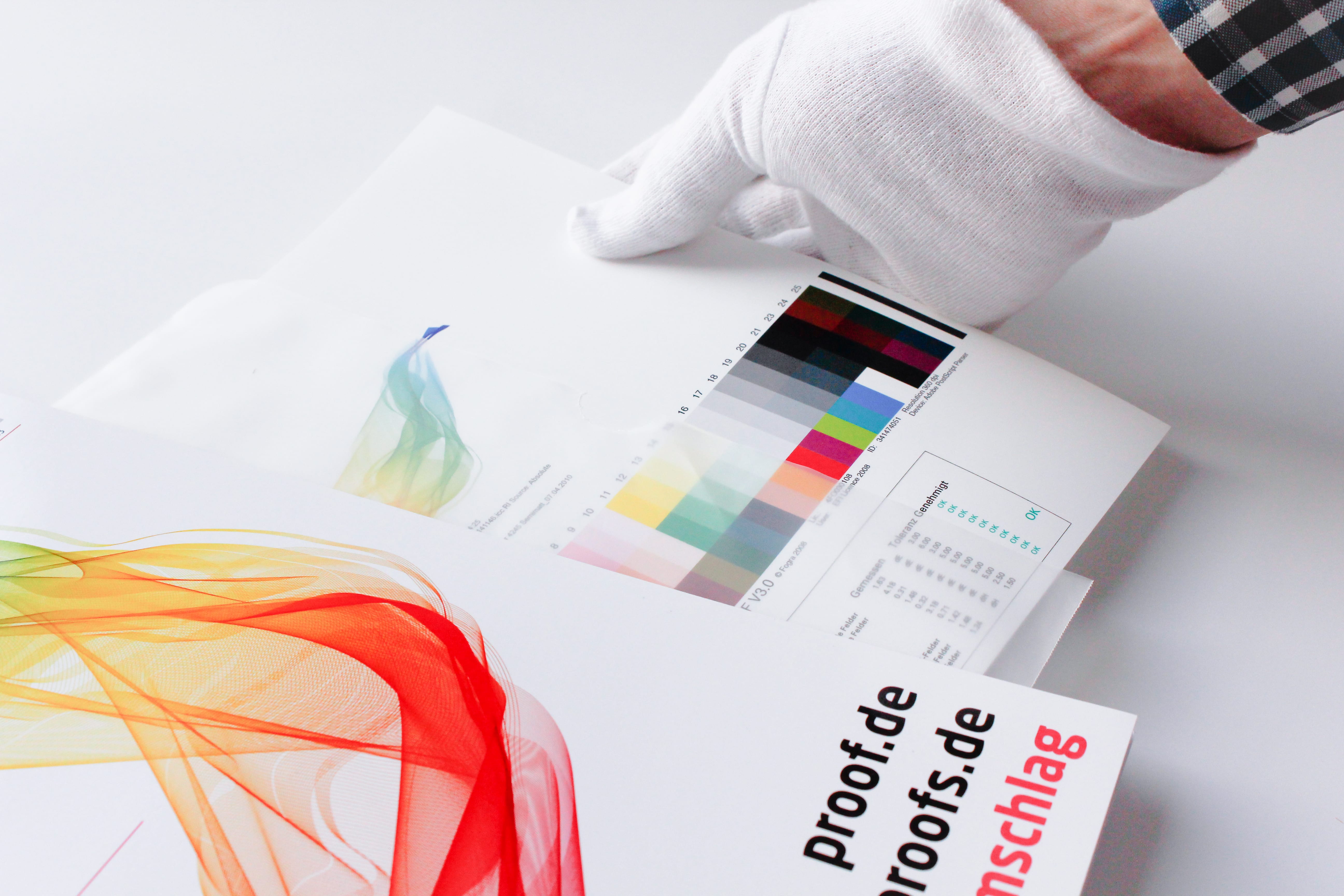
proof.de Packaging of a Proof/ Digital proof
  1. A proof is reassuring:
    The proof shows the colour result of the subsequent printing.
    The customer knows exactly the later result from the proof and is reassured.
    The printer knows that the customer knows the proof and is also reassured.
  2. A proof is fast:
    Ordered today, delivered tomorrow: Modern proofing service providers work quickly and produce hardly any loss of time in the design and printing process
  3. A proof is precise:
    All professional service providers nowadays work with proof printers that are recalibrated at short intervals. A media wedge with test report also provides clear metrological proof that the proof is correct and within the limits of the standard deviations.
  4. A proof is cheap:
    In the past, repro studios often charged almost 30 euros for an A4 proof. Nowadays, it only costs a fraction. Proofing costs are of little importance in the production process.
  5. A proof also shows the colors that the monitor does not show:
    In most agencies, hardware-calibrated proof monitors are in short supply. And TFTs or old tubes show colors, but unfortunately some. A proof also depicts colors that standard monitors cannot display, but which can be printed.
  6. A proof simulates newspaper as well as coated paper.
    If the same advertisement is to appear in the glossy brochure for the trade fair stand, in the trade fair news and in the special supplement in the local daily newspaper for the trade fair, then the three different colour results can be excellently simulated and presented in proofs in advance. And who knows: Perhaps the customer will then have the house brochure printed on picture printing instead of on uncoated paper due to the proof, or will choose a different motif for the newspaper ad. The proof shows it.
  7. A proof can do CMYK and more!
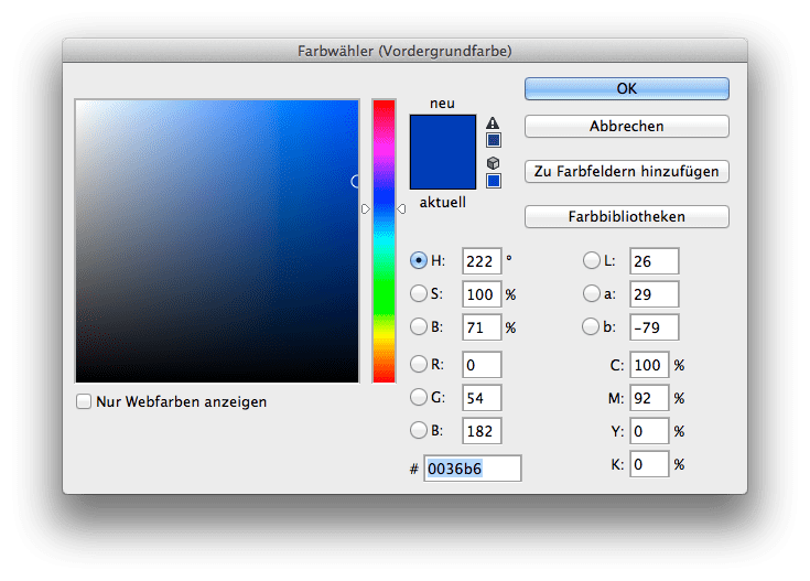
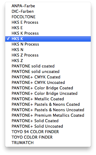
    Modern proofing systems can reproduce up to 98% of all Pantone colours and HKS colours in the proof.  This means that not only four-color, but also five, six and multicolor files can be proofed. Today, proofing is often done twice: once in CMYK plus corporate color in Pantone and once in CMYK and corporate color in CMYK. The client and agency can then decide whether the colour result is worth the extra charge for the fifth colour in the print.
  8. A proof is made of paper.
    Just like the product he’s simulating. A proof can be placed next to the print and compared under Normal. And to check it out, you can carry both to daylight, look at them in the candlelight and much more. A soft proof cannot do all this.

This is the first incomplete list. You know of other good reasons? We look forward to any comments and would be happy to add further points.

Which RGB working colour space is suitable for colour-consistent work?

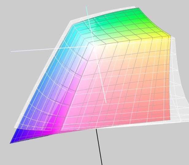
Comparison between eciRGB_V2 (white) and AdobeRGB 1998

In the early days of color spaces Apple and e.g. Photoshop up to version 5.5 set the monitor color space as working color space by default. But it soon became clear that a design office would be working with 10 Macs in 10 different color spaces. A neutral concept was needed.

There are many RGB Colour Spaces around. In the area of print media there are currently primarily three different variants: sRGB, AdobeRGB(1998) and eciRGB_V2.

The sRGB color space is widely used in digital cameras and is the industry leader in the consumer segment. Problem for printing: sRGB is a relatively small color space, and does not cover the color possibilities of modern offset printing systems and digital printers. Since offset printing profiles such as ISOCoated_v2 have a much larger color space, it makes little sense to perform retouching in sRGB.

From our point of view eciRGB_V2, a further development of eciRGB, is optimal. This color space has been specially created for use in the printing sector and offers some strengths:

  • It covers the colors of all modern printing color spaces (offset, gravure, web offset, newspaper), but is not much larger and therefore does not give away any resolution.
  • Equal shades of red, green and blue result in neutral shades of grey
  • Between 0/0/0 and 50/50/50 there is roughly the same distance as between 50/50/50 and 100/100/100.
  • The white is 5000 Kelvin and the gamma is 1.8 Kelvin.

The eciRGB_v2 color space can be downloaded free of charge from the pages of the European Color Initiative (ECI).

The AdobeRGB 1998 color space, which has been widely used by Adobe since Photoshop 5.5 and today in all parts of the Adobe product range, is also well suited for the printing sector, but works with a gamma of 2.2 and is designed for degrees of whiteness from D50 to D65. All common print color spaces can also be well mapped in AdobeRGB 1998. You can find Adobe documentation on this color space here.


Softproof – opportunity or risk?

Softproof means: The correct color display of a printed product on a monitor. Both a standardized print, e.g. according to process standard offset printing, can be simulated – e.g. a later offset print according to ISOCoatedV2 can be simulated correctly in colour on the screen – and the output on digital terminals such as LFP systems in advertising technology.

From a technical point of view, soft proofs are now well controllable. The monitor technology is advanced enough to provide excellent displays with a high color gamut and consistent illumination even for a few hundred euros. For example, monitors in two branches of a company can be coordinated in such a way that the result displayed on the monitors corresponds exactly to each other at both locations, i.e. one image editor in Hamburg and one in Munich can talk about retouching the same file.

The problem: The fact that the two monitors emit the identical color and light result can be precisely controlled. The fact that the colleague in Hamburg is looking at the foggy Alster lake at a northern window, while the colleague in Munich moved the monitor to a southern window in the direction of the Isar river in sunshine, already shows the problem: The environment variables under which the softproof is viewed are not identical.

It is even more difficult when the soft proof is to be used in the pressroom to coordinate the production run. Many companies such as JUST offer modern solutions that can provide a soft proof directly at the press. However, the problem remains that the soft proof should be considered to be less than 10% away of the brightness of the press. While 2000 lux brightness was previously the standard for printers, JUST now writes: “The comparison of soft proofs on monitors with prints and hard proofs is regulated in accordance with ISO 12646. The light conditions basically correspond to ISO 3664, but the brightness must be adjusted to the limited luminance of the monitor, which ideally is > 120 cd/m². ”

Two scenarios therefore arise at the printing press: Either the printer is “in the light” and can then match the print with a contract proof printed on paper, or it is “in the dark” and can match the print with the soft proof. The difficulty of matching paper and monitor – and these are two completely different and difficult to compare media – is compounded by the difficulty of the printer having to dim the light at the press by up to a factor of 10 to be able to match both a contract proof and a soft proof at the same workstation. From today’s point of view, this does not really seem practicable.

Conclusion: The soft proof is on the advance and will certainly sooner or later displace the classic contract proof from the market for reasons of speed and cost. However, due to the great technical lighting and haptic differences between the monitor and the illuminated sheet of paper, a widespread introduction is still a long way off. After all, anyone who has ever performed a color match on a printing press can imagine that a match to the contract proof on the one hand and to a soft proof monitor on the other hand is difficult to imagine at the same time.  The contract proof will therefore also have to remain the first choice in the near future in order to be able to carry out colour-accurate proofing of the printing result in the pressroom.

Embed profiles for proofing? Yes or No?

The question often arises whether color profiles should be embedded in the PDF files for proofing.

To answer the question, you have to get some answers: The proof should simulate the subsequent offset printing. For offset printing, with few exceptions, the imagesetters have been configured so that a 70% black in the file is displayed as 70% black on the printing plate, no matter what profile was specified in the file. It didn’t matter whether it was coated paper or uncoated paper: 70% in the file corresponded to 70% on the plate, the choice of the paper printed on resulted in the colour representation.

The proof has also adapted to this: Most proofing service providers ignore embedded profiles, as long as the data is in CMYK and do the same as their print colleagues. Even with grayscale, the profiles are usually ignored and the grayscale is simply assigned to the CMYK black channel. Thus all CMYK and grayscale data are simply interpreted as if they had been created in the output color space. If “ISOCoated V2” is proofed, all images are treated as such, and if “PSOUncoated” is proofed, then the CMYK images are created in this color space.

This is excellent for the majority of files to be proofed. Only RGB colors contained in the data are problematic.
Since the RGB color space is considerably larger than most CMYK color spaces, it must be clear from which color space to convert to CMYK according to which criteria. Most proofing service providers specify a color space from which they convert by default if no RGB color space is defined. This can lead to difficulties: For example, many proof studios choose AdobeRGB as color space because it is large and optimized for offset printing; however, most images from digital cameras come from sRGB and these color spaces differ considerably. Therefore, it is important that the RGB color space and the rendering intend is embedded for a proof, otherwise the proofing software normally selects a color space for conversion to the CMYK color space to be proofed; and this color space is possibly not the one in which the data has be created.

Verifiability of GTIN codes in proofing

Depending on the selected setting, the EAN lines in proofs are displayed smoother or less smooth. It is clearly recognizable that the modules are built up by many colours and especially within the narrow black lines a considerable increase in width takes place. Normally, a narrow black EAN bar should correspond to the width of the white space in between.

Proofing service providers are increasingly required to be able to display “verifiable” GTIN codes, i.e. barcodes in the proof.

The background to this is that especially the big german discounters like Aldi, Lidl, Hofer & Co. want to see a packaging proof from their suppliers in advance for approval. This packaging proof is not only visually assessed according to colour, but also the legibility of the printed EAN codes is evaluated using a measuring device and must meet certain criteria: Symbol contrast, modulation, decodability, defects, blemish: all this is measured and graded.

Depending on the selected setting, the GTIN lines in proofs are displayed smoother or less smooth. It is clearly visible that the modules are made up of many colours and that a considerable increase in width takes place especially within the narrow black lines. Normally a narrow black GTIN bar should correspond to the width of the white space.

This involves two different risks for the advertising agency or the reproduction company that processes this data: Firstly – according to our information – in most cases the proofs are not viewed under D50 standard light, but under TL84 – the light under which the packaging will also be seen in the later sales situation. This is understandable, since the sales process takes place under TL84 and not under the standard light of a printer. On the other hand, retouching under TL84 is not mandatory, since the spectral behavior of “standard” neon means that it is not possible to produce such a reproducible and “color-accurate” result as under D50. In addition, a colour matching box with D50 and TL84 is available in very few companies, which makes it possible to view the result under both light conditions in the colour retouching.

Secondly, the proofed GTIN barcodes are measured by a measuring device and checked for their mechanical legibility. Whereas a few years ago a press proof was the standard for such tests, today mostly the digital proof is used, since it is much cheaper. But until now, the manufacturers of proofing software have always only paid attention to the representation of color, but never to the verifiability of black and white lines.

Especially with Fiery proofs, but also with GMG Color, the lines of the GTIN barcodes are usually reproduced in such a way that they correspond exactly to the black value of the required profile in terms of color, but only school grades of 3 or even 4 are achieved during the examination, depending on the discipline. Most scanner cash registers could still read and process these barcodes without problems. However, ALDI Süd or Hofer with their own GTIN codes require at least a second grade in all disciplines: The proofs all fall through the test grid of the discounters. In particular, the decodability of EAN codes has probably not been of particular importance to proof manufacturers up to now.

After detailed tests, the width increases of the GTIN bars in the digital proof and the blurring of these bars seem to be the biggest problem for the verifiability of the codes. Farbproofs.de has developed a solution together with one of the testing companies for barcodes that makes it possible to print testable GTIN codes in accordance with the strict ALDI standards, which also comply with the current proofing standards. A proof is therefore sufficient for colour matching and for checking the GTIN numbers. However, the EAN must be created and edited specifically for this purpose. This still costs far less than a conventional proof, but it is not satisfactory.  Manufacturers of proofing software such as EFI and GMG Color are therefore called upon to improve the calculation of black and white line representations in writing and GTIN codes.

Until now, the focus has always been on color accuracy, but the proof increasingly demands services that were previously reserved for proofing. At costs of 5-10 EURO for a digital proof in DIN A4 format and 150-300 EURO for a proof in the same format this is more than understandable.

An article with tips for the creation of EAN / GTIN codes for graphic designers and the problems of verifiability of EAN and GTIN codes for e.g. Aldi, Hofer, Lidl and Co can be found here.

What data should I give for proofing?

A proof is suitable for two types of color control: firstly, during the creation or retouching phase, e.g. to reconcile a color retouched image with the original, and secondly to check the final data directly before printing.

For control proofs during the data creation of a project, the data format usually does not matter. Whether PDF, JPEG, TIFF; EPS, PS or even PSD… Many proofing companies accept a variety of data formats. For a correct evaluation of the result, however, it is important to proof in the color space in which the print product is also created later. Data for a letterhead should therefore be proofed in ISOUncoated or PSOUncoated, while products printed on image printing paper should be proofed in ISOCoatedV2. For yellowish paper, newsprint or gravure printing, there are many other profiles for which a proof can be produced. You can find a good overview of the current proof profiles here. It is also important that the proof format and the final print format do not differ too much. Only in this way is a correct check possible.

When the brochure has been laid out or the catalogue production has been completed, a proof should be prepared again for the final check by the customer. This proof is then created with exactly the same data that is also sent to the print shop. This is usually a PDF X/3:2002 file, as this is the preferred data format for printers. If the pages are delivered to the printer with bleed marks and bleed, then the proofs should actually be created in exactly the same way. The finished proofs can then first be used as approval for the customer, and secondly for checking the OK sheet in the print shop. This ensures that no unpleasant surprises wait for the customer (what does the colour look like????) or the printer (why does the customer make a complaint?????) after printing and bookbinding.

Can spot colours be proofed?

Since many printed matter contains spot colours such as Pantone or HKS, the question often arises whether these colours can be proofed at all. The answer is “no”. Only an approximate simulation of these colors is possible.
The reason: Each special ink is a specially mixed, “real” ink and therefore cannot be mixed from the 4 printing inks (cyan, magenta, yellow and black).

Today, modern proofing machines have up to 12 different printing colours and, in addition to the classic primary colours, also have, for example, orange and green and violet as real colour pigments in the machine. Proof printers such as the Epson SureColor P9000V are therefore capable of displaying significantly larger color spaces than, for example, ISOCoatedV2. The spot color simulation in these devices is therefore sometimes very good when controlled via a Contone driver, which can access the entire color space of the proof printer. Epson himself points out, for example, that “98% of all Pantone colors” can be covered. This may be doubted, but a number of over 90% of all Pantone colors is realistic from our point of view.

In the past, Pantone and HKS colors were simply converted by the proofing systems to CMYK and then simulated in the standard color space, i.e. mostly ISOCoatedV2. The representation of the colors here is mostly completely insufficient. For the reproduction of Pantone and HKS colours in a proof it is therefore immensely important to have a modern proof printer with many colours and a high colour gamut and a modern proofing software which is also able to precisely control the printed gamut.

Differences in the quality of the simulation of spot colors can quickly be seen in the different printing systems: If the proofing service provider prints with an older 6-color or 8-color system (Cyan, Light Cyan, Magenta, Light Magenta, Yellow and Black or Light Black), spot colors are simulated worse than, for example, with a modern 11-color system with Cyan, Light Cyan, Orange, Yellow, Magenta, Light Magenta, Photo Black, Matte Black, Light Black, Light light Black and Green.

The higher simulation quality of the spot colors is generated by the fact that orange, for example, already exists as a separate color and does not have to be mixed from magenta and yellow before the spot color simulation.

Of course, it must be said that there are limits, especially in the area of metallic or fluorescent colours; these colours are currently not reproducible in proofing.

The spot-colour simulation of gradations is also critical

In most proofing systems, only the 100% values of a Pantone or HKS color are underlaid. If, for example, a font logo with 100% color application of a Pantone color is to be simulated, this is precise and is well represented in most proofing systems.

However, it becomes more difficult if the logo contains not only 100% areas but also a 30% Pantone colour area, since this is not defined in the proofing system, but is simulated by the proofing system. In some cases, considerable deviations from e.g. HKS colour fans can be observed.

It becomes even more difficult if, for example, a grayscale TIFF lies on a 100% HKS area and overprints. For the graphic professional it is immediately comprehensible that the HKS surface simply has to become correspondingly darker at this point due to an overprinting 30% black. However, the proofing software must recognize this effect correctly, calculate it correctly and then simulate it correctly with the 11 colors available from the proof printer. It is easy to understand that countless errors can occur. And the supreme discipline: 7-colour Pantone files with lots of overlaying and overprinting Pantone colours or HKS colours with overprinting CMYK elements can at best be calculated even by the most modern proofing systems, but can by no means be colour-accurately simulated.

The bad news is that a proof with spot colors is therefore never as color-binding according to the current state of the art and varies more depending on the proofing system.

But the good news is that spot colors, especially solid colors, can now be simulated well by modern proofing systems. A modern proofing system therefore also offers the possibility of getting a realistic impression of spot color prints at a fraction of the cost of a test print on a offset press.

D50 is not the same as D50: Standardized light and ISO3664:2009

Since 2009, printers and proofing service providers have increasingly encountered a new D50 lighting standard: ISO 3664:2009, which defines how the new D50 standardized light, under which proofs and print products are to be evaluated, looks like. The new standard light contains UV components that address the optical brighteners that are frequently used in offset papers nowadays.

The result: next to a bluish-white glowing sheet in the pressroom, there is a yellowish-pale proof.

What is the reason for this? The standard came sort of as a surprise and was poorly communicated within the industry. All proofing substrates available from proofing service providers contain no or almost no optical brighteners – this was previously a requirement. And under the old D50 standardized light – which did not contain any UV components – the proof and production run looked identical, since the optical brighteners were not addressed in the production run. Proofing and production printing can no longer be compared on all new presses that are already equipped with light tubes of the new standard: This looks completely different, the differences in paper white are absolutely obvious.

Printers and proofing service providers have mostly replaced the old tubes with new ones. However, this is often a complex topic: The old diffusing screens, which are mounted in front of the neon tubes, had so far predominantly once again installed UV filtering in order to ensure that completely no UV components get through. If new ISO 3664:2009 tubes with a defined amount of UV components are mounted behind the diffusors, unfortunately exactly this component is missing in front of the diffusor again… So there are some extra costs for the printers.

In the meantime with M1 and the new proofing Standards Fogra51 upwards, many proofing papers with brighteners havel been launched on the market so that proof and run can be compared cleanly again in the pressroom.

Standardized light and metamerism effect

A proof is only as good as the light under which it is viewed. Just going to the window or switching on the light at dusk is useless: between December and July, between 8 am and 8 pm, between cloudy and sunny days there is a huge difference in the lighting, which makes any colour evaluation impossible. And if you switch on the light, you normally switch on a bulb with 2700 Kelvin – or even worse: an energy-saving neon bulb that somehow shines in any spectra… a disaster!

The reasons for metamerism effects (in short: that two colors look identical under one light, but completely different under another) lie in the different printing technologies. Colors that look the same under a light bulb can suddenly look very different under a neon tube.

In recent years, ink-based digital proofs have established themselves in the proofing sector. Because it is printed in ink, specially coated paper must be used, which is not in any way similar to the subsequent production run. Anyone who has ever tried to print on glossy coated paper with an inkjet printer knows: the ink never lasts! Metamerism is therefore always involved when a proof is to be compared with offset printing.

The light under which proof and production run are viewed is particularly important.

ISO 3664 regulates standardized light, which is important for viewing proofs and prints. D50 is no longer D50: The International Lighting Commission CIE has revised ISO 3664 in recent years and adapted it to today’s circumstances. If UV components used to be strictly prohibited, they are now part of the standard. In the past, the focus was on consistency between slide and print, while today monitor, digital proof and offset printing are important. Therefore, proofs must always be viewed under D50 Standardized Light, so that they are really “colour-binding” in their perception.

If you want to check metamerism effects, we recommend the UGRA colour temperature indicator. With these strips, metamerism effects can be checked very quickly and clearly.


Embed fonts, convert them into paths or rasterize them?

To ensure secure data exchange between customers and proofing service providers, fonts must be embedded, converted into paths or rasterized. This ensures that it is and remains exactly the same font and exactly the same style.

How do I do that?

  • With InDesign and QuarkXPress, you select the PDF/X-3 standard when exporting data.
  • For Illustrator and Freehand, select the font and select “Convert font to paths” from the menu.
  • In Photoshop, select the text layer, right-click on it and select “Rasterize Text”.


What is the UGRA-Fogra Media Wedge 3.0 used for?

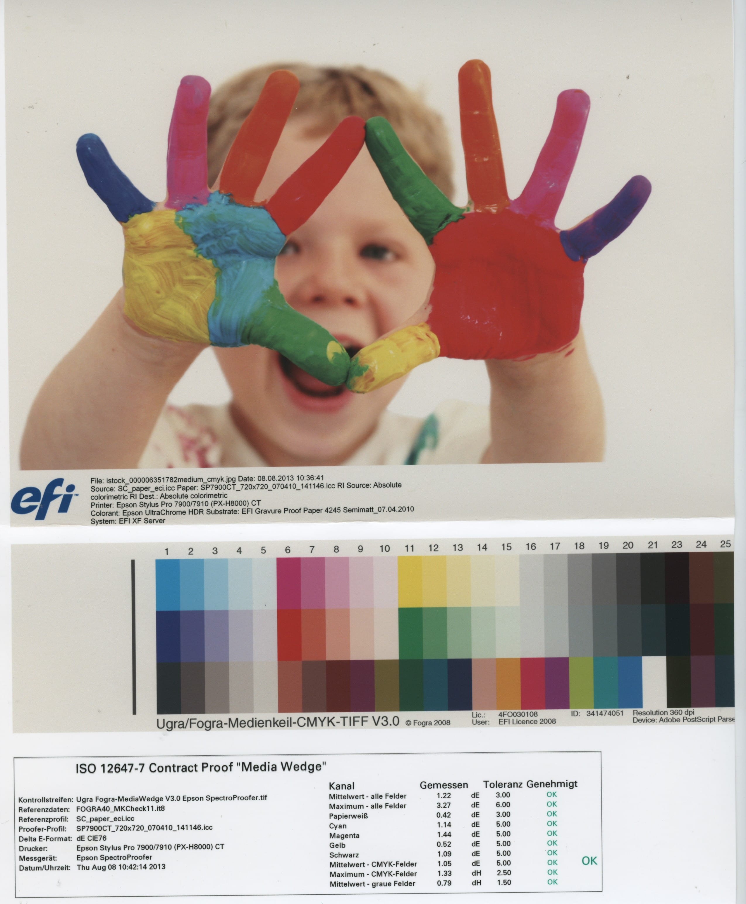
Ugra Fogra-MediaWedge V3.0 and measuring protocol

Every print shop in Germany adheres to a predefined standard, the process standard offset printing. This standard defines target and tolerance values for printed products. In order to prove that your proof delivered to the print shop meets these standards or is within the tolerances, the media wedge is measured and the values analysed in case of doubt – i.e. in case of a streak. If these measured values are correct, the print shop is obliged to adhere to and achieve these values.

Practice generally shows the following: If you want to have a 4-page image brochure proofed and printed, it is usually sufficient to have a single media wedge printed under the 4 pages. If the media wedge is also provided with a test report, the colour accuracy for the print shop is directly confirmed as a guideline.
However, if you want to be on the safe side, have a separate media wedge (including test report) printed under each of the 4 pages of your brochure.

How colour-accurate are proofs?

Ugra Fogra-MediaWedge V3.0 and measuring protocol

A proof is prepared according to the currently valid ISO standard 12647-7 and is legally binding with a UGRA-Fogra media wedge and measurement report.

How does this check work?

If you need a proof with UGRA/Fogra Media Wedge CMYK V3.0, there are two ways to add the test report to your data.

  1. With proofing devices in which a measuring device is integrated, the media wedge with 3×24 standardised colour fields is printed directly under the proof data. This media wedge is driven directly in the proofing device to a kind of “hair dryer” in the measuring device and dried there. After a few minutes of drying, the media wedge continues and is measured directly in the proofer. This takes a few minutes. The measured values determined in this way are returned to the proof server and evaluated there. If the colour values are correct and within the tolerances of the strict ISO standard, a test report of the measurement is then printed directly under the media wedge, which guarantees you colour accuracy in accordance with the process standard offset printing.
  2. For proofing devices without integrated measuring device, only the standardized media wedge is printed under the proof data. A check takes place subsequently and outside the proof printer. The media wedge is then measured with an external measuring device and the target and tolerance values are output to a label printer. This label is then stuck directly under the media wedge.

What is the advantage of automated creation and checking of the media wedge directly in the proofing device?

  • Measurement is automated directly after proof printing, measurement errors due to manual operating errors are excluded. Since the test report is not subsequently attached, as is often still the case, manipulation is impossible.

Further information on the test report, the media wedge and on the work and responsibility of UGRA/Fogra can be found at www.ugra.ch and www.fogra.org.

What is a Contract Proof? Softproof? Validation Print?

Very simple: A proof is the simulation of a later print, either as soft proof on the monitor or as contract proof, validation print or as form proof on paper.

Softproof: A softproof is the color-accurate representation of the print on a monitor. This can be done either at the agency or directly at the printing machine, for example, so that the printer can coordinate the production run with the soft proof.

Contract Proof: The “highest” level of proofing: A contract proof is a very high-quality simulation of the subsequent printing result, and is nowadays actually always produced with special inkjet printers on special paper with special software. The UGRA/Fogra media wedge print makes the proof “colour and legally binding”. In the best case, the media wedge is checked directly during proof production with a measuring device and a test report is glued or printed on which confirms compliance with the tolerances.

Validation Print: A Validation Print has higher tolerances regarding the color deviations from the given standard than a contract proof. It is therefore not “colour and legally binding”, i.e. it does not serve as a contract or “contract” between the designer and the printer, unless both parties have agreed that Validation Print can serve as a colour reference. Validation prints are often used in the coordination process in agencies or as quick templates with good colour matching, as they can also be produced on current laser and LED or other digital printers. Compared to inkjet printing, these printing systems are many times faster and cheaper.

Form Proof: A form proof is often found in print shops; large sheets of paper on which the finished imposed sheets, e.g. of a magazine, are printed. Form proofs are printed with inexpensive inkjet plotters on inexpensive paper and usually look terribly coarse and pixelated, even the colors are terrible. However, the data for the form proof runs through the same workflow with which the printing plates are later produced. This means that what can be seen on the form proof can later also be seen on the printing plate. Thus, the final printing forms can be optimally checked once again to ensure that all fonts, images and embedded graphics are displayed correctly. However, a form proof is by no means binding in terms of colour.

WordPress Cookie Plugin by Real Cookie Banner