“We print 135gr/sqm on a Berberich Allegro. Can you make us a proof on this paper? Can you proof on our final production paper?”
Our telephone support often asks for a proof on production paper. Unfortunately, we always have to answer the question negatively. I would like to briefly explain the reasons for this in the following article.
Proofing on production paper is still technically impossible.
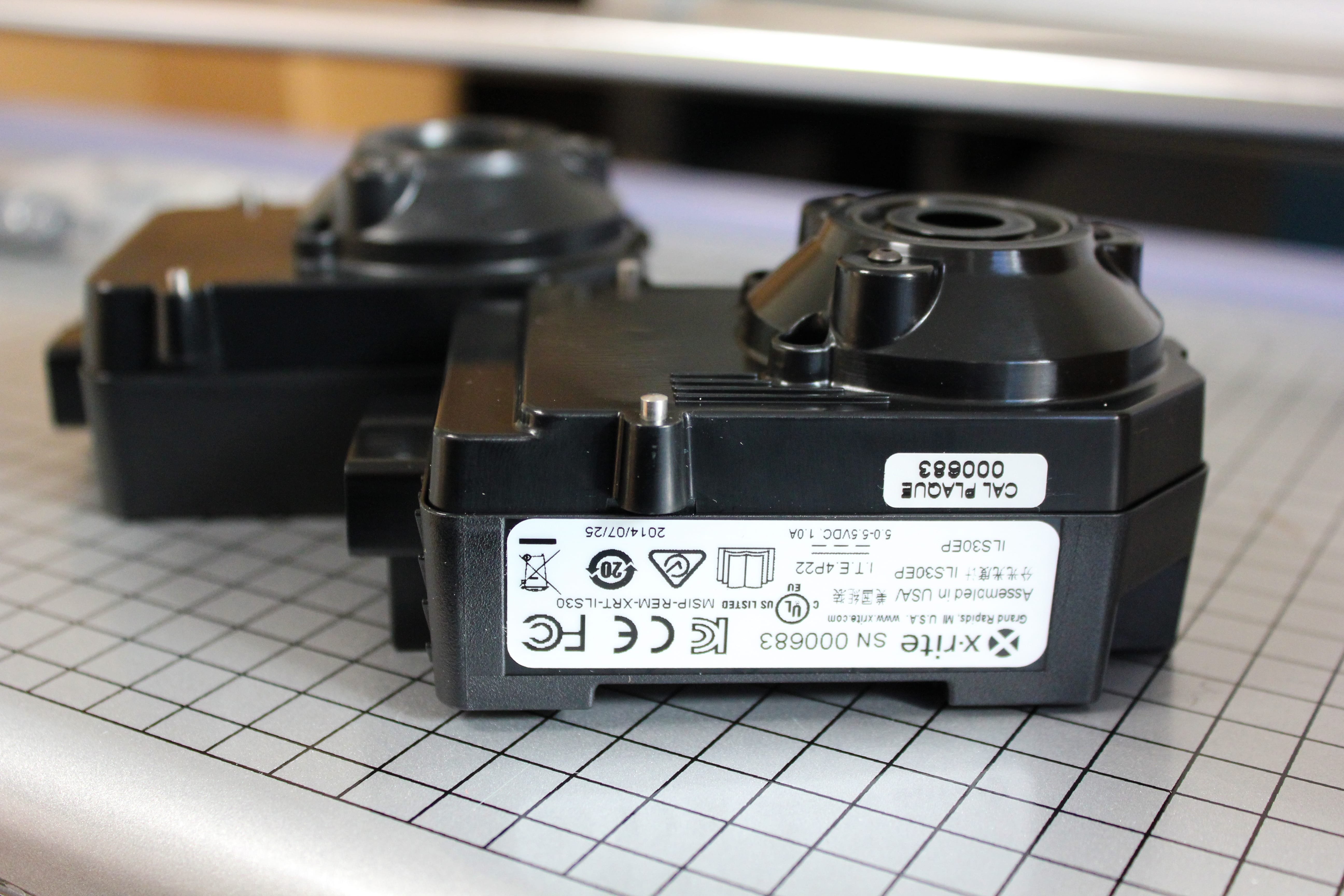
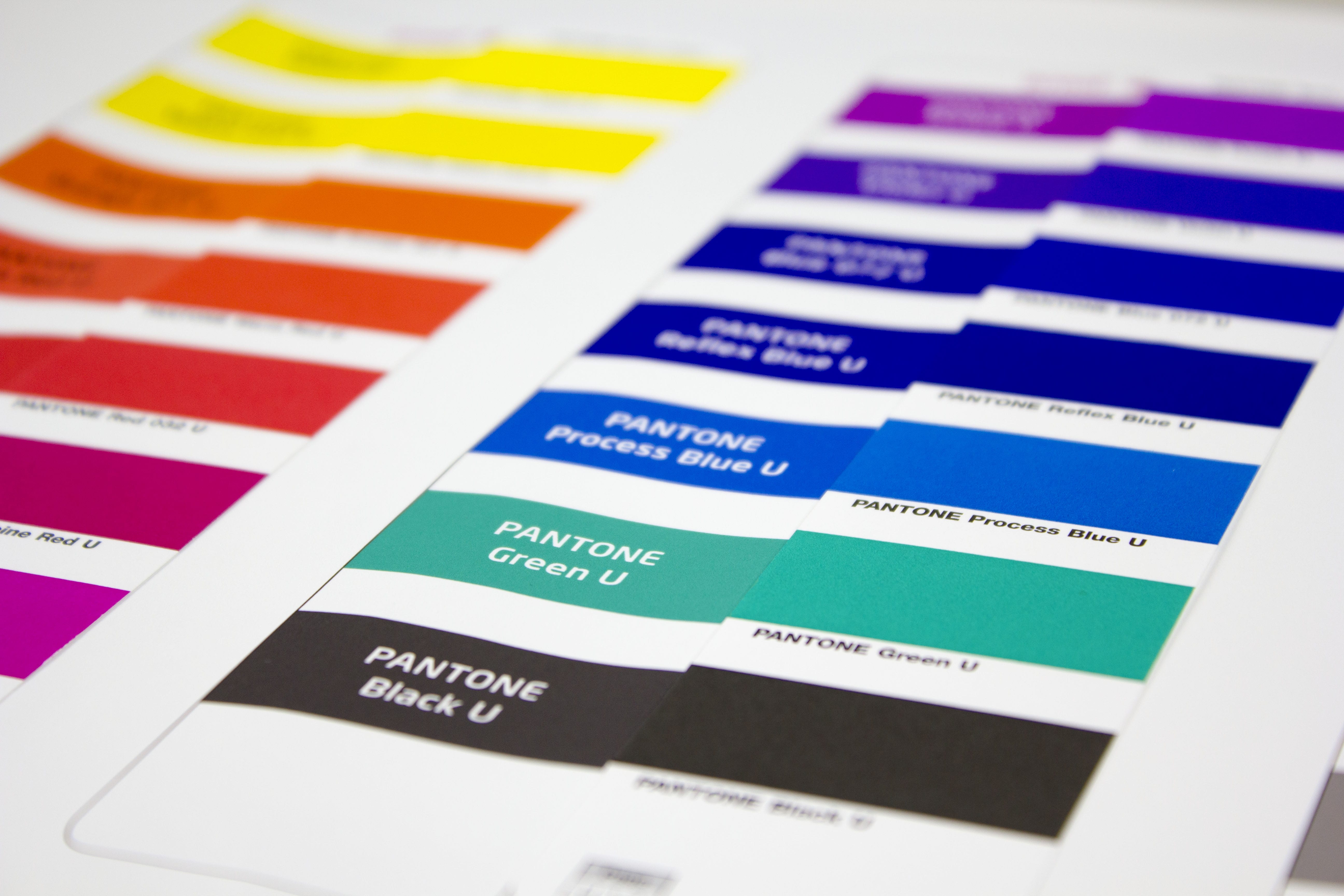
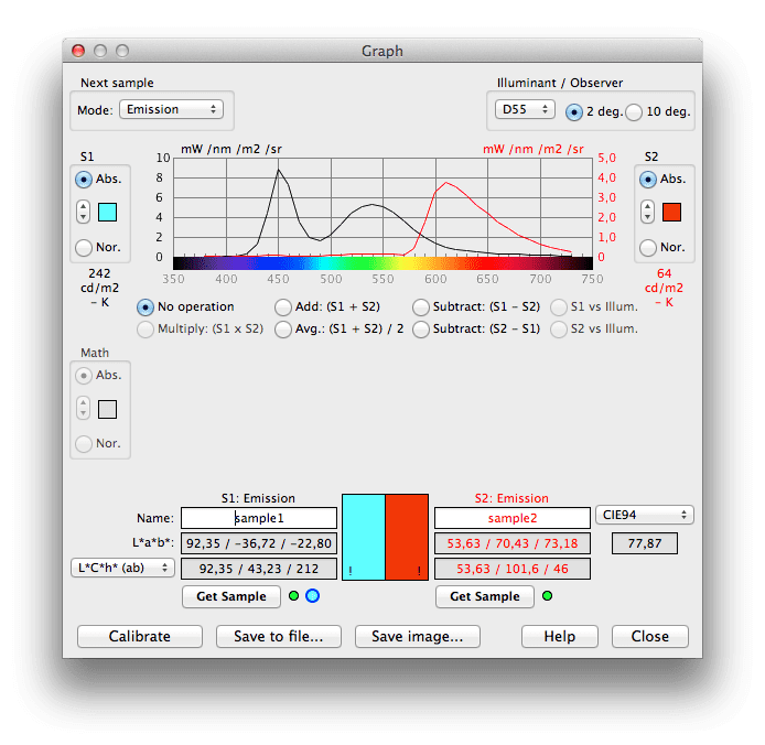
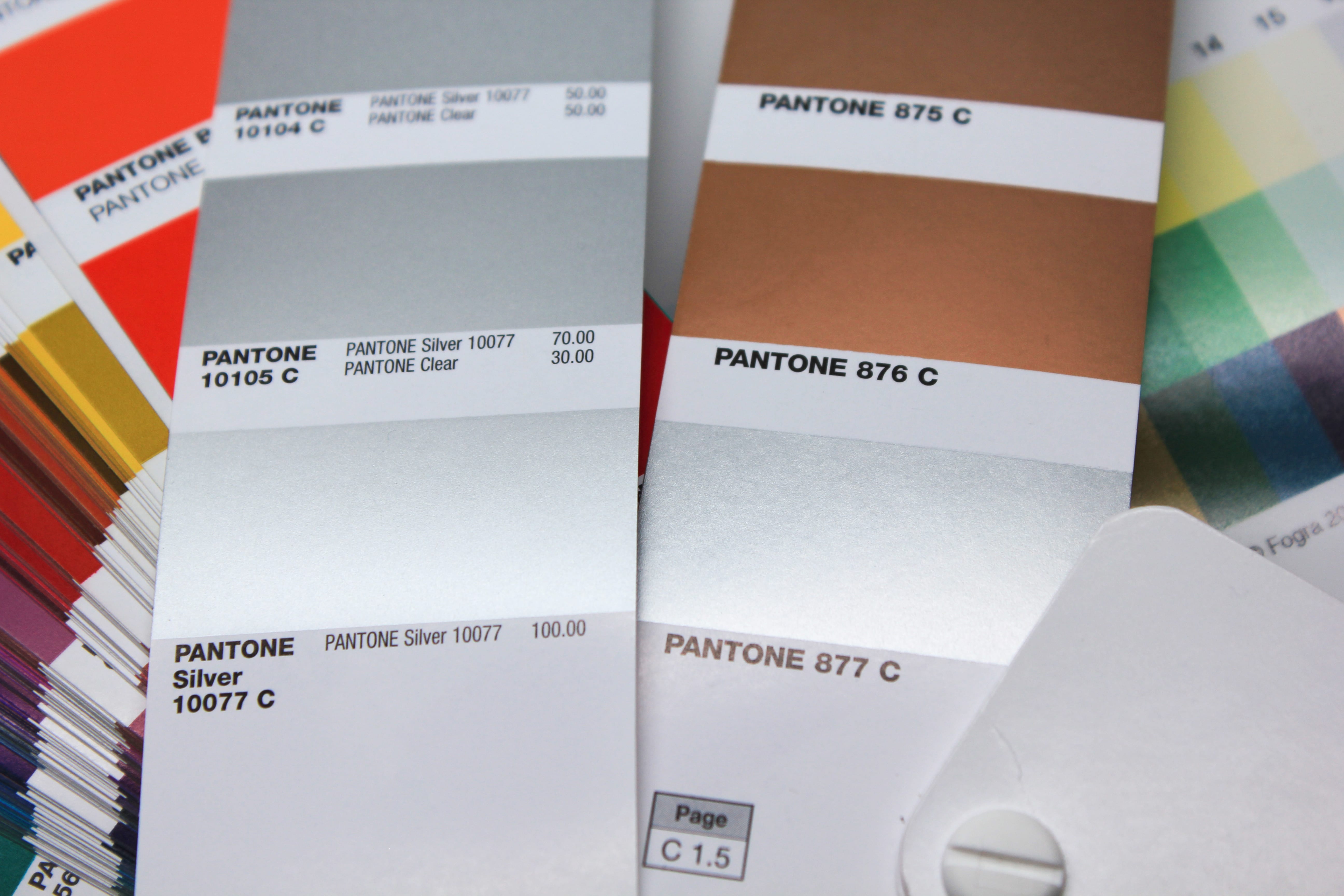
All proofing systems currently certified by Fogra are based on an inkjet printer as a test printer, mostly from Epson, Canon or HP. These printers are characterised by a large colour space, good resolution and excellent homogeneity and colour stability – all characteristics that are absolutely necessary for a proof printing system. The Epson systems used by the majority of proof printers are based on 11-colour pigment inks, which can reproduce a significantly larger colour space than e.g. ISOCoatedV2. However, the prerequisite for this is the use of special papers optimized for inkjet printing, in which the pigments and inks are optimally emphasized. This requires special coatings that are optimized for optimum reproduction, fast drying, good abrasion resistance and high UV stability of the print. On an image printing paper without these coatings, the ink would run, hardly dry and would not be smudge-proof. The color space would also be impossible to achieve. A proof would therefore not be possible from this point of view.
Read more