We produce proofs for classic white uncoated papers on a daily basis, but the question often arises as to which proof standard could be used for printing on recycled paper.
In general, the paper white in a proof is precisely defined in the proof standard and is also measured in every test report.
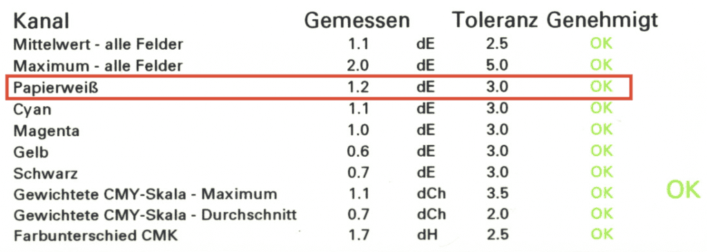
For PSOUncoated it is 95.00 / 0.00 / -2.00 in CIELAB and for PSOUncoatedV3 it is 93.50 / 2.50 / -10.00, i.e. slightly darker (93.50 instead of 95.00 for brightness L) and significantly bluer (-10.00 instead of -2.00 on the B axis, i.e. the blue-yellow axis in the blue direction).
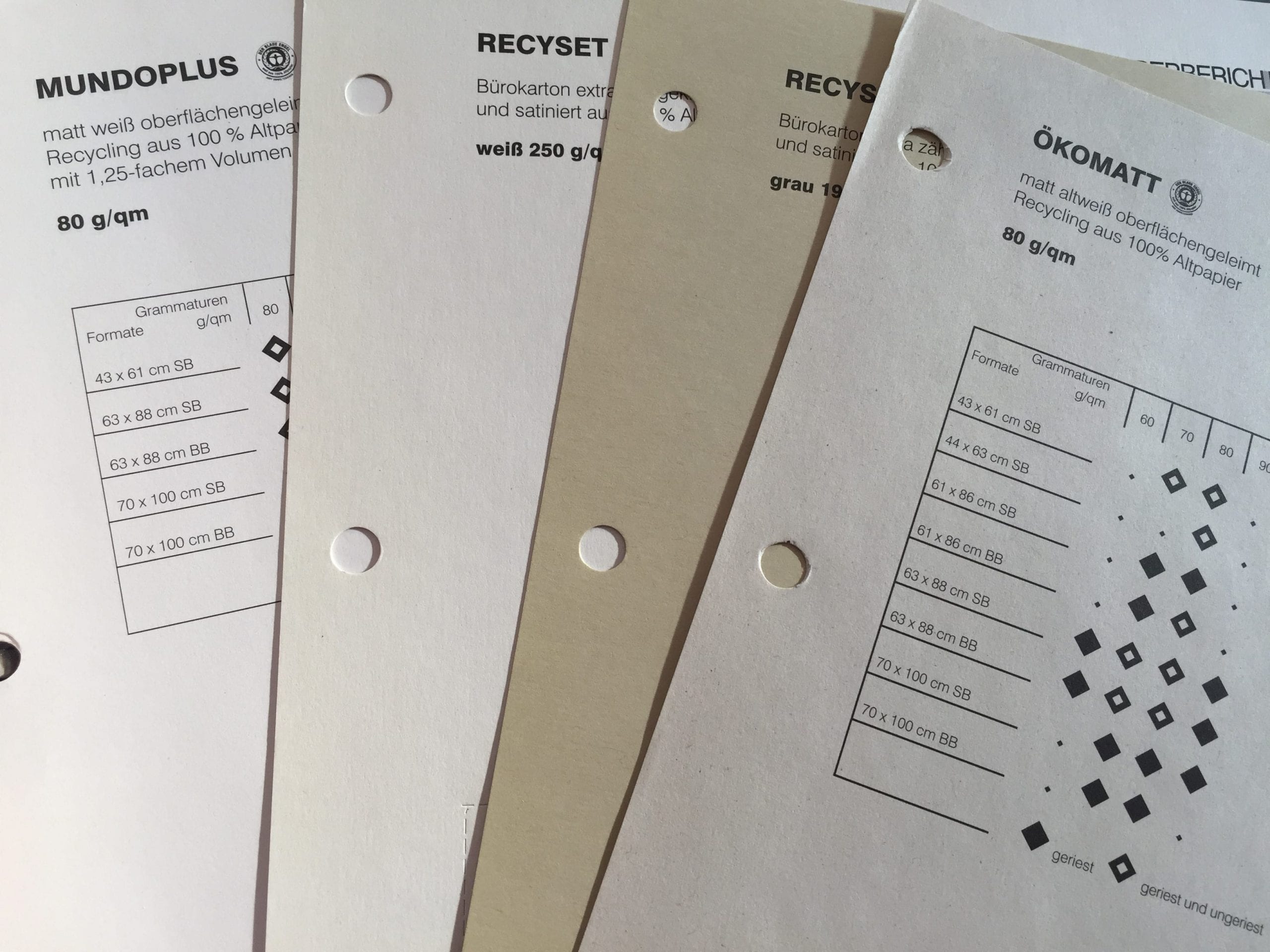
Recycling papers differ not only greatly from type to type in the area of paper white, but even from batch to batch. So if a printing company orders the same recycling paper in January and in February, the paper mill may well deliver a slightly different white value of the paper, as the paper white of course depends strongly on the recycled paper qualities used for production.
-
Recycling papers
White-point sample 1 -
Recycling papers
White-point sample 2 -
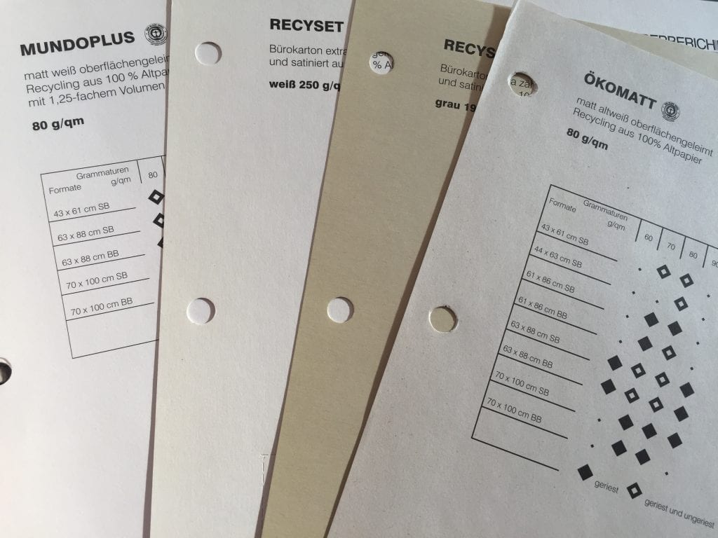
Recycling papers
White-point sample 2
A colour-binding proof for recycling paper is therefore not possible, as no standard has ever been worked out due to the different paper qualities and white tones.
It is recommended for the proof to choose a classic proof standard such as PSOUncoated / Fogra 47, which shows a rather neutral, unbrightened paper white in the proof. Place one side of the recycled paper next to the proof and mentally transfer the colour of the proof to the white tone of your recycled paper. This way you can imagine the later printing result quite well.
More articles related to this topic:
Incorrect grayscale display in Adobe Photoshop and InDesign

Adobe products are ideal for image retouching and layout and handle RGB and CMYK colour profiles very well. However, when editing and retouching grayscale images, for example for a black-and-white photo book, the experience is quite different. Suddenly, images look completely different in InDesign than they do in Photoshop, and even when exporting the image to PDF, greyscale images are suddenly treated differently. This article explains where the problems lie with black-and-white images and greyscale profiles in InDesign and Photoshop layouts, and how you can work in a more ‘colour-accurate’ … read more
Fogra Colour Management Symposium 2026 in Munich from 24 to 26 February

The most important colour management event takes place every two years in Munich: the Fogra Colour Management Symposium. Once again this year, all professionals are invited to make the pilgrimage to Munich: two days of lectures, discussions and a Bavarian evening await participants. Matthias Betz, owner of proof.de, will also be there again: for many years, he has been taking advantage of the opportunity to exchange ideas with colleagues and friends, learn about new technologies, hardware and software, and talk to colleagues from Fogra, freieFarbe, GMG and many more. In … read more
X-Rite i1Profiler no longer supports i1Pro2 and i1iO 2

Anyone who has reinstalled or updated their i1 Profiler app in the last few weeks has been confronted with disturbing news: X-Rite announced directly in the start window that it would no longer support its enormously popular i1Display and i1Pro2 devices. Users of the i1Pro 2 devices and i1iO 2 tables, which are extremely popular in printing and colour management, will be particularly hard hit by the announcement: An investment of €6,000 is quickly consigned to the electronic scrap heap. But what can you do if you own such a … read more
Precise proofing of tonal values of spot colours

In recent weeks, there have been lengthy discussions on the Fogra digital printing mailing list as to whether a research project should be launched to define standardised tonal value gradations for spot colours. What is this all about? In the field of CMYK and seven-colour printing, the definition of clear, printable and proofable standards is well established and has been tried and tested in practice. If the paper or paper class is known and defined, a measuring standard such as M0/M1/M2 has been established and the content of optical brighteners … read more
New edition of ISOCoatedV2 in M1 in sight?

Even almost 9 years after the introduction of the successor colour space PSOCoatedV3, ISOCoatedV2 / FOGRA39 is still the most widespread colour space in Europe. We at Proof GmbH count around 200 jobs from time to time for the German Printing and Media Industries Federation, among others. In the last count, proofs in ISOCoatedV2 accounted for around 68% of all proof jobs at our company. This is a clear sign of the continued widespread use of the colour space. ISOCoatedV2: From the classic colour space to the beacon of the … read more
New certified proof papers at proof.de

In recent years, various problems have arisen with our previous proof paper supplier. On the one hand, we sometimes had to wait more than three months for paper deliveries; on the other hand, we sometimes had significant problems with batch-to-batch discrepancies, surface defects and much more. After lengthy deliberations, we decided in December to replace all the paper. We therefore received pallets of new paper at the turn of the year, which we are now gradually incorporating into our production. There will be no hard cut, but the new papers … read more
PANTONE surveys users online about product and service direction

Today I received an email in which PANTONE asked how it should orientate its products and services in the future. The users were asked which countries, industries and company sizes they come from, but also what PANTONE products should look like in the future and what customers would be prepared to pay for PANTONE services in the future. Question: How much can PANTONE services cost? PANTONE appears to be orientating itself on the PANTONE Connect prices: All price queries have the lowest price category < $ 7,- / month, i.e. … read more
Cross-media colour management really works

Peter Jäger is an expert in colour management that reliably works across the boundaries of printers and monitors, web and print – essentially: cross-media.
New PANTONE Formula Guides with incorrect ink formulations

Several errors have crept into the new PANTONE 2023 fan decks. In both the PANTONE Solid Coated and the Solid Uncoated color fans, there are colours for which the new ink formulations are incorrect. In the PANTONE Formula Guide Solid Coated fan 2023, PANTONE 107 C and PANTONE 108 C have absolutely identical ink recipes, as well as PANTONE 113 C and PANTONE 114 C. As the colors differ, this cannot be the correct. Several errors in the PANTONE Solid Uncoated fan 2023 In the PANTONE Solid Uncoated fan 2023 … read more
RGB colour spaces explained

RGB colour spaces are colour systems that represent different hues with the three primary colours red, green and blue. RGB colour spaces are used in digital image processing, photography and computer technology to precisely define colours. The most important RGB colour spaces and their special features are: sRGB sRGB is the most widely used RGB colour space and is used by most monitors, printers and digital cameras. It was developed by HP and Microsoft in the 1990s to create a standard for colour representation on the internet and on various … read more