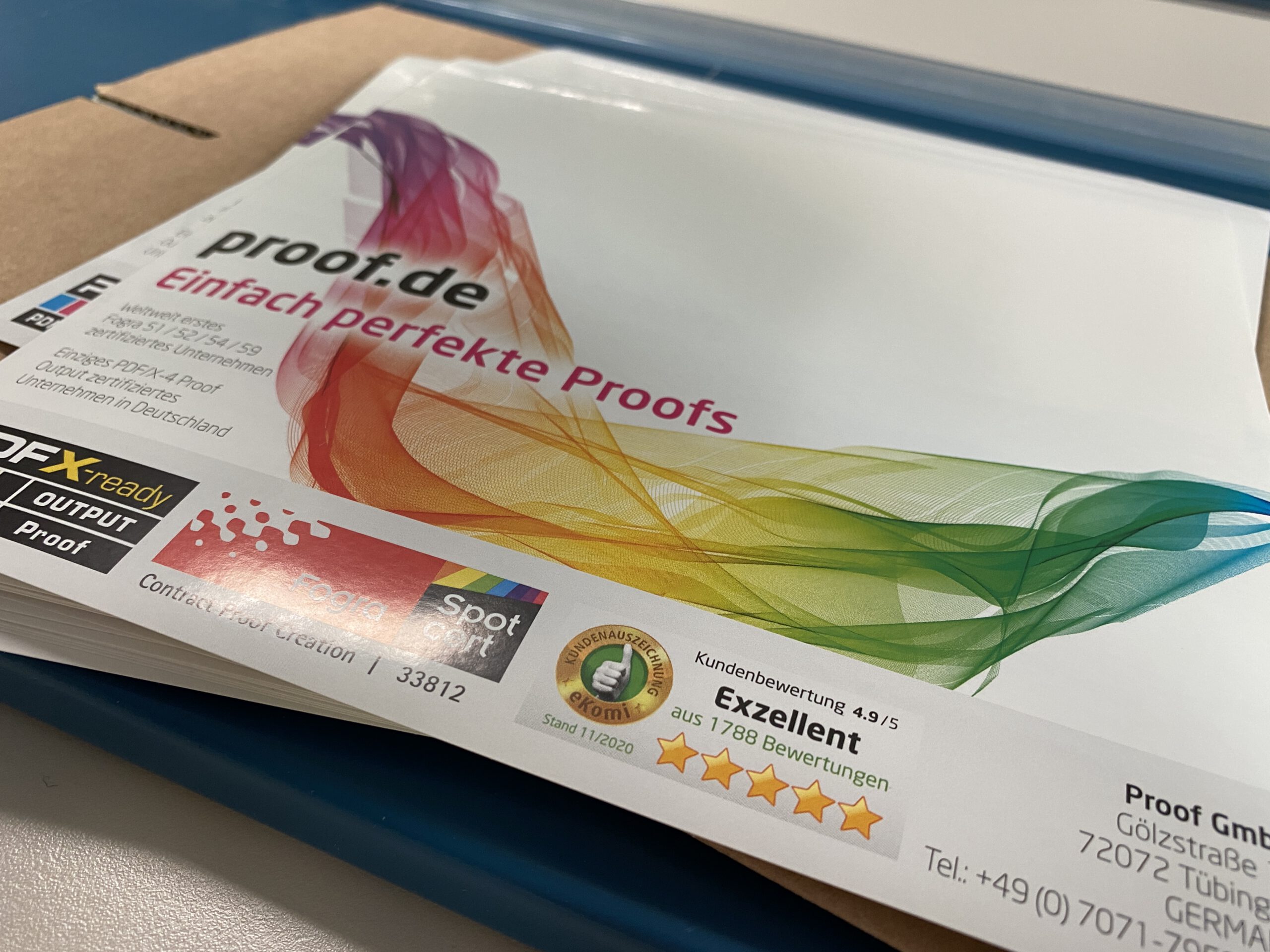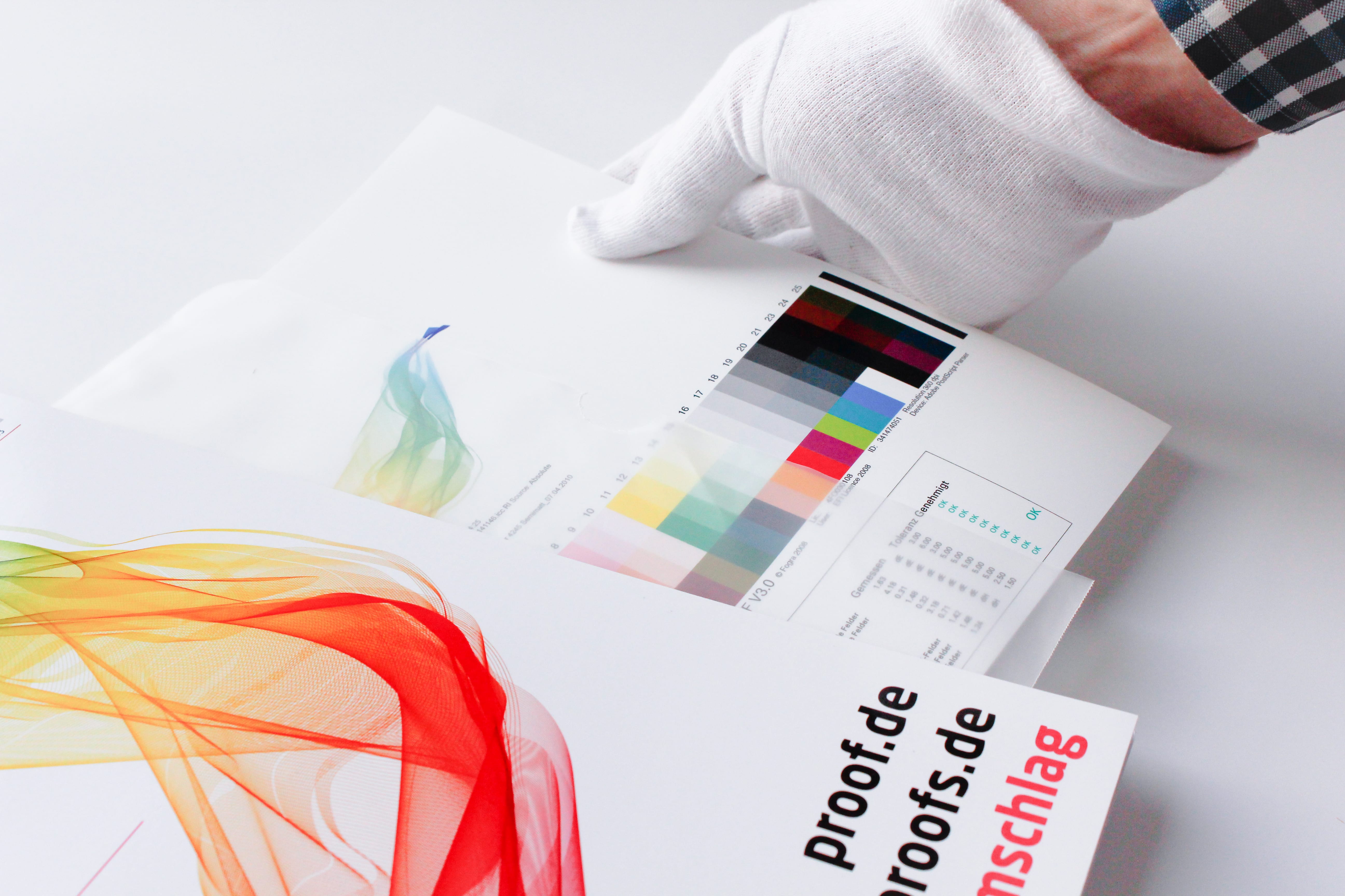
This year we have again submitted proofs for Fogra certification. We thus prove that we not only deliver excellent proof quality through internal quality controls and checks, but that the quality of our proofs is also confirmed by an external body. We have therefore had proof prints certified for the seventh year in a row.
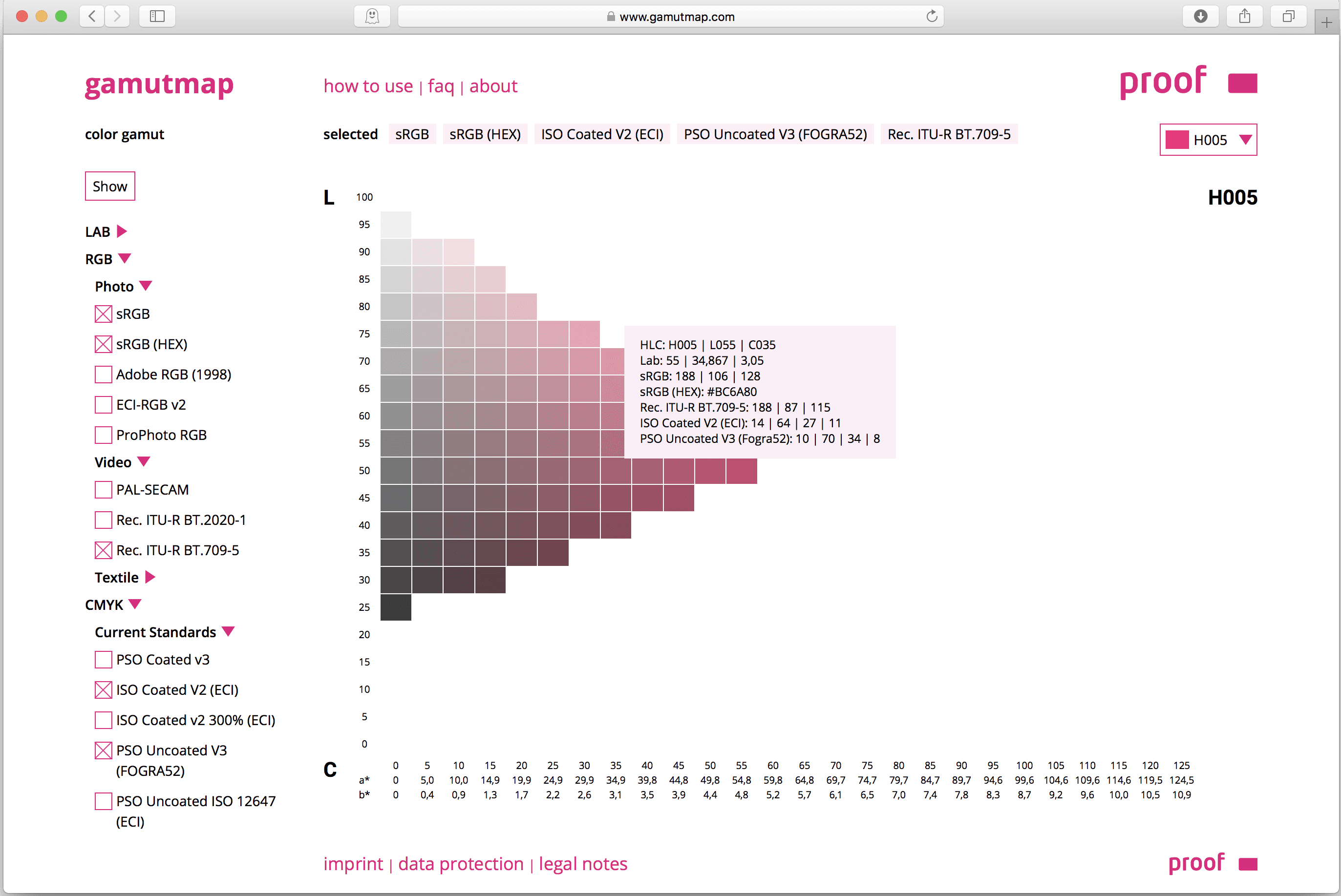
Cross-media colour management really works
Peter Jäger is an expert in colour management that reliably works across the boundaries of printers and monitors, web and print – essentially: cross-media.