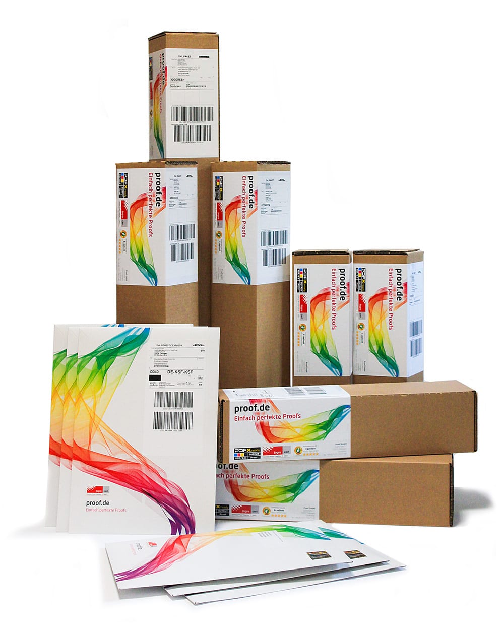
The new Proof Packaging from Proof.de: From now on your proofs are even better protected.

New packaging at Proof.de

Proof.de has introduced new packaging for proofs up to DIN A4+ and from A3.

The new A4+ packaging are made of high quality Chromosulfatcardboard with 450gr/m² weight and provided with a pull tab. They can be fitted on the front either with an adress label and postage stamp or for express shipments with a DHL Express label, as shown in the picture below. For shipping abroad we use to send via world letter large with registered mail, which is now directly printed as an adress label with stamp.

Die neuen Proof Verpackungen von Proof.de: Ab sofort sind Ihre Proofs noch besser geschützt.

The new cardboard shipping sleeves are slightly slimmer than before and also provided with a comfortable pull-tab. The new address labels are easy to recognize as of Proof.de. For the different formats between Proof DIN A3 and DIN A0 + they are available in various lengths and are each used appropriately according Proof size. They are used with DHL shipping labels for the standard shipping and express delivery.

Read more

Anaglyph glasses - transmitted spectrum of the two foils

Reproduction of anaglyph images and line drawings

Already a few weeks ago we received an unusual request: The musician and aspiring art student Tobias Weh from Osnabrück experimented with line drawings based on anaglyphs and achieved very good results on the monitor. He created superimposed line drawings, which then delivered a different image when viewed through the left eye than when viewed through the right eye. The question was whether this could be reproduced better with the high color range of a proofing system than with a simple domestic inkjet printer.

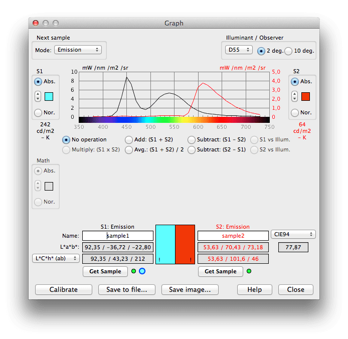
Since such questions are of course very interesting at first sight, we were quickly prepared to support Mr Weh in his work. To get closer to the matter, we use an i1 Pro 2 and BabelColor Color Translator & Analyzer to measure the spectra for the two films, which are transmitted through standard anaglyph glasses.

Anaglyphenbrille - Durchgelassenes Spektrum der beiden FolienActually a very satisfactory result. By choosing two colours as printing in the spectral ranges of 450 to 500 nanometres for blue and 650 to 700 nanometres for red, it should actually be possible to achieve quite a good result.

Read more

Proof GmbH Fogracert Contract Proof Creation 28651

Proof GmbH: Fogra certified for ISOcoatedv2 (Fogra 39) and PSOUncoated (Fogra 47)

The Proof GmbH has again successfully completed Fogra certification for the production of contract proofs – Contract Proof Creation. The certification proofs have been produced both on EPSON 7900 and EPSON 9900 proof printers with SpectroProofer measuring instruments. Our two proofing papers were included in the certification process. Proof GmbH is therefore certified for the most frequently used Proofing Standards. The requirements for the Fogra certification go far beyond simply measuring the media wedge. So the proofs are analyzed according to the following criteria: Compliance with the tolerances of the …

Read more

PaC.Space Proofs in the shop: New Proof Profile for packaging gravure printing

PaC.Space is the first uniform colour standard and proof standard for packaging gravure printing on coated substrates and films. Proofs in the PaC.Space colour space can now be ordered conveniently at shop.proof.de. Up to now, there have been no colour standards in packaging gravure printing, as it is much more complex than magazine gravure printing, for example, and much larger colour spaces can be achieved in packaging printing. So far, the ISOCoatedV2 color space has often been used, but it contains considerably fewer colors than PaC.Space. Or in-house standards of …

Read more

Colour deviation of Pantone metallics and Pantone Premium Metallics colours in proofing in Delta-E (∆E)

Current proofing systems can print spot colours like Pantone or HKS very accurate. With Fiery XF 5.2 Proof software and the Epson 7900/9900 proof printers we evaluated, with which colour deviation PANTONE Metallics Coated and PANTONE Premium Metallics Coated colours can be reproduced in proofing.

The colour deviations were calculated based on the measured colour space of the proof system of Proof GmbH by the proofing software. Deviations should therefore be quite similar in practice. Almost all PANTONE colours can be simulated quite well in the wide colour gamut of the proofer.

The smaller the Delta-E value, the lower is the colour distance of the PANTONE reference to the proofed PANTONE colour. Higher Delta-E values ​​show, which PANTONE colours can’t be simulated accurately in the proof.

Please note: Since the proof devices does not have colours with metallic pigments, the metallic shine in the proof can not be reproduced. Only through the satin finish of our proofing paper a somewhat shiny effect is produced, which replaces partly the metallic luster of true PANTONE colours. Although the colour is well rendered, the metallic effect in the proof does not exist. The proof can therefore always be used only as a guide, but not as binding simulation of the final result.

Read more

Pantone 877 and Pantone Silver 10077 C in comparison: Pic 2

PANTONE Premium Metallics or PANTONE Matching System Metallics?

Currently, PANTONE has two parallel Metallics colour fans:

  • PANTONE Metallics Coated: Contains the classic metallic shades available since the late 1980s.
    • Main basic colours: PANTONE 877, 876, 875 …
    • Typical colour names: PANTONE 8020, 8040, 8060, etc.
  • PANTONE Premium Metallics Coated: The new Metallics fan, which has been in existence since 2012, showing new, finer metallic shades.
    • Main basic colour: PANTONE Silver 10077 C
    • Typical colour names: PANTONE 10142, 10158, 10214, etc.

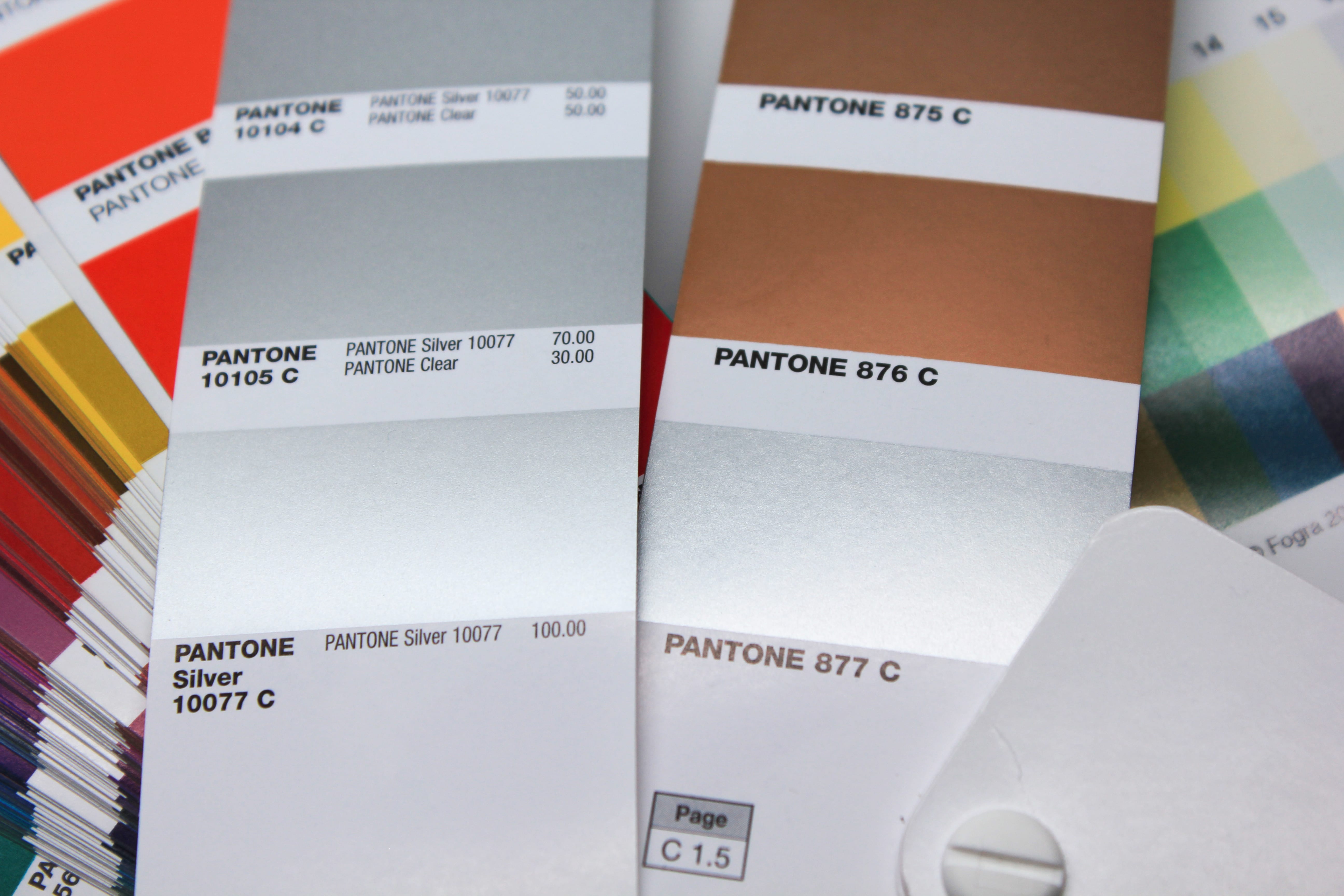
The main differences between the two fans lie in the composition of their respective basic colours: Firstly, there is the different Pantone Silver: PANTONE 877 or PANTONE Silver 10077 C. On the other hand, in the PANTONE Metallics Coated the silver is supplemented by further gold basic colours, while in the PANTONE Premium Metallics Coated the newly defined silver is the only metallic basic colour and is tinted by PANTONE Goe basic colours.

Read more

The names of the 84 new PANTONE Colours 2014

The following 84 PANTONE colours were added in February 2014 to the PANTONE Matching System and are included in the current Pantone Plus PANTONE 2337 | PANTONE 2338 | PANTONE 2339 | PANTONE 2340 PANTONE 2341 | PANTONE 2342 | PANTONE 2343 | PANTONE 2344 PANTONE 2345 | PANTONE 2346 | PANTONE 2347 | PANTONE 2348 PANTONE 2349 | PANTONE 2350 | PANTONE 2351 | PANTONE 2352 PANTONE 2353 | PANTONE 2354 | PANTONE 2355 | PANTONE 2356 PANTONE 2357 | PANTONE 2358 | PANTONE 2359 | PANTONE 2360 PANTONE 2361 | PANTONE 2362 | PANTONE 2363 | PANTONE 2364 PANTONE 2366 | PANTONE 2367 | PANTONE 2368 | PANTONE 2369 …

Read more

PDF X/4 data – who calculates? InDesign or the RIP?

Recently we received a PDF file from a Swiss customer who asked us to proof it according to ISOCoatedV2. The format was PDFX-4, we could open the file, preflight it and also display it in Acrobat. However, when proofing in Fiery XF 5.2, the file was only output after a RIP time of over 3 hours. Adobe PDF X4 screen output in Acrobat Professional We have recorded the screen layout on a modern Macbook Pro with four processor cores and the latest Acrobat Pro version to illustrate the enormous demands …

Read more

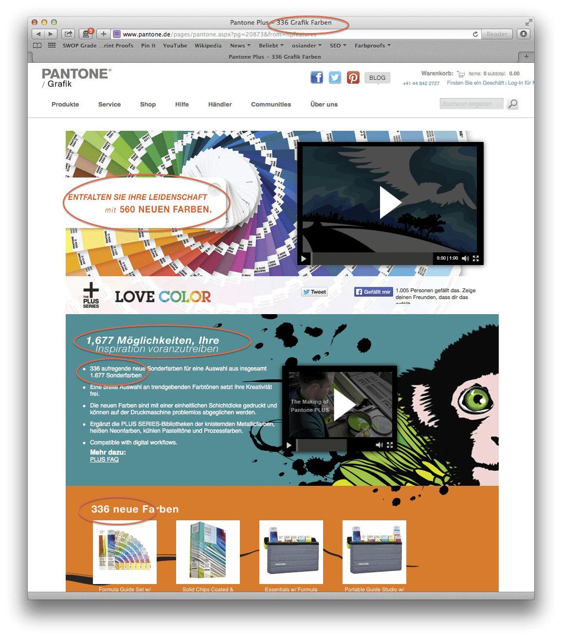
Screenshot Pantone Website 13.03.2014

Pantone Colour Chaos 2014: 84 new Pantone Plus colours annoy Pantone users

Pantone has added a further 84 colours to ist Pantone Plus colour palette in March 2014. The the total amount of the Pantone Plus colour now extends to 1755 colours as Pantone writes on his website. The colours were – matching the Pantone colour of the year: Radiant Orchid – expanded in the Rouge and Pink range, based on the previous base colours.

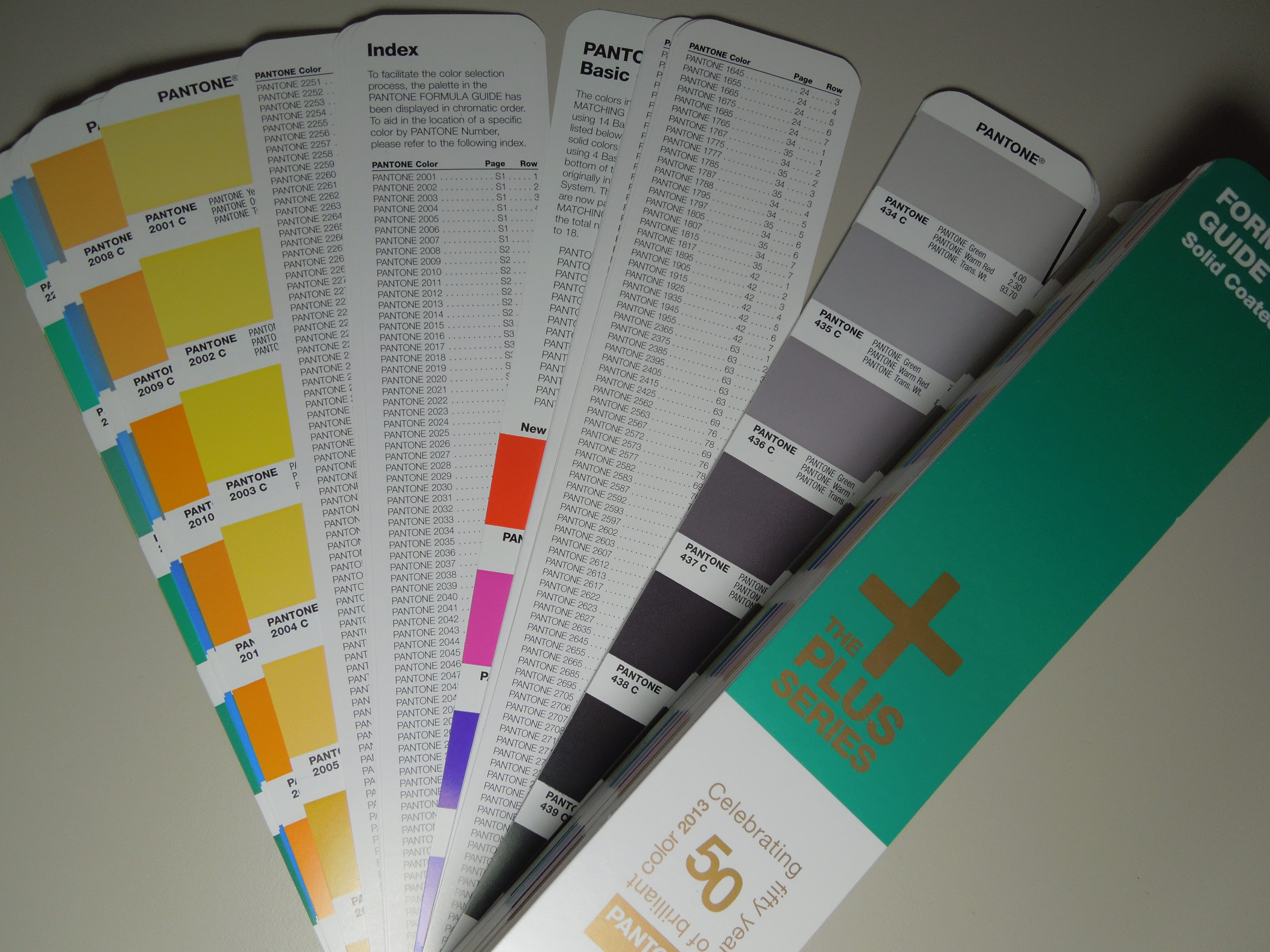
Two other changes compared to the previous 50th Anniversary PANTONE guides are visible:

  • The cover sheets have been redesigned
  • The order of colour arrangement has now changed by going to chromatic criteria and now corresponds to the chromatically correct order. The colours from 2010 and 2012 have now been logically integrated into the new colour fans.

Read more

Ten points that you should always keep in mind when proofing.

It is actually quite simple to have proofs made. But experience shows that many customers often stumble over the same mistakes. We have put together the ten most important steps towards a successful proofing job:

  1. Proof as late as possible in the production process
  2. Select the right proof profile for your purposes
  3. Convert RGB or LAB images to CMYK
  4. Name Pantone and HKS colours correctly
  5. Proof your data in a 1:1 ratio and not scaled down
  6. Always proof with UGRA/Fogra Media Wedge 3.0
  7. Make sure that the job ticket is correct
  8. Make sure your service provider has the latest proof software and hardware
  9. Only accept authentic “contract proofs” according to ISO 12647-7
  10. Make sure that your proof provider has valid certifications

In the following we would like to present these individual points in more detail.

Read more

Colour differences of Pantone Solid Coated and Pantone Solid Uncoated colours in proofing in Delta-E (∆E)

Current proofing systems can print spot colours like Pantone or HKS very accurate. With Fiery XF 5.2 Proof software and the Epson 7900/9900 proof printers we evaluated, with which colour deviation PANTONE Solid Coated and PANTONE Solid Uncoated colours can be reproduced in proofing.

The colour deviations were calculated based on the measured colour space of the proof system of Proof GmbH by the proofing software. Deviations should therefore be quite similar in practice. Almost all PANTONE colours can be simulated quite well in the wide colour gamut of the proofer.

The smaller the Delta-E value, the lower is the colour distance of the PANTONE reference to the proofed PANTONE colour. Higher Delta-E values ​​show, which PANTONE colours can’t be simulated accurately in the proof.

Read more

Pantone 50th Anniversary Guide: Two indexes

Pantone Plus vs. Pantone: Colours, fans and problems.

In 2010, one of the central innovations at Pantone was the new system for graphic designers, service providers and printers: The Pantone palette was extended by numerous colours and was given a new name: Pantone Plus

The extension by 560 colours was done in two steps:

 2010: 224 added to a total of 1341 Pantone Solid colours

In 2010, the Pantone palette was extended by 224 colours, which are named from 7548 to 7771 in the Pantone classification. All new colours could continue to be mixed with the previous 14 Pantone basic colours in the print shop.

Read more

Heatset and coldset? What’s the difference?

Nowadays, two different processes are used in web offset printing: heatset and coldset.

The coldset process is mostly used to print newspapers and paperbacks, with the printing ink drying purely by absorption.

In the heatset process, the paper is passed through a large dryer and a chill roll unit after the last printing unit. The length of the printing press is almost doubled by these two units. To ensure that the ink dries optimally, special heat-drying inks are used here.

Read more

ISO12647… and then what? On the further development of the ProcessStandard Offset Printing

Fogra is currently working with great commitment on modernising ISO 12647 and adapting it to current environmental conditions.

Important innovations of the reformed ISO 12647 will be:

  • Innovations regarding paper types (PT)
  • New tone value increases
  • For proofing: New papers with optical brighteners

Why is ISO 12647 being revised? Environmental conditions have changed significantly at three central points since the last revision in 2004.

Read more

Moiré effect through overlapping grid

What is Moiré? And can I see Moiré in a proof?

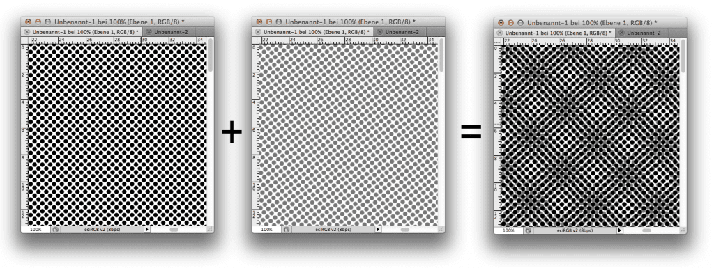
The Moiré effect, or in other words a halftone screen overlay, is a common phenomenon when viewing prints. It occurs when two even patterns overlap unevenly.
Moiré Effekt

When does Moiré appear?

Moire is always created when screens overlap. Typical examples:

  • You have scanned in a newspaper ad and print it in another newspaper.
  • You print the portrait of a managing director wearing a jacket with a fine houndstooth pattern, a checkered shirt and a finely patterned tie. Regardless of the printing process, complete moiré chaos is guaranteed to break out here.
  • A brick building is reproduced in offset printing.
  • The photograph of a ventilation grille is viewed on a monitor

    Read more

Color Selector - Adobe Photoshop

Easy conversion of Pantone – HKS – CMYK – RGB with Adobe Photoshop

Farbbücher Auswahl in Adobe Photoshop CC: HKS, Pantone, CMYK und vieles mehr

More often the question arises as to what kind of Pantone colour corresponds to the HKS 43 K. Or what CMYK value? And what kind of web color in RGB?

If you own Adobe Photoshop, you can do these conversions directly there. In Photoshop CC all well-known color books are stored with values.

Let’s assume we are looking for the Pantone equivalent and the matching CMYK color of HKS 43 K.

1: Open the color palette in Adobe Photoshop and select HKS K as the book and then the color HKS 43 K. All well-known colour books are directly stored in Photoshop.

Read more

Contract Proof in SC Paper FOGRA40, including media wedge and measuring protocol

Proof for Improved Newsprint (INP), Fogra 48

The default was:

“We need a proof for improved newsprint, white’76.”
“Do you know the proof profile?”
“No, unfortunately not. Can’t you decide that?”

We have looked into this question: UPM EcoPrime 76 H is printed on web offset paper in a large print shop. The information of the customer service there was:

“The default profile is Fogra 42, PSO SNP Paper (ECI) but that doesn’t fit at the back and front, is much too gray. “Proof according to Fogra 40, SC Paper (ECI), that’s much better.”

The two profiles do not match at all. SC Paper is for super-calendered paper, PSO SNP Paper for standard newsprint.. And the dot gain curves also differ completely.

Read more

original picture, iso coated v2 300%

What is a finishing proof? Fogra49 and Fogra50 in detail.

With the proof standards Fogra49 and Fogra50 for the first time a proof standard was created that is not binding for printing. Why?

Fogra49 and Fogra50 describe two colour spaces as they are created by foil lamination not after printing but after printing and finishing.

  • Fogra 49 refers to the ICC profile: PSO Coated v2 300% Matte laminate (ECI) – PSO_Coated_v2_300_Matte_laminate_eci.icc
  • Fogra 50 refers to the ICC profile: PSO Coated v2 300% Glossy laminate (ECI) – PSO_Coated_v2_300_Glossy_laminate_eci.icc

Why were these profiles created?

Print finishing plays an increasingly important role in the further processing of printed matter. The application of a printing varnish, for example, is nowadays usually done directly during the printing process, e.g. with dispersion varnish in a 5th inking unit. The print image is usually only slightly changed in the process: An dispersion varnish, for example, results in a dot gain of 2-3 percent, a UV varnish up to around 5-7 percent. In contrast, foil lamination with OPP foil has a much stronger

Read more

Create EAN / GTIN codes: Tips for graphic artists

EAN codes are standard on every product today. While in the good old days, shopowners themselves typed the prices into a cash register by hand, today scanner cash registers are the rule, which scan standardized EAN codes with a laser and thus clearly recognize the article and add it to the receipt.

EAN, by the way, stands for “European Article Number” and was replaced in 2009 by the global GTIN, “Global Trade Item Number”. The EAN or GTIN is a barcode that can be read automatically and read by barcode readers.

For graphic designers in Europe, two standards from the almost infinite number of EAN codes in use worldwide are primarily important in the product area. EAN 13 and EAN 8, i.e. a barcode of either 13 or 8 digits. What do these numbers actually mean?

Read more

How exactly can printing ink be measured?

For some years now, the possibilities of colorimetric measurement of printing inks have become simpler and cheaper. And so it is often believed that measuring printing inks is simple, inexpensive and, above all, highly accurate. And this also across a wide variety of brands and generations of measuring devices. Is that true?

If you look at a few studies, that does not necessarily seem to be the case. IFRA, for example, requires that when measuring BCRA ceramic tiles the colour differences between different measuring instruments should be below Delta-E 0.3. In reality, however, things looked different. In a Nussbaum study, 8 out of 9 measurements were for a Delta-E greater than 2.0; in a Wyble & Rich study, the deviations were between Delta-E 0.76 and 1.68. But why are the deviations so large?

On the one hand, the measuring instruments differ in the way they illuminate the surfaces to be measured. This is important in two respects: On the one hand, measurements can vary greatly depending on the material, for example, because light is emitted and measured from only one light source onto the measuring surface. If a measuring instrument has only one lamp, which, for example, radiates at an angle of 45 degrees onto the measuring surface and whose reflection is measured, then the measurement can deviate by up to Delta-E 3.0 if you only rotate the measuring instrument about its own axis. If a left-handed person and a right-handed person measure the same tiles with the same measuring device, then just by holding the measuring device differently and by the different lighting angles of the tiles a measurement can be completely different.

Read more

WordPress Cookie Plugin by Real Cookie Banner