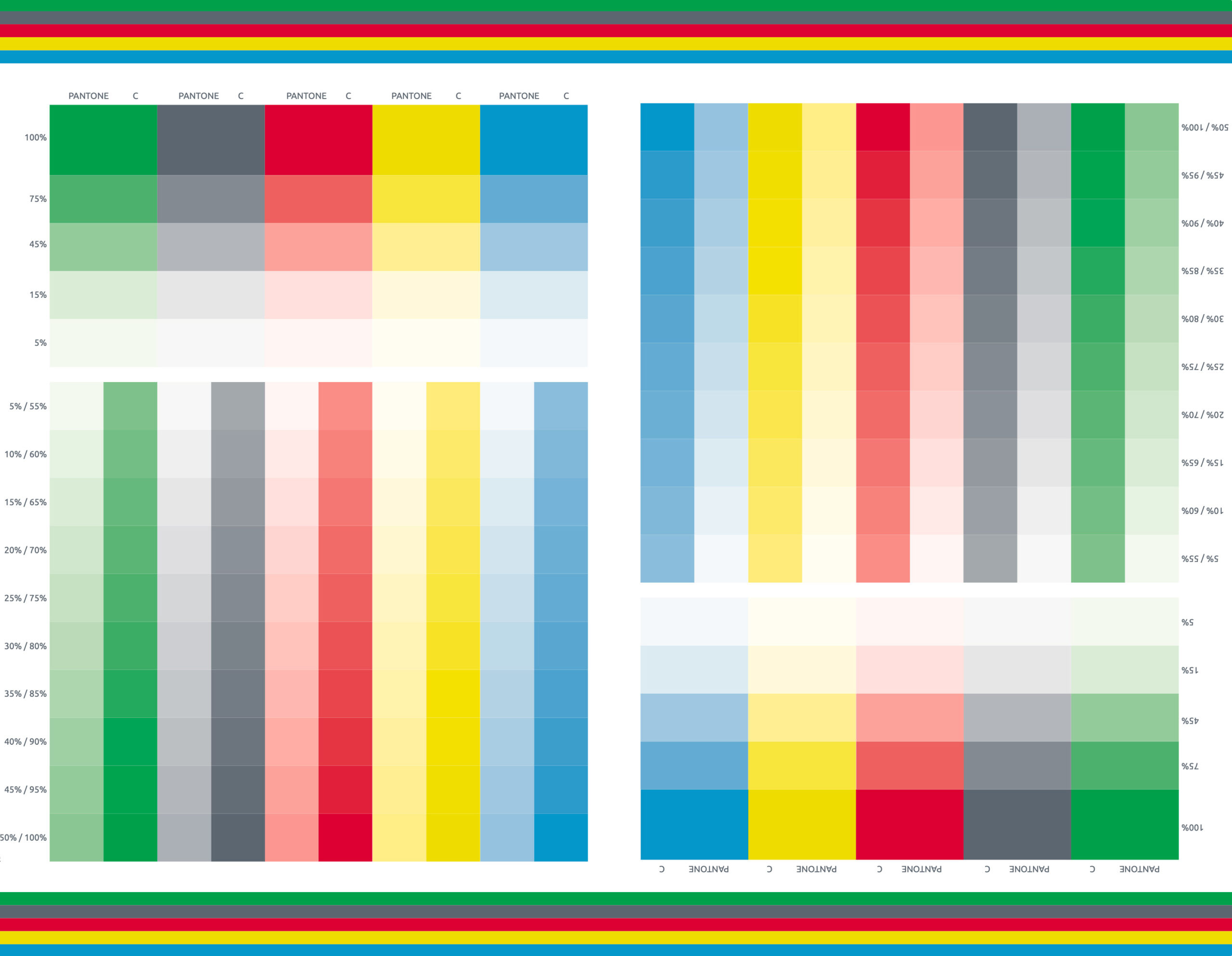
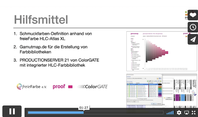
Recently, we have been receiving more and more colour management consulting enquiries where “digital first” designs reach their limits: Namely, always when, after a few months or years, the first trade fair appearance, the first annual report or the first catalogue in classic online printing is due. And it is precisely at this moment that it occurs to everyone involved that they do not even know how their “digital first” colour strategy is supposed to look in print. But let’s take a look at the problem from the beginning:
Fogra Colour Management Symposium 2026 in Munich from 24 to 26 February
The most important colour management event takes place every two years in Munich: the Fogra Colour Management Symposium. Once again this year, all professionals are invited to make the pilgrimage to Munich: two days of lectures, discussions and a Bavarian evening await participants. Matthias Betz, owner of proof.de, will also be there again: for many years, he has been taking advantage of the opportunity to exchange ideas with colleagues and friends, learn about new technologies, hardware and software, and talk to colleagues from Fogra, freieFarbe, GMG and many more. In …


