Colour deviations in 2023 PANTONE Color Bridge Guides

PANTONE Color Bridge Coated Comparison 2023 and 2022 CMYK an Solid Coated colour deviations in DeltaE00

After Eddy Hagen pointed out in this posts, that there were some major colour deviations between the brand new PANTONE Solid Coated Guide 2023 and the previous version especially for the PANTONE 2635 C, I was curious to lookup the same colours in the new PANTONE Color Bridge Coated Guide of 2023 and compare the colours with the previous version.

I measured a dE00 of 8,15 between the two colours that Eddy mentioned, which is really far apart from how accurate PANTONE colours should match between the different PANTONE guides.

Even on the first glance it was clear, that there are not only large deviations in the Solid Coated PANTONE Colours, but as well in the colour swatches with the CMYK equivalents.

I have measured both PANTONE fandecks with an i1 Pro2 and Babelcolor in M2 D50/2° and compared the measurements in Delta-E2000.

The maximum deviation of two PANTONE Solid Coated C Colours is Delta-E00 of 7,01, the maximum deviation of two PANTONE Color Bridge CMYK Colours is Delta-E00 of 5,67.

The lowest DeltaE00 of all PANTONE Colours of that specific page is the one of the PANTONE base colour PANTONE Violet C. That might take into account, that the change in recipies might account for more deviations than anticipated by PANTONE.

Color Deviations between
We compared the current 2023 version PANTONE Color Bridge Guide with the predecessor version of the guide. Both version are official PANTONE versions in March 2023 and are both being sold on the PANTONE online shop.

We compared the current 2023 version PANTONE Color Bridge Guide with the predecessor version of the guide. Both version are official PANTONE versions in March 2023 and are both being sold on the PANTONE online shop.

New PANTONE Formula Guides with incorrect ink formulations

PANTONE Fächer Solid Uncoated 2023 mit Fehlern in der Farbrezeptur. Detailansicht der identischen Rezepturwerte für unterschiedlichen PANTONE Farben.

Several errors have crept into the new PANTONE 2023 fan decks. In both the PANTONE Solid Coated and the Solid Uncoated color fans, there are colours for which the new ink formulations are incorrect.

In the PANTONE Formula Guide Solid Coated fan 2023, PANTONE 107 C and PANTONE 108 C have absolutely identical ink recipes, as well as PANTONE 113 C and PANTONE 114 C. As the colors differ, this cannot be the correct.

Several errors in the PANTONE Solid Uncoated fan 2023

In the PANTONE Solid Uncoated fan 2023 it gets even more critical: In the new fan, PANTONE 106 U and PANTONE 107 U have exactly the same ink formulation, the same applies to the formulations of PANTONE 108 U and PANTONE 109 U as well as for PANTONE 113 U and PANTONE 114 U which also have identical colour formulations.

PANTONE Connect also with formulation errors

But not only in print are the formulations wrong, in PANTONE Connect the shown formulations are identically wrong. In one case, in PANTONE Connect, the PANTONE 109 U spot colour even has a different, but nevertheless incorrect formulation, as it shows the exact ink percentages of the PANTONE 110 U.

At the same time, there are 3 formulations for 1 colour:

Currently there are three formulations for PANTONE 109 U within PANTONE, as the former fandecks are still available for sale on the PANTONE website: Of the three formulations, one is old and the two new ones are wrong.

PANTONE 109 U

  • The “old” formulation of the still available previous fans:
    PANTONE Yellow: 98.5%
    PANTONE Warm Red 1.50%
  • The new formulation of the 2023 fan, probably wrong:
    PANTONE Yellow PY 12: 27.01%
    PANTONE Orange 016: 1.07%
    PANTONE HD Extender: 71.92%
  • The new formulation from PANTONE Connect, probably wrong:
    PANTONE Yellow PY 12: 51.95%
    PANTONE Orange 016: 3.28%
    PANTONE HD Extender: 44,77%

An annoying mishap that PANTONE has made here. I am curious if and when PANTONE will correct the mistakes. In PANTONE Connect it can be done with a simple update, but current colour fans will hardly be able to be exchanged or supplemented with corrected pages.

“Digital First” often means “Colour Problems Second!”

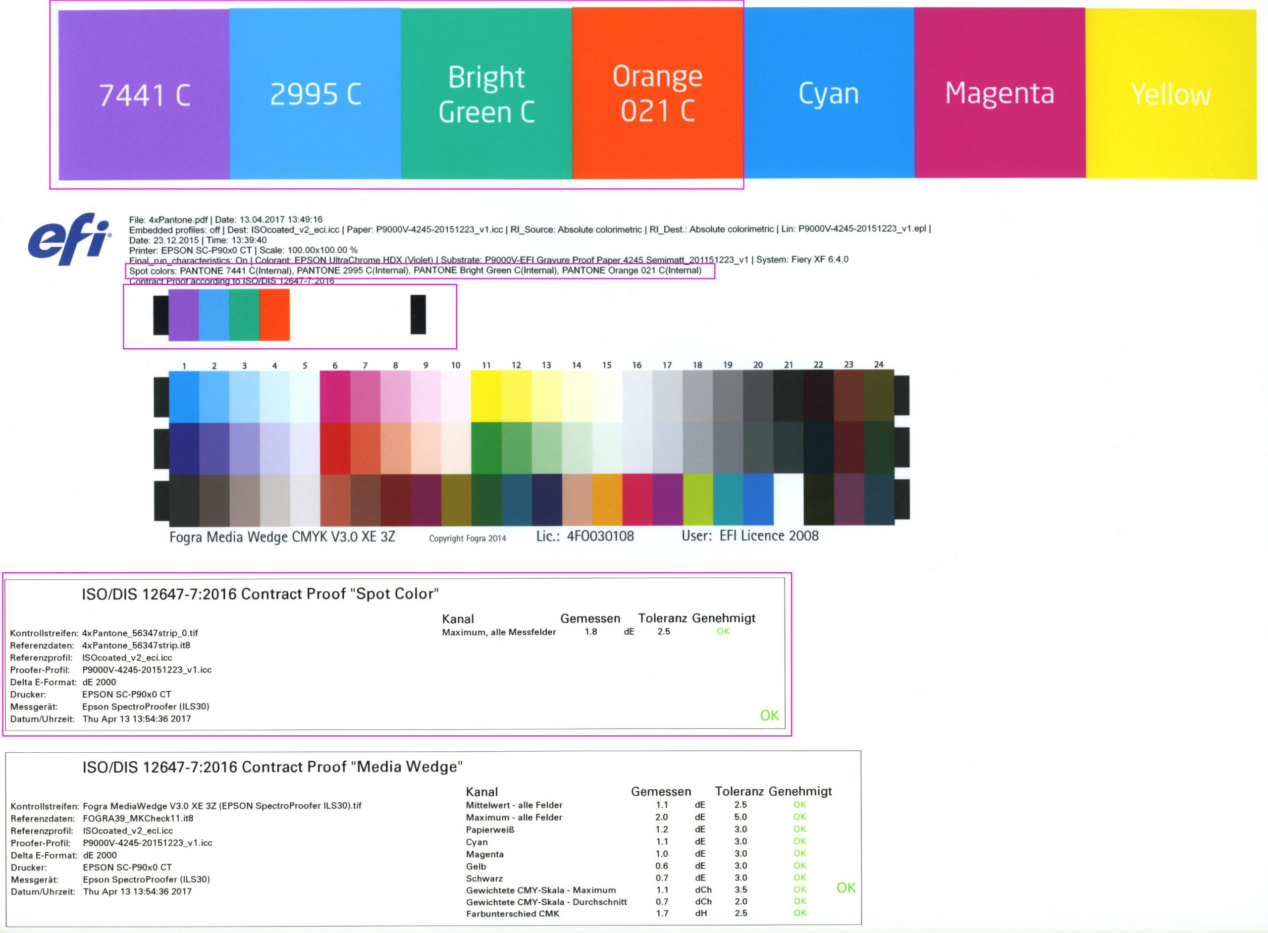
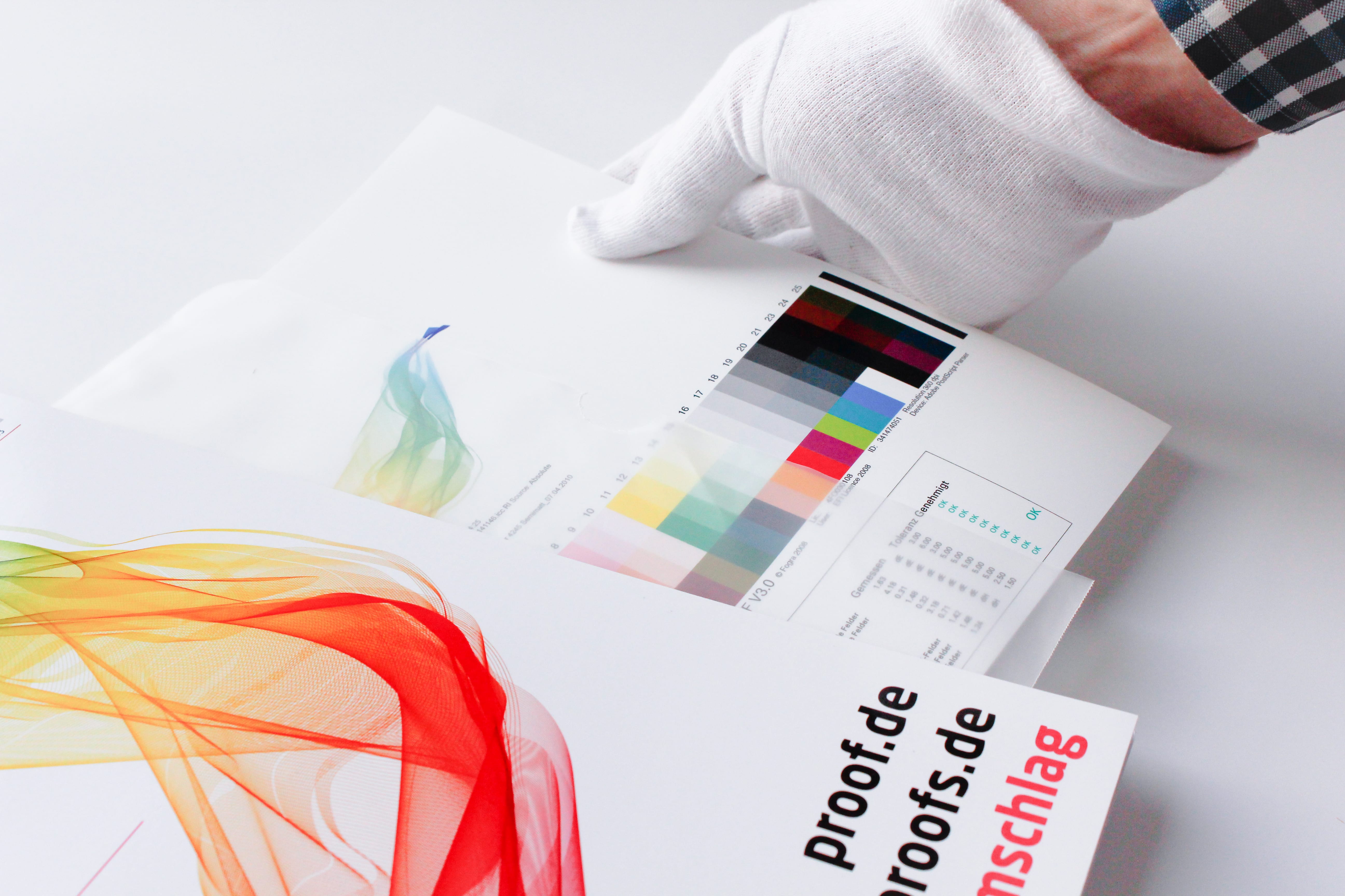
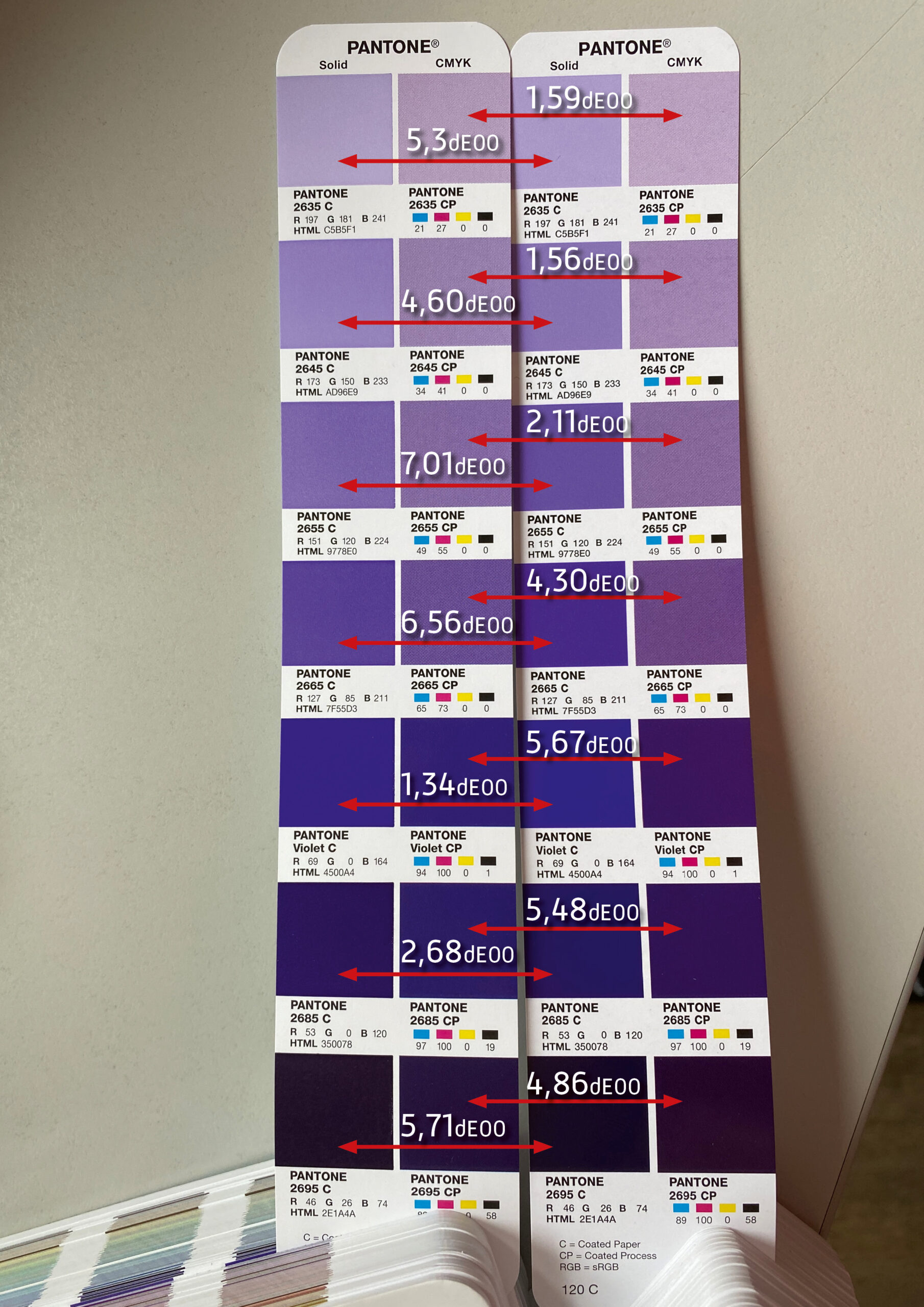
Recently, we have been receiving more and more colour management consulting enquiries where “digital first” designs reach their limits: Namely, always when, after a few months or years, the first trade fair appearance, the first annual report or the first catalogue in classic online printing is due. And it is precisely at this moment that it occurs to everyone involved that they do not even know how their “digital first” colour strategy is supposed to look in print. But let’s take a look at the problem from the beginning:
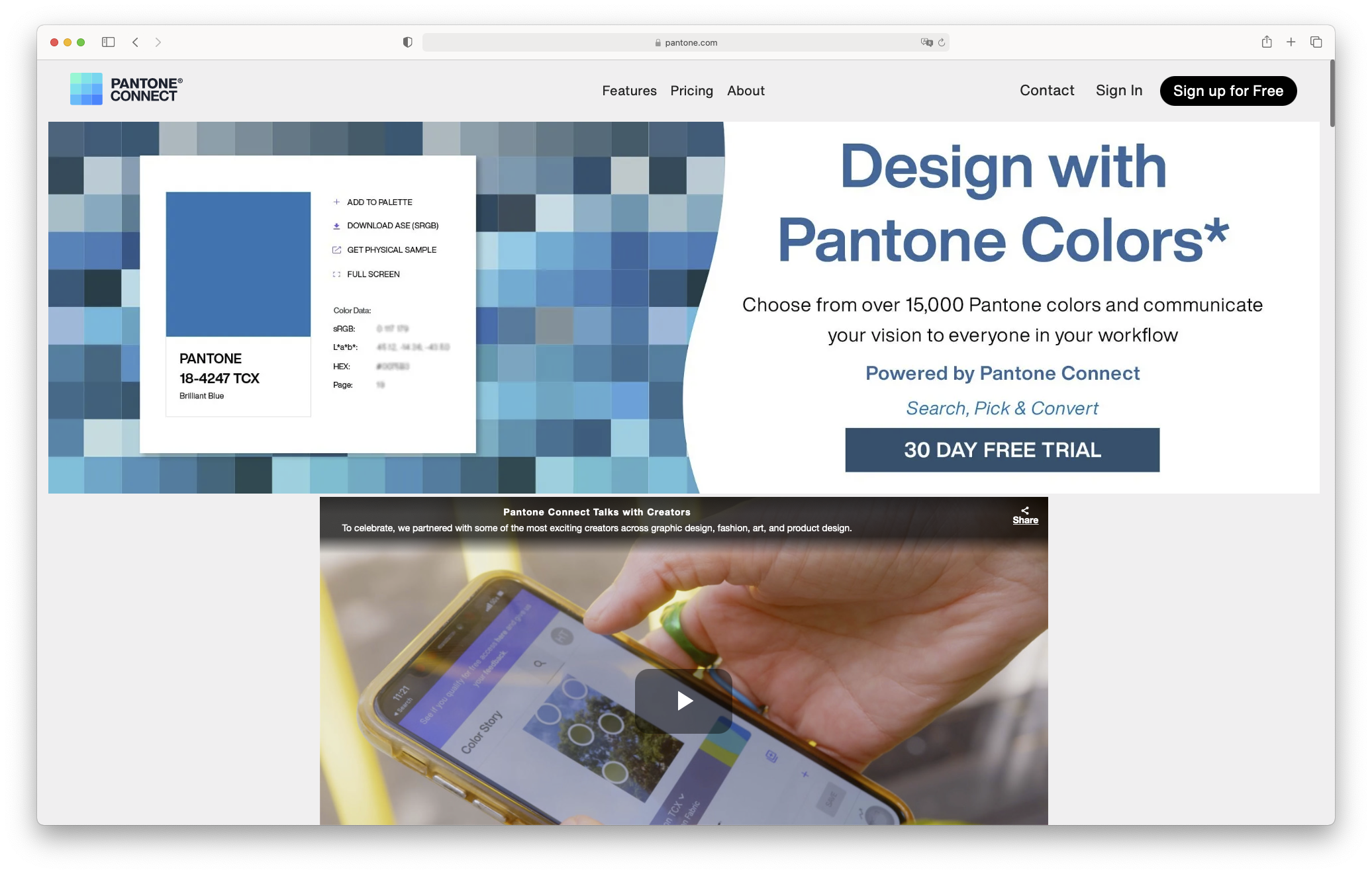
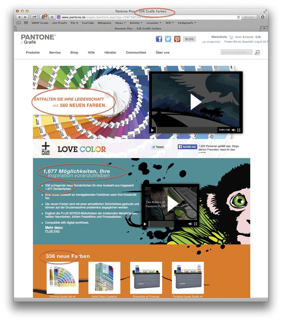
Digital First = First priority for digital online media. But what if it’s time to print?

Whether it’s a large global corporation or a small company, the following often applies to designs or redesigns today: we develop everything for digital first. Agencies therefore create RGB colour worlds for the new corporate design, often with crisp, saturated screen colours and strong pastel tones. And if colours are used for different products or communication lines, then a complete corporate colour world with many corporate design colours in RGB is created, presented and approved, the online presentation portfolio is launched and the company is presented digitally in a new corporate design light.

The whole thing works well at first, and everyone looks at it on their monitor and is satisfied. But then, after a year, the first trade fair and the first printed annual report arrive. All right, think agency and client, let’s take our “digital-first” colours and print them in offset in our annual report and in digital print on our trade fair wall and on posters. But by the time the first design draft comes out of the laser printer and the printer has printed the first pages of the catalogue, a colour hangover breakfast is in order.

  • “Oh no, that looks completely different from what I see online on my monitor.”
  • “The blue is kind of too purple now, isn’t it? Or is the purple now blue?”
  • “It kind of looked different and better in the presentation on the big screen TV, didn’t it?”
  • “The crisp ultramarine is quite washed out and pale on the uncoated paper…”
  • “Idea: If we print with PANTONE colours, it will be more colourful. But which ones?
  • ” For John, the PANTONE fan was a great match for the screen, but for Hannah it wasn’t at all.”
  • “And what, printing three PANTONE colours and CMYK costs a lot more?”

By now, at the latest, it is clear to all those involved that things are going to get difficult and that they have a lot of work ahead of them. Using a real-life example from the past, let’s assume: For more than 10 sRGB colour tones, matches for spot colours and CMYK for picture printing and uncoated paper have to be found quickly. This is where important questions arise:

  • Who decided the colour design based on what view a year ago?
  • Did they see the colours on the monitor? On the beamer? On the iPad? On the big-screen TV? Were the devices calibrated?
  • Is it to be printed with PANTONE or with CMYK or both? Coated? Uncoated?
  • “The printer was kind enough to select a PANTONE colour for all our shades.”
  • A PANTONE colour? For coated and uncoated? What did they base it on? And how did they determine the best matching PANTONE colour? By eye? Measurement? Calculation?

Proof.de makes ” Digital First” colour worlds printable.

Optimised CMYK implementation of spot colours as PANTONE, RAL, HKS, Oracal and more

We have been able to assist many clients in making decisions and converting “Digital First” sRGB online colour worlds into printable colours. This does not mean that we have been able to find optimal CMYK or PANTONE spot colour conversions for all online colours. But it does mean that we were able to determine good conversion values for all colours and, in the case of strong deviations, explain why these occurred and on the basis of which criteria we decided on the best of the bad conversions. How far was the original colour “out of gamut”? Are we better off going for the greatest possible colourfulness, or for the best possible brightness match, which is then perhaps less colourful? Can we use the same PANTONE spot colour for picture printing and uncoated paper, or do we use different colours for coated and uncoated?

We do not rely on mumbo jumbo for such colour consulting jobs, but on measuring, determining and calculating colour distances.

It is often easier to talk about colours when you talk about measurements rather than feelings. With a colour matrix, it is often possible to show what more or less cyan and magenta would look like in a colour mix. With a sample or a fan as a reference, it is easier to sample colours and better understand where the limitations of a CMYK conversion and colour space lie.

PANTONE to CMYK optimisation by Proof.de: Colour matrix for matching existing prints and colour templates such as PANTONE fans or coated references.
Pantone to CMYK optimization

In the end, we work with the customer to determine the best colour conversion for their application: If the layout is written in white on a colourful sRGB colour field, then it is probably more helpful to use a more saturated and therefore somewhat darker colour value, which increases the contrast and legibility of the white font to the colourful background. If, on the other hand, black is written on the surface, then it is often helpful to keep the brightness close to the sRGB or PANTONE original, and to do without “more” colourfulness. Do we define different PANTONE colours for coated and uncoated, or do we use only one colour for consistency and ease of communication? And for the same reasons, do we use the same CMYK values for image printing and uncoated paper, or different ones?

You need an sRGB to CMYK conversion? Talk to us.

If you have a need for a conversion of RGB colours from “Digital First” coproprate designs to CMYK, then please feel free to contact us at any time. We will advise and help you transparently and competently to achieve the best possible solution for you and with you.

Proof GmbH 2021 Certified Again by Fogra with Fogra “Spot cert”

Title Test Report Fogra Certificate Proof GmbH 2021 Fogra Contract Proof Creation 34558

Fogra Certificate Proof GmbH 2021 Fogra Contract Proof Creation 34558

This year we have again submitted proofs for Fogra certification. We thus prove that we not only deliver excellent proof quality through internal quality controls and checks, but that the quality of our proofs is also confirmed by an external body. We have therefore had proof prints certified for the seventh year in a row.

Already in 2019, we were among the first to also be certified for the representation of spot colours (“Spot-cert”), and in 2020 we also went through Spot-cert in addition. And all in all, we have been successfully certified by Fogra for the ninth time in a row. Sometimes customers ask:

“You get Fogra certified every year. Won’t that become unnecessary at some point? You know you can do it …”

Yes, that is sometimes true. Every certification means effort and costs, the prints have to be made, sheets have to be filled in, everything has to be sent to Munich and invoices have to be transferred. And that’s just so that we can have the same high quality confirmed as in previous years. On the other hand, this isn’t true either.

Proofing is only superficially “service by the book as always”. In real life, no two years are the same. Proofing software, for example, is not sold on the mass market, so every update brings difficulties: Important functions fail, protocols are output incorrectly, optimisations do not optimise but worsen the results…: What we haven’t had to experience! Especially here it is important to have the security of certification by Fogra that even with the latest software revision all relevant processes still run cleanly.

The same applies to the hardware, which can be just as troublesome as the software: sometimes we have a generation change of proof printers, which always involves a change of inks and colour pigments, sometimes the driver or firmware is renewed, sometimes faulty print heads have been replaced …: Here, too, there are many possible sources of error that keep us on our toes. And here, too, the certifications bring us security for daily production – our everyday business. And that, too, is often not commonplace at proof.de:

Verifiably precise …

Our so-called “everyday business” is often characterised by special cases, exceptions and special requirements. Admittedly: We like to work off Fogra39 proofs in ISOCoatedV2, where all data is delivered in CMYK. Something like that just runs really smoothly for us. But apart from these “standards”, we process much more for our customers: we produce high-precision colour samples, proof individual proof profiles for metal decor printing, process thick, high-gloss papers for proofs and extremely thin, matt papers for art projects, apply PANTONE colours to roll-ups, fine art prints in AdobeRGB on cotton canvas, ECI-RGB-V2 on Hahnemühle papers, print XYZ colour targets for multispectral cameras and …:

Our so-called “everyday business” is often characterised by special cases, exceptions and special requirements. Admittedly: We like to work off Fogra39 proofs in ISOCoatedV2, where all data is delivered in CMYK. Something like that just runs really smoothly for us. But apart from these “standards”, we process much more for our customers: we produce high-precision colour samples, proof individual proof profiles for metal decor printing, process thick, high-gloss papers for proofs and extremely thin, matt papers for art projects, apply PANTONE colours to roll-ups, fine art prints in AdobeRGB on cotton canvas, ECI-RGB-V2 on Hahnemühle papers, print XYZ colour targets for multispectral cameras and …:

Read more

PANTONE Find a Color No Longer Available Without Registration

New PANTONE Find a Color home page: Now only with PANTONE Connect: Without logging in, you can no longer even access the RGB and CMYK values of PANTONE colours on the PANTONE website.

That was fast: Only a few days after Adobe’s announcement to remove the PANTONE colours from their latest revisions of the Adobe product range, PANTONE reacted and removed the popular tool “PANTONE Find a Color” from the internet. Instead, the login to PANTONE Connect can now be found there, a tool that provides the previous functionality partly for free and partly for a subscription price with extensions.

New PANTONE Find a Color home page: Now only with PANTONE Connect: Without logging in, you can no longer even access the RGB and CMYK values of PANTONE colours on the PANTONE website.


If you are looking for the usual functionality again, you at least have to register, but many additional features are only available for a hefty surcharge. The discount in the first year still sounds reasonably cheap, but when paying the full price, the PANTONE colours are only available for 6.99 €/month or almost 84 euros per year. This is a steep price for the fact that PANTONE should have a vested interest that their colours on the internet should also be used by people who do not have a PANTONE fan in their hands.

Price table of PANTONE Connect: If you need all functions, you have to dig deep into your pocket.

PANTONE Color Manager discontinued

The popular PANTONE Color Manager was also discontinued. This software was available to anyone who bought a PANTONE fan. An individual code was printed on the back of the fan, with which one could download the PANTONE Manager and get it running. Once installed, you could access all current fans, colours and key colour definitions in RGB and CMYK and export all PANTONE colours as LAB, CMYK and more as ASE and ACO for Photoshop, Illustrator and InDesign. If you now call up the Color Manager website, it says: Product set.


But maybe that is exactly PANTONE’s new approach: We are so big, we can afford everything. Just like Adobe: nothing works without a subscription. But while Adobe has really set standards in the graphics sector, PANTONE has not necessarily stood out as the indisputable “Biggest Global Player in Colour” in recent years due to its often short-term actions.

Let’s see how the next months turn out. It is not impossible that PANTONE will have to row back. If a licence-free colour system like the free colour CIELAB HLC colour system should ever gain a foothold, then hard times are ahead for the licence-driven systems. If more companies open up to such duel-open, transparent and yet precise and predictable solutions, then PANTONE will quickly be on a difficult track. Because when it comes to colour, it is certainly difficult to regain market share once lost. Also noticeable:

PANTONE Connect rated very poorly

If you search for PANTONE Connect in Adobe’s extensions, reading the ratings will bring tears to your eyes. At the tool Ekomi, which we at Proof GmbH use for rating collection, the best rating score is only up to 4.8 out of 5 stars. And below 4 out of 5 stars, everything is rated as a disaster. And PANTONE Connect: 1.9 out of 5 stars. In other words: absolutely miserable.

Read more

Adobe Software Without PANTONE Colours

CIELAB HLC Colour Atlas XL Colour Wheel v1

This was not the announcement that was expected: As of March 2022, new Adobe software products will no longer include included PANTONE colour libraries. Adobe said: “In March 2022, Pantone colour libraries pre-installed in Adobe Photoshop, Illustrator, InDesign, Adobe Color and Adobe Capture will be removed from future software updates.”

https://helpx.adobe.com/creative-cloud/adobe-color.html

That Adobe and PANTONE have become increasingly estranged in recent years has been noticeable for some time.

The integration of current PANTONE libraries was sluggish or, in recent times, no longer automatic; anyone who wanted current libraries had to export them via the PANTONE Color Manager and import them into Adobe software … a tedious and error-prone system. Presumably, however, it was the licensing costs that prompted Adobe to take the final step. The clear leader in software production was probably simply tired of being bullied by PANTONE in terms of licensing law and took the logical step: no more PANTONE palettes for Adobe products.

Will the users care? Anyone who has designs in PANTONE colours in their computer still has all the colours available in their software, every AI or EPS from Illustrator placed in InDesign has the PANTONE spot colours created there imported directly back into InDesign. And another colour is also quickly created manually – well, maybe not with the latest LAB values from PANTONE, but a CMYK equivalent from the gut is also good to be able to see the colour at least halfway on the screen. So I don’t think the phone lines will be ringing off the hook because our customers can no longer find their PANTONE colours.

But nevertheless: it is a shift in paradigm that Adobe is carrying out here:

After all, PANTONE has not been able to improve as much over the years as the industry had hoped. Holger Everding from freieFarbe summarised this appropriately in his blog entry. He writes:

“The lack of quality of the system should be known to most readers of these lines:

  • confusing variety of colour guides and the colour tones they contain
  • the associated incomplete software integration
  • lack of accuracy and high metamerism of the colour guides and shades, due to various manufacturers with different papers and pigments
  • very restrictive licensing policy, no freely accessible source for colour values”.


But does the rift hurt PANTONE or Adobe?

I am divided on this. Presumably both partners will quickly get their act together: PANTONE will certainly take the understandable path of changing and softening the restrictive licensing policy of recent years: they must offer more standard features free of charge for all users. Small businesses and designers in particular want to and can pay my monthly subscription costs for the non-slimmed-down version of Adobe Connect. After all, Pantone is just a guide, there are many other ways to determine colours. And Adobe? Adobe will certainly take the opportunity to put out feelers for practical alternatives to PANTONE and implement them voluntarily in Adobe in order to free itself from PANTONE’s licensing pressure. After all, competition is known to stimulate business. And once free colour systems such as the free colour CIELAB HLC system were integrated into Adobe, PANTONE would surely quickly understand that they do not have a “monopoly” on special colours, on the contrary:

If Adobe were to integrate freely available, precise and transparent colour systems into their software, PANTONE would finally have to take the overdue steps to position itself better and more consistently in order to ever find its way back into Adobe software. If this does not happen, PANTONE will quickly become one of the dinosaur colour systems that have not survived an impact. Because better, more open and more transparent systems are not only waiting in the wings: they already exist today.


PANTONE Metallics and Premium Metallics combined in one fan

PANTONE Metallics Solid Coated fan by PANTONE
Photo: PANTONE.com

PANTONE has combined and supplemented its two metallics fans “PANTONE Metallics Coated” and “PANTONE Premium Metallics Coated” into one fan. On the one hand, a new metallic base colour, “PANTONE Rose Gold 10412 C” has been added to the existing “Premium” base silver “PANTONE Silver 10077 C”, adding 54 new metallic shades. On the other hand, the two previous fans are now separated according to Metallics base colours, the fan is divided into two areas: Into one Metallics area for “packaging” and into one for the classic “printed graphics”.

The 354 high-gloss, durable metallic packaging colours are based on the two premium metallic base colours PANTONE Silver 10077 C and PANTONE Rose Gold 10412 C and form the front part of the fan. Fan pages with the 54 new colours are now marked with a black square on the top pagination to make the new colours easier to recognise, a good idea in my opinion. The 301 metallic spot colours for advertising graphics are based on the seven classic, “old” PANTONE gold and silver shades with PANTONE 871 C to PANTONE 877 C and form the back part of the fan.

Printed graphics PANTONE Metallics (previously referred to as “Metallics”)

Metallic inks for non-packaging projects Marketing and sales materials, publishing and literature. The colours are based on the seven classic PANTONE Gold and Silver Shades 871 to 877 C.

Packaging PANTONE Metallics (previously referred to as “Premium Metallics”)

Metallic packaging inks for packaging printing. These former “Premium Metallics” colours are created with the basic colours Pantone Silver 10077 and Pantone Rose Gold 10412. These special inks are made with pigments that are easier to process with water-based and UV varnishes. The varnish seals the inks, this protects the inks and thus provides the protection that is often required in the packaging sector. According to PANTONE, the new inks offer

  • Better print results
  • Greater brilliance
  • Higher gloss
  • More durability
  • Less leafing and tarnishing in the long term

According to PANTONE, the inks used to produce these inks (if my memory serves me well, from Sun Chemical) are somewhat more expensive, but are also suitable for a wide range of aqueous and UV coatings.

PANTONE and EFI? No chance.

After having implemented the new PANTONE colours in our proofing system over the past few days via a difficult update from Fiery XF, we noticed that the new Metallics colours were still missing.

Currently, the PANTONE Metallics colours for packaging printing are not yet supported by Fiery XF, and there are no plans to support them, according to Fiery Support. For us an incomprehensible decision. Admittedly, metallic colours cannot be reproduced in the proof anyway, as only the colour but not the metallic gloss can be reproduced. For us as a service provider, however, this decision by EFI means that we – when customers order proofs with Premium Metallics colours – have to create them manually with LAB values in the job, because our proofing software will not recognise all current PANTONE colours, but will mark them as unknown special colours and refuse the proof.

Since the current PANTONE V4 colour palettes can only be integrated into the Adobe product palettes with considerable effort on the part of the users, it is not quite clear to me whether the lack of colours in Fiery is due to a profit-driven, ostentatious PANTONE licensing policy or a miserly, ostentatious EFI product policy. However, be sure:

We at proof.de will provide the service and also offer these colours for the proof. We owe this to our customers.

Proof. de offers proofs according to the latest tolerance criteria of ISO 12647-7:2016

The ISO 12647-7 proofing standard was revised in November 2016 and the test criteria for FograCert contract proof creation were adapted. We have now incorporated these changed criteria into our proofing system and are now working to the stricter tolerances of the latest ISO 12647-7:2016.

Why hardly anything changes for our Proof customers

The good news is: you won’t notice that our proofs are now precisely produced according to the latest standards. Why? Quite simply: Because our demands on our proofing system, our FIERY proofing software, our EFI proofing papers and the X-Rite measuring decvices are already so high that all components of our proofing system – and of course our proofs themselves – have been meeting the new criteria of the revised November 2016 standard for years.

The most important new features of the new Proof Norm in brief

1. colour accuracy

The new standard brings the classical formula for the colour distance Delta-E from the traditional definition of 1976 (CIELAB 1976) to the updated version of 2000 (CIEDE2000). Since the values cannot be converted directly, new tolerances for the test report are introduced, which are valid immediately. These new tolerances and new criteria are also the only difference that you will notice on our proof when you take a closer look at it.

Why this change: Fogra used measurements from the 116 Contract Proof Certifications from 2016 to show that the old and new tolerances of the old? These colors have so far had a? E-value that is too high in relation to the visual assessment. The new Delta-E values, on the other hand, are much more “equidistant”, i. e. with the human assessment of the colour distance, which Fogra has also demonstrated in tests.

The deviations of the gray axis and hue are now also determined more precisely, the evaluation of the hue spacing? You can also see this on the test report. The Fogra writes:”Since HC mainly depends on the hue angle, the evaluation of neutral grey or similar colours with sometimes very large differences in brightness and saturation did not yield meaningful results. The measure?Ch now describes the actual distance of a color pair in the CIEa*b* plane and is therefore no longer suitable only for the evaluation of the colorfulness difference of very rich colors.

2. durability of proofing papers

The ageing tests for proof papers were clarified more clearly with the introduction of the new standard. All certified proof papers undergo the following tests:

Read more

How accurate can PANTONE colours be reproduced in proofing?

Comparison of PANTONE U colours to Contract Proof

Pantone colours can be simulated very well today. T be able in advance to see how well your Pantone colour can be reproduced, we have published tables of all Pantone inks where the colour differences of the Pantone colours can be looked up already before proofing.

Colour variations of Pantone colours in Delta-E

Colour variations of Pantone metallic colours in Delta-E

We have now even photographed some pictures that visually show how appropriate proofs on the latest Pantone subjects.

PANTONE Solid Coated Fan colors vs. Digital Proof

Read more

Colour deviation of Pantone metallics and Pantone Premium Metallics colours in proofing in Delta-E (∆E)

Current proofing systems can print spot colours like Pantone or HKS very accurate. With Fiery XF 5.2 Proof software and the Epson 7900/9900 proof printers we evaluated, with which colour deviation PANTONE Metallics Coated and PANTONE Premium Metallics Coated colours can be reproduced in proofing.

The colour deviations were calculated based on the measured colour space of the proof system of Proof GmbH by the proofing software. Deviations should therefore be quite similar in practice. Almost all PANTONE colours can be simulated quite well in the wide colour gamut of the proofer.

The smaller the Delta-E value, the lower is the colour distance of the PANTONE reference to the proofed PANTONE colour. Higher Delta-E values ​​show, which PANTONE colours can’t be simulated accurately in the proof.

Please note: Since the proof devices does not have colours with metallic pigments, the metallic shine in the proof can not be reproduced. Only through the satin finish of our proofing paper a somewhat shiny effect is produced, which replaces partly the metallic luster of true PANTONE colours. Although the colour is well rendered, the metallic effect in the proof does not exist. The proof can therefore always be used only as a guide, but not as binding simulation of the final result.

PANTONE Metallics
Coated
Delta-E Deviation
Proof
PANTONE
Premium Metallics Coated
Delta E
Deviation
Proof
PANTONE 871 C 0,71 ∆E PANTONE 10101 C 1,49 ∆E
PANTONE 872 C 0,72 ∆E PANTONE 10102 C 1,77 ∆E
PANTONE 873 C 1,03 ∆E PANTONE 10103 C 1,00 ∆E
PANTONE 874 C 1,26 ∆E PANTONE 10104 C 1,42 ∆E
PANTONE 875 C 0,97 ∆E PANTONE 10105 C 1,42 ∆E
PANTONE 876 C 0,86 ∆E PANTONE Silver C 1,65 ∆E
PANTONE 877 C 1,37 ∆E PANTONE 10106 C 1,09 ∆E
PANTONE 8001 C 1,52 ∆E PANTONE 10107 C 0,97 ∆E

Read more

The names of the 84 new PANTONE Colours 2014

The following 84 PANTONE colours were added in February 2014 to the PANTONE Matching System and are included in the current Pantone Plus

PANTONE 2337 | PANTONE 2338 | PANTONE 2339 | PANTONE 2340
PANTONE 2341 | PANTONE 2342 | PANTONE 2343 | PANTONE 2344
PANTONE 2345 | PANTONE 2346 | PANTONE 2347 | PANTONE 2348
PANTONE 2349 | PANTONE 2350 | PANTONE 2351 | PANTONE 2352
PANTONE 2353 | PANTONE 2354 | PANTONE 2355 | PANTONE 2356
PANTONE 2357 | PANTONE 2358 | PANTONE 2359 | PANTONE 2360
PANTONE 2361 | PANTONE 2362 | PANTONE 2363 | PANTONE 2364
PANTONE 2366 | PANTONE 2367 | PANTONE 2368 | PANTONE 2369
PANTONE 2370 | PANTONE 2371 | PANTONE 2372 | PANTONE 2373
PANTONE 2374 | PANTONE 2376 | PANTONE 2377 | PANTONE 2378
PANTONE 2379 | PANTONE 2380 | PANTONE 2381 | PANTONE 2382
PANTONE 2383 | PANTONE 2384 | PANTONE 2386 | PANTONE 2387
PANTONE 2388 | PANTONE 2389 | PANTONE 2390 | PANTONE 2391
PANTONE 2392 | PANTONE 2393 | PANTONE 2394 | PANTONE 2396
PANTONE 2397 | PANTONE 2398 | PANTONE 2399 | PANTONE 2400
PANTONE 2401 | PANTONE 2402 | PANTONE 2403 | PANTONE 2404
PANTONE 2406 | PANTONE 2407 | PANTONE 2408 | PANTONE 2409
PANTONE 2410 | PANTONE 2411 | PANTONE 2412 | PANTONE 2413
PANTONE 2414 | PANTONE 2416 | PANTONE 2417 | PANTONE 2418
PANTONE 2419 | PANTONE 2420 | PANTONE 2421 | PANTONE 2422
PANTONE 2423 | PANTONE 2424 | PANTONE 2426 | PANTONE 2427

The following six PANTONE colours are dispensed compared to PANTONE 50th Anniversary compartments of 2012:

PANTONE Medium Yellow | PANTONE Bright orange | Red PANTONE STRONG
PANTONE Medium Blue | PANTONE Bright Green | PANTONE Neutral Black

Pantone Colour Chaos 2014: 84 new Pantone Plus colours annoy Pantone users

Screenshot Pantone Website 13.03.2014

Pantone has added a further 84 colours to ist Pantone Plus colour palette in March 2014. The the total amount of the Pantone Plus colour now extends to 1755 colours as Pantone writes on his website. The colours were – matching the Pantone colour of the year: Radiant Orchid – expanded in the Rouge and Pink range, based on the previous base colours.

Two other changes compared to the previous 50th Anniversary PANTONE guides are visible:

  • The cover sheets have been redesigned
  • The order of colour arrangement has now changed by going to chromatic criteria and now corresponds to the chromatically correct order. The colours from 2010 and 2012 have now been logically integrated into the new colour fans.

For the CMYK guides and the Premium Metallics and Neons & pastel colour guides only the cover pages have been updated. Graphic artists and the printing industry should forthwith upgrade its Solid Coated and Solid Uncoated guides to those of 2014 or newer.

Customers are annoyed by Pantone Product Policy

Since the year 2010, there has been chaos in the PANTONE Plus colour portfolio, which is not improved by the new colour guides generation. At present, there are four parallel Pantone Plus colour guides on the market, three of them with different number of colours included in the guide, although that is hardly communicated by Pantone.

The same is true for the Pantone product partners such as Adobe: Hardly any graphic designer knows what Pantone Plus colour are integrated into Adobe the specific Version since neither Pantone nor Adobe characterize their colour guide generation different. Pantone’s statement: “Compatible with today’s digital workflows – colours can be easily updated in leading design applications” translates rather: “What Pantone colours you see in your application, is pure cuincidence – depending on the update status and your manual intervention.”

Read more

Colour differences of Pantone Solid Coated and Pantone Solid Uncoated colours in proofing in Delta-E (∆E)

Current proofing systems can print spot colours like Pantone or HKS very accurate. With Fiery XF 5.2 Proof software and the Epson 7900/9900 proof printers we evaluated, with which colour deviation PANTONE Solid Coated and PANTONE Solid Uncoated colours can be reproduced in proofing.

The colour deviations were calculated based on the measured colour space of the proof system of Proof GmbH by the proofing software. Deviations should therefore be quite similar in practice. Almost all PANTONE colours can be simulated quite well in the wide colour gamut of the proofer.

The smaller the Delta-E value, the lower is the colour distance of the PANTONE reference to the proofed PANTONE colour. Higher Delta-E values ​​show, which PANTONE colours can’t be simulated accurately in the proof.

Pantone Colour
Solid Coated
Delta-E Deviation
Proof
  Pantone Colour
Solid Uncoated
Delta-E Deviation
Proof
PANTONE 100 C 0.89 ∆E PANTONE 100 U 1.69 ∆E
PANTONE 101 C 0.60 ∆E PANTONE 101 U 1.62 ∆E
PANTONE 102 C 1.23 ∆E PANTONE 102 U 1.40 ∆E
PANTONE 103 C 0.72 ∆E PANTONE 103 U 0.49 ∆E
PANTONE 104 C 0.48 ∆E PANTONE 104 U 0.92 ∆E
PANTONE 105 C 0.80 ∆E PANTONE 105 U 1.07 ∆E

Read more

Pantone Plus vs. Pantone: Colours, fans and problems.

Pantone 50th Anniversary Guide: Two indexes

In 2010, one of the central innovations at Pantone was the new system for graphic designers, service providers and printers: The Pantone palette was extended by numerous colours and was given a new name: Pantone Plus

The extension by 560 colours was done in two steps:

 2010: 224 added to a total of 1341 Pantone Solid colours

In 2010, the Pantone palette was extended by 224 colours, which are named from 7548 to 7771 in the Pantone classification. All new colours could continue to be mixed with the previous 14 Pantone basic colours in the print shop.

  • PANTONE Yellow
  • PANTONE Yellow 012
  • PANTONE Orange 021
  • PANTONE Warm Red
  • PANTONE Red 032
  • PANTONE Rubine Red
  • PANTONE Rhodamine Red
  • PANTONE Purple
  • PANTONE Violet
  • PANTONE Blue 072
  • PANTONE Reflex Blue
  • PANTONE Process Blue
  • PANTONE Green
  • PANTONE Black

 2012: Another 336 more to a total of 1677 Pantone Solid colours

In 2012, the Pantone Plus palette was expanded by additional 336 colours, which in the Pantone classification are named from 2001 to 2336. In order to achieve these colours, the previous 14 Pantone base colours were extended by 4 new colours to a total of 18 base colours. The new colours borrowed from the Pantone GOE palette are:

  • PANTONE Bright Red
  • PANTONE Pink
  • PANTONE Medium Purple
  • PANTONE Dark Blue

Unfortunately, Pantone did not communicate these changes very well. A typical example can be seen in a screenshot from November 8, 2013: On the German and English Pantone pages, there are two completely different numbers for new colours; only the total number of colours on the two Pantone country pages is the same.

Read more

Easy conversion of Pantone – HKS – CMYK – RGB with Adobe Photoshop

Color Selector - Adobe Photoshop

Farbbücher Auswahl in Adobe Photoshop CC: HKS, Pantone, CMYK und vieles mehr

More often the question arises as to what kind of Pantone colour corresponds to the HKS 43 K. Or what CMYK value? And what kind of web color in RGB?

If you own Adobe Photoshop, you can do these conversions directly there. In Photoshop CC all well-known color books are stored with values.

Let’s assume we are looking for the Pantone equivalent and the matching CMYK color of HKS 43 K.

1: Open the color palette in Adobe Photoshop and select HKS K as the book and then the color HKS 43 K. All well-known colour books are directly stored in Photoshop.

Farbauswahl von HKS 43 K im Buch HKS K in Adobe Photoshop CCThe color corresponds to a Lab value of 26/29/-79 and a CMYK value is already stored here. Simply select the book HKS K Process:

Read more

What’s a proof for? The most important reasons for proofing!

proof.de Packaging of a Proof/ Digital proof
  1. A proof is reassuring:
    The proof shows the colour result of the subsequent printing.
    The customer knows exactly the later result from the proof and is reassured.
    The printer knows that the customer knows the proof and is also reassured.
  2. A proof is fast:
    Ordered today, delivered tomorrow: Modern proofing service providers work quickly and produce hardly any loss of time in the design and printing process
  3. A proof is precise:
    All professional service providers nowadays work with proof printers that are recalibrated at short intervals. A media wedge with test report also provides clear metrological proof that the proof is correct and within the limits of the standard deviations.
  4. A proof is cheap:
    In the past, repro studios often charged almost 30 euros for an A4 proof. Nowadays, it only costs a fraction. Proofing costs are of little importance in the production process.
  5. A proof also shows the colors that the monitor does not show:
    In most agencies, hardware-calibrated proof monitors are in short supply. And TFTs or old tubes show colors, but unfortunately some. A proof also depicts colors that standard monitors cannot display, but which can be printed.
  6. A proof simulates newspaper as well as coated paper.
    If the same advertisement is to appear in the glossy brochure for the trade fair stand, in the trade fair news and in the special supplement in the local daily newspaper for the trade fair, then the three different colour results can be excellently simulated and presented in proofs in advance. And who knows: Perhaps the customer will then have the house brochure printed on picture printing instead of on uncoated paper due to the proof, or will choose a different motif for the newspaper ad. The proof shows it.
  7. A proof can do CMYK and more!
    Modern proofing systems can reproduce up to 98% of all Pantone colours and HKS colours in the proof.  This means that not only four-color, but also five, six and multicolor files can be proofed. Today, proofing is often done twice: once in CMYK plus corporate color in Pantone and once in CMYK and corporate color in CMYK. The client and agency can then decide whether the colour result is worth the extra charge for the fifth colour in the print.
  8. A proof is made of paper.
    Just like the product he’s simulating. A proof can be placed next to the print and compared under Normal. And to check it out, you can carry both to daylight, look at them in the candlelight and much more. A soft proof cannot do all this.

This is the first incomplete list. You know of other good reasons? We look forward to any comments and would be happy to add further points.

Can spot colours be proofed?

Since many printed matter contains spot colours such as Pantone or HKS, the question often arises whether these colours can be proofed at all. The answer is “no”. Only an approximate simulation of these colors is possible.
The reason: Each special ink is a specially mixed, “real” ink and therefore cannot be mixed from the 4 printing inks (cyan, magenta, yellow and black).

Today, modern proofing machines have up to 12 different printing colours and, in addition to the classic primary colours, also have, for example, orange and green and violet as real colour pigments in the machine. Proof printers such as the Epson SureColor P9000V are therefore capable of displaying significantly larger color spaces than, for example, ISOCoatedV2. The spot color simulation in these devices is therefore sometimes very good when controlled via a Contone driver, which can access the entire color space of the proof printer. Epson himself points out, for example, that “98% of all Pantone colors” can be covered. This may be doubted, but a number of over 90% of all Pantone colors is realistic from our point of view.

In the past, Pantone and HKS colors were simply converted by the proofing systems to CMYK and then simulated in the standard color space, i.e. mostly ISOCoatedV2. The representation of the colors here is mostly completely insufficient. For the reproduction of Pantone and HKS colours in a proof it is therefore immensely important to have a modern proof printer with many colours and a high colour gamut and a modern proofing software which is also able to precisely control the printed gamut.

Differences in the quality of the simulation of spot colors can quickly be seen in the different printing systems: If the proofing service provider prints with an older 6-color or 8-color system (Cyan, Light Cyan, Magenta, Light Magenta, Yellow and Black or Light Black), spot colors are simulated worse than, for example, with a modern 11-color system with Cyan, Light Cyan, Orange, Yellow, Magenta, Light Magenta, Photo Black, Matte Black, Light Black, Light light Black and Green.

The higher simulation quality of the spot colors is generated by the fact that orange, for example, already exists as a separate color and does not have to be mixed from magenta and yellow before the spot color simulation.

Of course, it must be said that there are limits, especially in the area of metallic or fluorescent colours; these colours are currently not reproducible in proofing.

The spot-colour simulation of gradations is also critical

In most proofing systems, only the 100% values of a Pantone or HKS color are underlaid. If, for example, a font logo with 100% color application of a Pantone color is to be simulated, this is precise and is well represented in most proofing systems.

However, it becomes more difficult if the logo contains not only 100% areas but also a 30% Pantone colour area, since this is not defined in the proofing system, but is simulated by the proofing system. In some cases, considerable deviations from e.g. HKS colour fans can be observed.

It becomes even more difficult if, for example, a grayscale TIFF lies on a 100% HKS area and overprints. For the graphic professional it is immediately comprehensible that the HKS surface simply has to become correspondingly darker at this point due to an overprinting 30% black. However, the proofing software must recognize this effect correctly, calculate it correctly and then simulate it correctly with the 11 colors available from the proof printer. It is easy to understand that countless errors can occur. And the supreme discipline: 7-colour Pantone files with lots of overlaying and overprinting Pantone colours or HKS colours with overprinting CMYK elements can at best be calculated even by the most modern proofing systems, but can by no means be colour-accurately simulated.

The bad news is that a proof with spot colors is therefore never as color-binding according to the current state of the art and varies more depending on the proofing system.

But the good news is that spot colors, especially solid colors, can now be simulated well by modern proofing systems. A modern proofing system therefore also offers the possibility of getting a realistic impression of spot color prints at a fraction of the cost of a test print on a offset press.

WordPress Cookie Plugin by Real Cookie Banner